More Features of Mac OS X Lion Revealed

Apple seeded developers with a preview of the next iteration of Mac OS X, dubbed Lion. They also put up a nice site for the rest of us to start drooling over.

Some of this we saw at Apple's media preview in October, and some of it is new. For instance, Launchpad, Mission Control, and full screen apps are things we knew about. Heck, the Mac App Store is listed as a feature, which is something we have now on Snow Leopard.

But the new stuff looks equally great.

Auto Save & Versions

Lion is bringing a system-wide ability to end manually saving a file. This is just one of those quality of life features. Here's how Apple describes it:

Say good-bye to manual saving. Auto Save in Mac OS X Lion automatically saves your work — while you work — so you don’t have to. Lion saves changes in the working document instead of creating additional copies, making the best use of available disk space. The lock feature prevents inadvertent changes from being saved and automatically locks documents after two weeks. And the revert feature returns you to the state the document was in when you last opened it, so you can feel free to experiment with confidence.

Tying into Auto Save is Versions, which records the evolution of document as you create it. It's kind of like Time Machine for an individual document. I like the idea of reverting to a previous state, but more so, being able to copy and paste from a past version. This would have been amazing to have in college for research papers.

Resume

You know when you install an update that requires a reboot, and you have to stop everything you are working on, save, quit apps, reboot, then reopen all those apps and documents back up? Yeah? Annoying, isn't it? Lion's Resume feature lets you restart your Mac to the state it was when you turned it off, with all your apps exactly where you left them.

In an even finer grain detail, Resume works for just closing an relaunching an app. Close Safari, reopen it, and it starts on the page you were on when you closed it, not back at Top Sites or your homepage. (I also noticed from the photos, the "active app" lights on the Dock are gone. It doesn't look like quitting an app will be a thing in Lion).

Mail 5

Can we say "hallelujah"? Mail is getting a major overhaul, losing a lot of visual bloat, and becoming a lot like the iPad Mail app. Looks absolutely stunning, especially in full screen mode.

I'm also digging the conversation view.

AirDrop

AirDrop lets you send files to anyone with Lion on your network. Click an AirDrop button in Finder, your Mac shows you who is around, then you drag a file onto their name. They are notified, and when they accept, the file zips to their computer wirelessly.

Lion Server

Typically, Mac OS X comes as either a client version (what most of us use) or a Server version. In Lion, Server is included, so anyone can set up a Mac as a server without anything extra.

New Gestures and Animations

I love gestures in Snow Leopard. The multitouch trackpad in my MacBook Pro is amazing. So amazing, that I immediately purchased the Magic Trackpad when it was released. Lion is what the Magic Trackpad was made for. Gestures are a huge focal point of Lion.

I am loving the idea of being able to tap or pinch to zoom content in my browser. Swiping between Spaces looks fantastic, and the animation of swiping back and forth between pages in Safari looks stellar. See for yourself. If you use a Magic Mouse now, I highly recommend moving to a Magic Trackpad for Lion.

All in all, Lion is shaping up to be amazing. I can hardly wait until summer.

FaceTime for Mac Officially Released

FaceTime for Mac is out of beta as of today. Honestly, I didn't think it would leave beta until Mac OS X Lion's release this summer. The big new feature is HD video calling if you have a FaceTime HD camera (currently exclusive to the MacBook Pro line that was refreshed today).

FaceTime for Mac comes with the new MacBook Pro, or is available for 99¢ on the Mac App Store for the rest of us.

Some folks I've spoken with that had the beta installed say they are sticking with that. Your mileage may vary. Me? It's a buck, and I use it quite a bit.

MacBook Pro Updated, Thunderbolt Included

Today Apple did a refresh of their MacBook Pro line, something that has been due for some time, as the previous refresh was in April of 2010.

Processors & Graphics

The entire MacBook Pro line is on the latest Intel processors. The 13-inch models have finally graduated from the Core 2 Duo processors to dual-core Core i5 on the low-end and Core i7 on the high end. Apple says the new 13-inch model is twice as fast as the previous generation. The 15- and 17-inch models all sport Core i7 processors instead of i5 processors, and they are quad-core!

All models have shifted to Intel HD 3000 integrated graphics. I am unsure how I feel about this as Intel's integrated graphics have never been known as fantastic. However, Intel blocked NVIDIA from making integrated chipsets for the Core i-Series of processors (this is why Apple stuck with the Core 2 Duo for so long on the 13-inch MacBook Pro. They preferred NVIDIA's chipsets).

Whereas the 13-inch model relies solely on the Intel graphics chip, the 15- and 17-inch models can automatically switch to higher-end AMD discrete graphics when some extra horsepower is needed. The low-end 15-inch sports the AMD Radeon HD 6490M with 256MB GDDR5, and the high-end 15-inch and the 17-inch models have the AMD Radeon HD 6750M with 1GB GDDR5. Nice.

FaceTime HD

The new MacBook Pro's have a new HD camera in the monitor bezel. These used to be called iSight's, but since the iPhone 4 was introduced, Apple has been rebranding with FaceTime. The MacBook Air was the first Mac to receive the FaceTime Camera moniker, and the MacBook Pro now has FaceTime HD.

Thunderbolt — One Port to Rule Them All

This section quite possibly deserves a post all in itself. Thunderbolt is a new port that handles, well, everything. It was a project by Intel to create a port that just about anything can plug into. Intel and Apple worked together to make this port, which has taken on the form-factor of Apple's mini-DisplayPort plug.

Thunderbolt can transfer data at 10 Gbps (USB 3.0 does 5 Gbps), connect storage devices, storage arrays, displays, and even connect to networks. It even supplies 10-watts of power to power devices.

So, what does this mean for future Macs? Well, one of the things I was hoping for in this refresh was that the MacBook Pro would become more like the MacBook Air. Especially in adopting the thin wedge profile. There are four main things that stand in the way of the MacBook Pro getting much thinner: hard drive, optical drive, Ethernet, and FireWire.

The hard drive will eventually go solely SSD in portable Macs, I am convinced of this. The optical drive can go the way of the floppy, and users who need it can have an external drive, like we see with the MacBook Air today.

But Ethernet and FireWire are large ports that aren't going away in the near future — or at least weren't, since there wasn't a viable replacement. Thunderbolt is that replacement.

Apple and Intel designed Thunderbolt to continue to support existing USB, FireWire, Gigabit Ethernet, and Fibre Channel networks using simple adapters. And since Thunderbolt is based on mini-DisplayPort, users can still use existing adapters to connect DisplayPort, DVI, HDMI, or VGA displays.

Thunderbolt literally wraps all the ports on the side of the MacBook Pro into one connector. This is just the first step.

As Thunderbolt takes off and is included with other devices natively, Apple (and other manufacturers) could offer a bunch of Thunderbolt ports on their computers, and retire ports such as Ethernet, FireWire, and maybe even USB.

Imagine if thumbdrives had a Thunderbolt plug instead of USB. This one port design could very well be the future.

Conclusions

This is an impressive update to the MacBook Pro line. If you've had your eye on a new MacBook Pro, now is the time to get one. Mine is doing fine, and I am honestly waiting for the MacBook Pro and the MacBook Air to hook up. Not to mention that the inclusion of Thunderbolt has me waiting to see a simplified I/O and thinner designs.

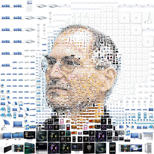
Happy 56th Birthday, Steve Jobs

Steve Jobs by tsevis

Just wanted to give warm wishes to Steve Jobs, who has been quite the influence on my life. The products he and his team at Apple have made over the years have become essential in my daily life. There literally isn't a day that goes by that I don't use something from Apple. Thanks, Steve, for helping make insanely great stuff. Happy birthday, and good health to you.

Apple Holding Second-Gen iPad Event

The Loop just posted an invite from Apple for an iPad event in one week, on March 2nd. If I had to guess (and I don't really think I have to), we'll see an announcement of the second generation iPad, and likely the release of iOS 4.3, which has been in beta for the past month and a half or so.

As a left-field guess, maybe we'll get a preview of iOS 5, though Apple usually previews that as a separate event, however, the timeframe would fit judging from past preview events.

iPad 2011 Event Invite

Making the Case for Ollie

Ben Brooks doesn't like the new Twitterrific for Mac. I know, I know, I'm a Twitterrific die-hard. Ben has some good points, but I find a lot of his criticisms to either be unfounded or, well, nit-picky.

After you post a tweet your Twitter stream is not updated, so you see your new tweet at the top of the old tweets. Then when Twitterrific does update, the new tweets jump into position where they should be in the timeline. Your new tweet, that was at the top of where you had read, is now mixed in with a jumble of other tweets. You could get used to this, but you shouldn’t have to get used to non-sense like this.

Agreed. I am used to this behavior of the app, but I would love for the stream to update.

The title bar with all the icons is very imposing and throws off the balance of the entire app. Even with all icons removed it is still just too thick. Twitter clients should always feel like small-apps and not like full-blown apps 1 — Twitterrific fails at this.

I partially agree with this. The account switcher could, honestly, be better. I also like having icon only for the elements in the title/tool bar. His opinion of Twitter apps being constrained to "small-apps" (I believe we call those Dashboard widgets) seems odd. These are Mac apps. Why should they not be a full app? And TweetDeck, being an Adobe AIR app, is a horrible comparison. May as well compare a steak to a pile of crap.

If you want two accounts you need to pay $9.99 — which is silly given that Twitter for Mac is free.

Then go download Twitter for Mac. Fact is, the Iconfactory doesn't, to my knowledge, have venture capital and angel investments totaling in the tens of millions of dollars. They make great products, and sell them for money. That's called a business plan. If the only incentive to pay is to get rid of ads, then I don't think many folks would pay.

You can’t remove the menubar icon.

I don't have a problem with it, but I agree. It's not for everyone.

You can’t close image windows (Twitpic and the like) with the keyboard.

Tap the escape key. Side story: Popovers are an iPad UI element. They aren't native to Mac OS X (at least, not yet. I wouldn't be surprised if they are in Lion). If you rip open Twitterrific's app bundle (right click, Show Package Contents) and scope out their frameworks, you'll see UIKit. UIKit is an iOS framework. To me, that says Iconfactory rewrote Apple's UIKit framework for use on the Mac. That's pretty much amazing (and a lot of work).

In contrast, when you click an image link in Twitter for Mac, it appears a type of popover opens. You can dismiss this with Command-W. That tells me that Twitter for Mac is actually opening a standard window with a custom UI.

Iconfactory did the work to bring iOS popovers to OS X. They chose to use escape as the dismissal shortcut for this new UI.

This is my biggest gripe: the direct messages show up as a random hodgepodge based on the time sent. So I can’t view the entire conversation thread, I just see messages in a confusing and un-helpful way.

I partially agree. In the main timeline, I like that DM's are part of the timeline. It's part of what attracts me to Twitterrific, a universal timeline. However, when viewing just DM's, I would actually like them to be threaded as conversations.

No live streaming of the Twitter feed, which at this point is basic and mandatory.

It'd be a nice option. Personally, to me, it would feel like a constant trickle of information overload. I prefer to digest tweets in morsels during set intervals. But, that is a personal preference that is different for everyone. I'm sure this will be in an update.

No drag and drop support for posting pictures — I mean I guess sending the file path for the picture could be useful at times.

I actually reported this during the private beta. There just wasn't time for it for the initial release.

The icon: I don’t hate it, but I don’t love it.

Dude, it's fricken Ollie! He's awesome! And don't get me started on Twitter for Mac's various icons over its three updates thus far.

The app is stable and works. It does what it says. I can’t help but feel a lot was left out to get the app out. Most of the problems can be easily fixed with updates, but for a version 4 product these issues should have never shipped. Making sure CMD+W closes picture previews and that dragging in pictures to a compose window attaches the image, is basic stuff for a 4th version product. [...] It doesn’t feel finished — it feels like a version 1.0 product. If this was a version 1.0 then I would be excited for its future, but given the version 4 nature I am hardly impressed.

I get the feeling Ben just doesn't know about the product's history, which is understandable. I highly encourage reading Filing a Flight Plan and On Final Approach for some context. Essentially, Twitterrific 3 for iOS was a complete re-write of the iOS app, and likewise, to get the Mac and iOS apps on the same codebase the Mac app is essentially built from the ground up as well. Even though the new Mac version says 4.0, it's a 1.0 from a codebase point of view.

Now that the Mac and iOS versions are built on the same foundation, it should be easier for both platforms to grow concurrently with new features. It was a ton of work for the Iconfactory, but in my opinion, a great investment for the future of the app.

iTrip DualConnect

I've been a big fan of Griffin Technology's accessories for Apple kit ever since I bought my first iPod. One of the first things I scout out every time I buy a new iPod (or these days, iPhone) is a way to hook it up to my car.

Back in the day, I used their iTrip device to broadcast music from the iPod to my car's stereo via FM. But having to change stations gets old quickly when driving a decent distance. Griffin has mitigated that over the years with new iTrips that scan for open frequencies, but I hopped ship to AUX ports when those became popular.

My all time favorite car accessory was the TuneFlex AUX with Smartclick for my old iPhone 3G. The best part was the remote that attached to the steering wheel. Fantastic device. Unfortunately, that doesn't work with my iPhone 4.

So I tried their new TuneFlex AUX Handsfree. That didn't work out so well.

Finally, I've settled on a simpler solution. The iTrip DualConnect. It can connect via either FM or AUX. I took the AUX road. It charges your iPod or iPhone and acquires the audio as line-out via the Dock connector. I'm a big fan of line-out.

The play/pause, forward, backward controls are nice (but I do miss my steering wheel remote).

All in all, it works as advertised, unlike the TuneFlex AUX Handsfree. Consider it highly reccommended.

iPhone App Essentials

I've seen a few of the folks I follow on Twitter get a Verizon iPhone 4 today, and quickly posed the question of what are the must-have apps. Here's my list:

  • A twitter client. My two recommendations are either the official app or my personal favorite, Twitterrific.
  • Apple has some great apps. iBooks for reading (fanatastic for PDFs, also comes with a free copy of Winnie-the-Pooh), Remote to control iTunes or an Apple TV, Apple Store which is handy if you ever need to make an appointment at your nearest Apple Store, and an absolute must-haveFind my iPhone. If you don't sign up for this, you will regret it someday. It's a free service Apple provides, so there isn't an excuse.
  • 1Password Pro is a great standalone password manager, but it is even better when paired with its Mac or Windows counterpart. I recommend syncing your 1Password keychain over Dropbox.
  • Everyone needs a little entertainment in their lives, so I suggest Netflix for watching movies and managing your Instant Queue on the go. Also, Wigglehop is a great way to see what is showing at theaters nearby. And of course, IMDB for when you need to settle a bet about who was in what movie.
  • If you fancy Starbucks and have a registered Starbucks Card, get the Starbucks Card Mobile app so you can reload your account and pay for your coffee all from your phone.
  • I like to take photos, and my favorite apps to do so besides the standard Camera app are Camera+ and Instagram.
  • To keep up on news important to me, I use Instapaper, where I save links for later that I don't have time to currently read, and Reeder to keep up with my RSS subscriptions.
  • I'm a big fan of Amazon Mobile, as it allows me to quickly compare prices when I am in a store, and order if the price is right. To track those shipments from Amazon (or anyone else) I use Delivery Status touch. One last shopping related app is Groceries. This app keeps my wife & I sane in the grocery store.
  • Lastly, a few utilities: LED Light for iPhone 4 Free does one thing well, and that is turning on the iPhone 4's LED as a flashlight. Have a crooked picture on the wall and want it level? The Stanley Bostitch Level is there for you.

Those are some of my favorites. Enjoy your new iPhone 4.

Twitterrific Comes Back to the Mac

It's no secret that I am a huge fan of the Iconfactory's wonderful twitter client Twitterrific. Back in October I wrote about an upcoming revamp of the Mac version of Twitterrific.

Today, the eagle has landed.

Apple's motto for the upcoming Mac OS X Lion is "Back to the Mac." Twitterrific 4 for Mac is exactly that. It is the iOS app brought "Back to the Mac." From popovers to fade-away scroll bars, Twitterrific 4 for Mac is a foreshadowing of Lion on Snow Leopard.

I've been beta testing Twitterrific 4 for the past month or so, and I wouldn't even think of using another Twitter app on my Mac. Where the new Twitter for Mac feels completely foreign on the Mac (in my opinion, it feels too much like an iOS app), Twitterrific is the perfect blend of the Mac and iOS worlds. It has many visual elements from the iOS version, but feels like it belongs on the Mac and operates accordingly.

My favorite thing about Twitterrific, for both the Mac and iOS, is that it covers the essentials of tweeting. The app is well-designed, and isn't bogged down by feature creep. Too often twitter clients throw in everything but the kitchen sink (and sometime even that). Not Twitterrific. It serves two main purposes: reading and writing tweets. You know, the good stuff.

Without further ado, I'd like to overview some of the features. Twitterrific has the ability to open multiple timelines, a collapsible sidebar that shows searches, lists, & trends. The sidebar also lets you switch between a the unified timeline, or filter between Mentions, Direct Messages, and Favorites. There are dark and light themes. Lastly, just to show them off, the tweet composer, and the info and photo viewer popovers.

There's even a fantastic little video walkthrough.

If you aren't convinced, give Twitterrific for Mac a try for free (ad-supported) from the Iconfactory directly. There is also paid version which is ad-free and supports multiple accounts for $9.99 either directly or on the Mac App Store.

I'd like to give a huge congratulations to Ged, Craig, Sean, David, and the rest of the Iconfactory team for bringing Ollie back to the Mac.

Year One

One year ago today, I relaunched my previous efforts in blogging as techēse. To celebrate, some changes are going into effect.

  • When I launched techēse, i thought it was imperative to bring all my content that I'd ever written. I have since seen the light and realized that focus is more important. So I have culled out many posts that didn't fit right with the mission of techēse. Granted there are a few in the archives that likely don't follow this criteria, but they likely have sentimental value to me. More or less, anything after 1 Feb 2010 should be fairly in focus for this site.
  • There have been some design tweaks. Not many, but some. These have been quietly rolled out over the past few weeks. The most notable is that the gray-to-white gradient background, which was a standard on Squarespace, has been replaced by a textured gray. It isn't a huge change, but I think it gives the site a better overall feel.
  • The main area of the site has been renamed from journal (another Squarespace default) to articles. I know this breaks the permalink for any site that had linked back to an article, but I felt this was a contextual necessity for the mood of the site. I'm not writing to present a glorified diary, I'm writing to present news and opinions on technology. Articles makes more sense to me. If you have previously linked to this site, all you need to do is change journal to articles in your current permalink.
  • This is a big one. Comments are disabled for all future posts. First, I have come to believe that comments on individual posts do not foster valuable discussion. It is possible for this to happen, but it is rare. More often than not, comments are used for anonymous flippant retorts. Second, the comment system has been abused by spam. I receive far more spam via the comment system than discussion from actual readers. That is why I switched it to editor approval a while back. Now I am taking the system offline. Please write to me using either the contact page or via one of the Twitter accounts listed in the sidebar.

The site is a work in progress. I am constantly polishing ambiguities in the design, optimizing for making the content stand out. If you have any suggestions, please write in.