¶ Twitterrific 6 for iOS Tailors Twitter Your Way

When my friends at The Iconfactory said that Twitterrific 5 on iOS was released 6 years ago and has had 86 free updates, I almost didn’t believe them. There’s simply no way Twitterrific 5 is 6 years old. Looking back at my own review confirmed its vintage.

Let’s put this in perspective. 6 years ago this site had a different name and domain, iOS 7’s new design language hadn't yet been revealed, and iPhones still had tiny screens.

Twitterrific has seen a lot of changes in that time. The design was completely overhauled for iOS 7 and tweaked frequently to stay fresh, features have ebbed and flowed as Twitter has given and taken away, and like a Phoenix from the ashes Twitterrific made its triumphant return to the Mac.

Today is the next perch in Ollie’s journey with the release of Twitterrific 6.0 for iOS. This new version of Twitterrific is CHOCK-full of experience enhancements that make Twitter usable and — dare I say — enjoyable.

Media Matters

A great deal of the improvements are related to media handling. Videos and GIFs now silently autoplay in the timeline and direct message threads. If they do contain sound, a speaker icon is shown so you aren’t surprised if you tap it. Also, autoplay can be disabled in the settings if you prefer that.

Image thumbnails now display at the photo’s native aspect ratio. If you like to add GIFs to your tweets, there is a new GIF button in the composer that integrates with GIPHY. I’m fond of the built-in filters for Reactions, Memes, and Swear Trek. Is that a buffet? Not for long.

Speaking of the composer, it’s media capabilities have been revamped. Now you can tap the thumbnail for attached media to see it larger and add accessibility descriptions — even to videos and GIFs. And you can swipe between multiple attachments to quickly add descriptions.

Twitterrific also embraces Twitter’s new ability to add media to tweets that contain quote tweets, as well as viewing said tweets properly.

Twitter Your Way

Twitterrific has always offered customizations to its experience, leaning heavily into one of its tag lines: Twitter your way. Version 6 continues that theme with three new home screen icon choices (Crow, Dove, and Neon — I have been loving Neon during the beta), five new themes (Dove, Akikiki, Puffin, Falcon, and Parakeet, twelve new “Olliemoji” iMessage stickers, a new font, and a few new display customizations.

Pricing

After 86 free updates over 6 years to Twitterrific 5, there are naturally some long overdue changes to the app’s pricing to continue its development — sort of.

No matter what, all features are available for free, but are subsidized with banner ads from The Iconfactory’s own ad network. Users at the free tier will also see reminders for the next level of supporting development — subscriptions.

A monthly or yearly subscription (99¢ and $9.99, respectively) will remove the banner ads and subscription reminders during the length of the subscription. There are some scenarios where recent purchasers of version 5 or users of its Tip Jar feature get a grace period. The Iconfactory has a support article outlining the scenarios.

For those who are not fond of the current app trend of subscriptions there is, thankfully, a one-time “Forever” option priced at $29.99 USD. The quote marks around “Forever” are in the app’s official documentation, and I don’t think it means forever. I would assume it means the lifespan of version 6. Which, if that is the case, shouldn’t be a concern given the longevity of version 5.

Flying Into the Future

It's no secret to users of third-party Twitter clients that Twitter has been hostile to these apps over the past years. Yet a few bravely remain to make Twitter a more delightful place on the internet to connect at. The Iconfactory has poured a lot of love into Twitterrific for the past 10+ years, and it’s encouraging to see them continue to push the needle forward in the face of adversity.

I have no doubt that as long as Twitter continues to allow its existence, and it has a dedicated user base willing to put their money where their tweets are, Twitterrific will continue to soar for years to come. That may seem like a tall order, but the people at The Iconfactory have faced overwhelming odds in the past and persevered, and I know they can continue to do so — as long as we stand alongside them.

Twitterrific 5.9 — The Photography Update

Twitterrific is an app that is near and dear to my heart, as I have been using since day one of being on Twitter (nearly 7 years!). Over the years I have developed a wonderful friendship with some of the folks at The Iconfactory. As such, I've been a beta tester for a good long while, and the 5.9 update has been particularly difficult to keep quiet as I've just wanted to scream about its awesomeness from the mountains.

Yeah yeah, there aren't mountains in the Great Plains, so maybe just a small hill. I digress.

I love photos. Twitterrific 5.9 is all about photos. You can now add mutliple photos (up to 4) using Twitter's photo service, and you can view photos (even multiple photos) from just about any service you can link to. Best of all, Instagram photos now load in Twitterrific's photo viewer without having to load the mobile site.

Videos also get a nice treatment with an improved viewer with playback controls, as well as animated GIFs. My colleagues at work and I basically live off GIFs, so this is extremely welcome.

Twitterrific 5.9 is a free update in the App Store, and it really is the most delightful Twitter app out there. If you love simplicity without sacrificing features, you need to get acquainted with Twitterrific.

Be sure to check out The Iconfactory's feature overview video for Twitterrific 5.9, and either leave or update a review on the App Store.

Twitter is turning into a bully.

TwitPic is shutting down. For the uninitiated, TwitPic was the de facto place to post a picture on Twitter back in the good old days of 2008. This was years before Twitter had its own photo service.

From The Verge's piece on the news:

In a blog post announcing the service closure, Twitpic’s Noah Everett notes "Twitter contacted our legal demanding that we abandon our trademark application or risk losing access to their API." The move shocked Everett "since Twitpic has been around since early 2008, and our trademark application has been in the USPTO since 2009." Twitpic doesn’t have the resources to battle Twitter legally and Everett has decided to shut down Twitpic instead.

Twitter as a company is turning into a bully. Plain and simple.

Free(mium) Ollie

Today my longtime friends at The Iconfactory released Twitterrific 5.7, and with this update they set Ollie free. Or rather, freemium.

From their announcement:

Today marks a new era for our venerable Twitter client, Twitterrific. We’re pleased to say that with the 5.7 update, Twitterrific is now free to download from the App Store. It is supported by revenue from Deck Network ads displayed at the top of the timeline and in-app purchases that unlock advanced features such as push notifications and tweet translation.

Twitterrific has been available in the App Store since day one and we’ve experimented with different revenue models in the past, including the one we’re returning to today. Our hope is that this helps get Twitterrific into more people’s hands than ever before so they can enjoy the simple beauty of reading and posting tweets once again.

If you're a longtime fan of Twitterrific, I'm sure the first thought is whether or not you need to pony up for the in-app purchase. Iconfactory is using one of the awesome new features of iOS 7 to make sure existing owners of Twitterrific 5 for iOS don't need to do that. They are smartly using iOS 7 Receipt Validation to check whether you had paid for Twitterrific 5 before, and if so, the in-app purchase is waived.

I think this is a smart change in business model for them. Exposure is everything in the App Store, and this will definitely remove the barrier to entry to get people to see how great third-party Twitter apps are compared to Twitter's own app.

The very first app I bought when I got my iPhone 3G (which was also the launch day for the App Store) was Twitterrific 1.0. The Iconfactory has always had the most sensible approach to Twitter in my mind and Twitterrific has always been my preferred app.

I'm glad to see The Iconfactory setting Ollie free so he can soar higher than ever.

Twitterrific 5.6 Glides with Streaming

I've had the privilege to be testing Twitterrific 5.6 for iOS for the past few weeks, and it is a fantastic update. This big feature with this release is support for Twitter's streaming API.

Once you've enabled streaming in the app's settings, tweets will come in as they are posted in real-time while you are on Wi-Fi. Twitterrific will intelligently switch back to manual refresh when you drop to a cellular connection.

Streaming is one of those features that has been a long time coming for Twitterific. Streaming makes the Twitterrific experience that much more frictionless and delightful. In my opinion, the lack of streaming was pretty much the final piece of friction left in Twitterrific, and now it really feels feature complete.

Another great feature, though one I admit I have not used often, is list management. For the extremely organized among us, this is a great addition.

You will love Twitterrific 5.6, which is available as a free update to existing users, and available to new folks for $2.99 99¢ on the App Store.

Update: Changed pricing to reflect limited time 99¢ sale.

Twitterrific 5.5 for iOS 7

When iOS 7 was announced, surely everyone's imaginations started to ponder what their favorite apps would do for redesigns to fit in. Out of all my apps, Twitterrific 5 looked like it was all set to just go ahead and blend right in.

I thought to myself, "They probably don't even need to do anything!"

Boy, am I glad the folks at The Iconfactory didn't think the same way.

I've been testing Twitterrific 5.5 for a couple weeks, and I'm blown away by the level of detail. The Iconfactory has taken Twitterrific's already delightful design and lovingly embraced all of iOS 7's strengths.

I have two favorite parts: the new color choices for Dark Mode look like they were pulled straight from Tron: Legacy, and the other is when you have an image or menu popover pulled up, it has the same parallax effect between the foreground and background as iOS 7's home screen. Of course, there are many more nice things.

I've been using Twitterrific as my main client since before iOS was even a thing. By far Twitterrific 5 has been the most iterated and well-thought-out edition yet. Twitterrific 5.5 is a free update for existing Twitterrific 5 owners, and requires iOS 7. This is hands down my favorite app and I hope it becomes yours, too.

Twitterrific 5.5 is out on the App Store and runs for $2.99 if you are new to the app.

Twitter for Mac Updated

Speaking of being shocked, I thought this app was long dead. The last time it had received an update prior to today was June 1, 2011. That's right, OS X Snow Leopard reigned king when Twitter for Mac was last updated.

But, it appears Twitter is breathing new life into their desktop app. They added Twitter Photos support, Retina graphics, updated iconography, and a slew of languages. They've even put Ben Sandofsky in charge of it full time.

We'll see what happens, but personally, I am more excited that Iconfactory is working on Twitterrific 5 for Mac.

¶ Twitterrific 5 for iOS | Review

I love Twitter. Most of my friends over the past few years, both local and afar, started as acquaintances on Twitter. For the years that I have been on Twitter there is one app that I have used primarily to interact with the service — Twitterrific.

Twitterrific has had a mixed past. It started as simple as Twitter itself, and contributed some features back to Twitter that we all take for granted now. While Twitterrific’s roots are on the Mac, it is the iPhone, and later the iPad, where its story really takes flight.

A Brief Overview of the Past

Twitterrific for iOS was my first app downloaded from the App Store as soon as I had purchased my iPhone 3G on launch day in July 2008. The initial iOS app was a basic way to read, tweet, and reply, just like its big brother on the Mac. And it was fantastic in its simplicity.

I have always admired The Iconfactory for their attention to simplicity.

That is why Twitterrific 2 was a little surprising. It packed in just about every feature that could be thought of but the kitchen sink. However, it suffered from feature creep and interface bloat. And The Iconfactory knew it.

When the iPad came out, The Iconfactory was again first to have an app out for the new device. They took the opportunity afforded to them by the short time to develop the app to strip Twitterrific back to basics. Where version 2 had feature overflow, Twitterrific for iPad went back to the bare minimum.

Then Twitterrific 3 (and 4, since 4 was really an evolution of 3) came to the iPhone, actually being an update to the iPad app. It had the same feature set as the iPad app did, and cautiously returned features as needed. However, Twitterrific remained very bare bones compared to other apps, something I enjoyed. As I alluded to earlier, I am a fan of simplicity.

That is not to say I didn’t have some qualms with Twitterrific 3 & 4. It always felt a step behind other clients, and it had really started to show in recent months.

Twitterrific 5

Today we have Twitterrific 5. It is not only an all-new direction for The Iconfactory and Twitterrific, but it is a new direction for the potential of an iOS app.

Twitterrific 5 feels like the intersection of all the great interface aspects of iOS, Palm’s WebOS, and Microsoft’s Windows Phone.

Twitterrific 5 captures the smoothness and fluidity of iOS, a look and feel reminiscent of Windows Phone, and the “sidebar”, browser, Tweet composer, and image popovers pay homage to WebOS’ cards.

The First Run Experience

When you launch Twitterrific 5 for the first time, it will ask you if it can access your Twitter accounts in iOS’ settings. When you allow it to, it will show the avatars of all the accounts you have signed in to iOS. Tap each one you want to add, and Twitterrific handles the rest.

In the past, and in other clients, you would have to be shown an ugly Twitter web form to sign in with manually. Somehow The Iconfactory has cooked up some secret sauce that will take care of business for you.

The Timeline

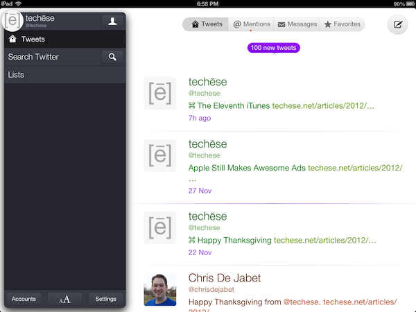
Twitterrific’s timeline is cleaner than ever. Controls for reply, retweet, favorite, and an ellipses for more items appears on a tap of a tweet. Delightfully, gestures are also integrated. Swipe a tweet from the left to right to reply, and from right to left to see a conversation.

The timeline has a setting to be unified, showing all replies and direct messages in the main timeline. This is Twitterrific’s hallmark since the beginning, and I am glad to see it still there.

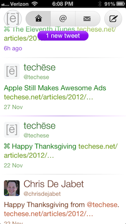
Along the top there is a circle with your profile picture on the left, a capsule navigation for the main timeline, replies & mentions, and direct messages. On the right is the Compose button.

Timeline
Timeline

Twitterrific 5 now supports proper gap detection in the timeline, signified by a tiny capsule with an ellipses smack in the middle of the horizontal rule that separates tweets.

That separator also glows purple to serve as the last read point when syncing the timeline either via iCloud or Tweet Marker.

To refresh the timeline, Twitterrific 5 now uses Pull to Refresh. They rolled their own custom pull to refresh and it is adorable. Look below.

Pull to Refresh
Pull to Refresh

I mentioned the unified timeline earlier. In the past the entire cell that contains the tweet would be color coded to show what kind of tweet you were seeing. Green for your own tweets, orange for mentions, and blue for direct messages. In Twitterrific 5 the cell is not colored, but rather the text itself. There are even a couple shades of orange and blue, the first to show whether a mention is just a mention or a reply, and the latter to show whether a direct message is sent or received.

Filtering by direct messages used to be a bit of a chore, because there was not a way to thread the conversation. Now, simply swipe a direct message toward the left and the conversation will thread, just like mentions. This is a huge improvement.

The Sidebar Card, or As I Like to Call It, the Sidecard

Sidecard
Sidecard

Tapping the circle with your profile picture in it will bring up what I am calling the Sidecard. It is pretty much the Sidebar of old, but it literally looks like a floating card. From here you can browse saved searches and lists. You can also tap the search button to search for tweets, or the newly added People. I have been wanting people search in Twitterrific for a long time.

At the bottom of the Sidecard, you will see Accounts, which brings up your various accounts, the format panel, and the Settings panel.

Protip: Tapping and holding the circle with your profile pic at any time will bring up the account switcher. I love this!

The format panel, which is shown by two A’s, sized differently, allows you to change the font, the font size, the spacing between lines, avatar size, dark theme and light theme, and brightness.

I appreciate the ability to choose which size the avatar is shown at, as you can reduce it to nothing. I go to an area of the Middle of Nowhere twice a year, and being able to cut out loading avatars at that time will save on bandwidth, battery, and time.

Settings lets you change the sync service, its behavior, notification sounds (which I love the new sounds), whether or not to have a unified timeline, and my favorite, automatically turning on the dark theme at night. It flips to dark at 7pm local time and back to light at 7am.

The Help button in the Settings panel explains the various gestures available. There’s good stuff there. Be sure to check it out.

Composing

Composing a tweet is rather straightforward. You tap out your tweet. If you don’t like it, tap the character count to bring up a delete circle, tap again to delete it all.

Tap the location glyph to add your location, or the camera to add a photo.

There is no longer a choice of photo services. It is just Twitter’s photo service. I’m okay with that.

However, it is somewhat misleading in that Twitterrific will let you take a video or choose one from the library, but it will not upload anywhere. The Iconfactory told me this is an oversight, and video options will be removed for now in a future update. They didn’t say, but I suspect they think Twitter will have its own video service. Honestly, it makes sense. If that happens, I am sure we will see the return of video uploading to Twitterrific.

Taking Flight

In the week I have had Twitterrific 5, I am enamored with the new direction The Iconfactory has taken their flagship app. It is clean, light, and fun. Delightful and adorable are other adjectives I’ve used so far.

Everything loads fast, looks fantastic, and the gestures have ruined me.

Twitterrific has been and still is my favorite Twitter app. Of course, there is room for improvement, but there always is. The Iconfactory told me streaming is on the roadmap, as well as a Mac counterpart (I can’t even look at the Mac app anymore, that’s how good this is).

Twitterrific 5 is available now (or will be shortly) on iTunes for an introductory price of $2.99. The regular price will be $5.99.

Twitterrific 5 doesn’t have all the bells & whistles. But I do think it has what most people will want out of a Twitter client. Just enough power to do more than before, but not overwhelming where many features go unused.

If you appreciate fantastic design, speed, and overall delight, Twitterrific 5 is for you.

IFTTT Forced to Remove Twitter Triggers

If you are a follower of this site on Twitter (@techese), then you have been benefitting from a Twitter trigger I have set up via IFTTT. IFTTT stands for If This, Then That. It’s simply really. For instance, I have it set up for “If a new post hits techese.net’s RSS feed, then tweet the title and link”. There’s a myriad of other useful things the service can do, right down to turning on a light in your home at a certain time if you have the right devices.

Amazing stuff.

Well, Twitter sure seems to hate amazing stuff lately (like, oh, you know, third-party anything). Twitter is forcing IFTTT to remove Twitter triggers. Now, not all triggers are disappearing. The particular one I use to post is staying. But this whole crusade of “all roads lead to Twitter and none lead out” is leaving a bad taste in my mouth.

I have no idea what is going on at Twitter. They really seem to be losing their way.

¶ Best in Class

The nerds (myself included) have been getting pretty antsy about Twitter’s increasing restrictions on third-party apps. We love our third-party apps like Twitterrific and Tweetbot (and I am sure my Android friends have their favorites, too).

Why?

Because, frankly, third-party Twitter apps have offered the best in class experience to date. Let’s loosely recap how Twitter’s experience has changed over the years.

  • There’s the website, which offered the bare necessities, and text messaging, which is still enabled (and is the basis of the 140 character limit). I even know people who still solely use text messaging as their interaction with Twitter, which boggles my mind.
  • Twitter released an API for developers to make apps with. One of the first was Twitterrific for Mac. Twitterrific was truly my first experience with using Twitter. It has been my primary way of using Twitter for the entirety of my time on the service.
  • Users and the developers of third-party apps came up with ways to modify the Twitter experience, almost all of which made their way back as an official API within Twitter. Examples include @replies, hashtags, direct messages, and retweets. These are all things Twitter did not pioneer, but they are essential to its experience today.
  • Third-party apps have dominated the best in class experience throughout Twitter’s history. A couple years ago the king of the hill was Tweetie, which Twitter bought and renamed as the official Twitter client. Once again, Twitter did not pioneer the best in class experience, they simply bought it.
  • Twitterrific and Tweetbot, at least on iOS and the Mac, have made fantastic experiences respectively by making apps for the iPhone, iPad, and Mac that share the same general look and feel, and sync last read positions across the three platforms. Best in class.
  • Twitter, however, gutted what was once known as Tweetie and left a dim shadow of the best in class app that it once was. Their interface across platforms is extremely fragmented. On Apple’s devices alone, the experience on the iPhone is wildly different from the iPad, and both are very different from the Mac.
  • Twitter’s official Mac app hasn’t been updated since two full OS X versions ago. It doesn’t support any features from OS X Lion, much less Mountain Lion, which ironically has Twitter support built into the entire system. (It obviously isn’t retina-ready, either, so it is an eyesore for Apple’s flagship Mac).
  • Now Twitter is slowly strangling off third-party apps, and catering to braaaaands through promoted tweets and promoted accounts.

I don’t think I would feel so morose about Twitter’s actions to stifle third-party apps if Twitter itself offered the best in class experience. If Twitter’s experience was far and away better than what third-parties have come up with, there would hardly be an argument to make.

Twitter doesn’t even leverage its own streaming technology in its mobile apps. Tweetbot does and it’s awesome. And what about things like Tweetmarker? Twitterrific and Tweetbot use this to keep timelines in sync at the user’s “last read” position. With Tweetmarker, I can easily launch a client on Mac, iPhone, or iPad and pick up where I left off.

What if Twitter made best in class apps on all their platforms, using their streaming feature when appropriate, and rolled a Tweetmarker-like feature across all their apps and the web? Well, for starters, it would make the service just that much better. Secondly, it would make the deprecation of third-party apps hurt less.

The fact is Twitter doesn’t seem to care about having the best experience, they care now about being the only experience.

And if your experience is the only experience, I suppose the majority of users won’t know that it could be so much better.