Dark Sky Acquired by Apple

My favorite weather app, Dark Sky, had a big announcement today. Adam Grossman on the Dark Sky blog:

Today we have some important and exciting news to share: Dark Sky has joined Apple.

Our goal has always been to provide the world with the best weather information possible, to help as many people as we can stay dry and safe, and to do so in a way that respects your privacy.

There is no better place to accomplish these goals than at Apple. We’re thrilled to have the opportunity to reach far more people, with far more impact, than we ever could alone.

All in all, it makes sense why Apple would want to own the full stack for weather data. Over the years Apple has partnered with providers such as Yahoo! and The Weather Channel. And let’s face it, there are apps — even weather apps, including The Weather Channel’s apps — that abuse location privacy. Dark Sky is a huge player in the weather data arena and they always had a staunch stance on respecting user privacy. That’s why I use Dark Sky as my primary weather app.

So, what’s happening to the app, and more importantly, the service behind it that powers many other weather apps such as CARROT Weather and Weather Line?

  • The iOS app is staying the same, for now. It is available for $4 on the App Store.
  • The Android app is gone. It cannot be downloaded anymore. And the service for it will be discontinued on July 1, 2020. Sorry, droids.
  • The website is also largely being shuttered on July 1, 2020. That’s too bad, because it is a nice site.
  • And finally the API that powers other apps’ weather data will be kept alive until the end of 2021.

I’ll admit I am both excited and trepidatious with today’s announcement. On one hand, I fear the app I use daily and have used for over 8 years will end up disappearing and just become the data layer behind the beautiful yet too simplistic Weather app on my iPhone.

On the other hand I am excited that maybe Dark Sky’s story will turn out much like Workflow’s did. Workflow was acquired by Apple and largely left intact yet supercharged with system access as it became Shortcuts. Shortcuts today is very familiar to Worklfow users of old.

My hope is that Dark Sky becomes the new Weather app. Of course, I do think Apple may update the theme a bit to be a little more Apple-y, but I hope it retains its extensive forecast visuals and radar. And perhaps this means the iPad would finally have a built-in weather app. And heck, why not flex some Mac Catalyst muscle and bring it to the Mac?

I’m very happy for the Dark Sky team, as this is a huge win for them. And I hope the days ahead for the Dark Sky app I know and love are very bright.

Apple Opens Up 3 Health Studies with New Research App

Apple launched a new app called Research yesterday as a follow up to the Apple Watch Heart Study from a couple years ago, which I imagine was a key influence on the Apple Watch Series 4 including a built-in ECG.

US-based users can participate in any of the three studies offered so far:

  • Women’s Health
  • Heart and Movement
  • Hearing

9to5Mac summarizes:

The Women’s Health study draws data from the Cycle Tracking app on watchOS 6 with the aim to improve scientific understand of menstrual cycles. The Heart and Movement Study uses a variety of signals from the watch, including movement and health rate information. The Hearing Study examines the impact of sound exposure on hearing health and stress levels.

I had participated in the Apple Watch Heart Study when it was available, so I went ahead and signed up to contribute data to the Heart and Movement study, and I’ll likely participate in the Hearing study, as well, since I wear an Apple Watch Series 4, which has the ability to measure decibels with its microphone.

I think these studies are very beneficial to helping devices like the Apple Watch truly help people in regards to their health. (And yes, they will undoubtedly be beneficial to Apple’s bottom line, too).

I, for one, am a sucker for the videos Apple sometimes puts out about how the Apple Watch has really saved people. It makes me happy that I wear a device that monitors my heart and can detect a fall (especially living in a climate that is covered in ice for months). You never know when you may need the extra insight, and it could vastly improve or even save your life.

So if you feel inclined, download the Research app and check out the different studies offered. If you feel comfortable with the privacy policy, contribute your data.

¶ Twitterrific 6 for iOS Tailors Twitter Your Way

When my friends at The Iconfactory said that Twitterrific 5 on iOS was released 6 years ago and has had 86 free updates, I almost didn’t believe them. There’s simply no way Twitterrific 5 is 6 years old. Looking back at my own review confirmed its vintage.

Let’s put this in perspective. 6 years ago this site had a different name and domain, iOS 7’s new design language hadn't yet been revealed, and iPhones still had tiny screens.

Twitterrific has seen a lot of changes in that time. The design was completely overhauled for iOS 7 and tweaked frequently to stay fresh, features have ebbed and flowed as Twitter has given and taken away, and like a Phoenix from the ashes Twitterrific made its triumphant return to the Mac.

Today is the next perch in Ollie’s journey with the release of Twitterrific 6.0 for iOS. This new version of Twitterrific is CHOCK-full of experience enhancements that make Twitter usable and — dare I say — enjoyable.

Media Matters

A great deal of the improvements are related to media handling. Videos and GIFs now silently autoplay in the timeline and direct message threads. If they do contain sound, a speaker icon is shown so you aren’t surprised if you tap it. Also, autoplay can be disabled in the settings if you prefer that.

Image thumbnails now display at the photo’s native aspect ratio. If you like to add GIFs to your tweets, there is a new GIF button in the composer that integrates with GIPHY. I’m fond of the built-in filters for Reactions, Memes, and Swear Trek. Is that a buffet? Not for long.

Speaking of the composer, it’s media capabilities have been revamped. Now you can tap the thumbnail for attached media to see it larger and add accessibility descriptions — even to videos and GIFs. And you can swipe between multiple attachments to quickly add descriptions.

Twitterrific also embraces Twitter’s new ability to add media to tweets that contain quote tweets, as well as viewing said tweets properly.

Twitter Your Way

Twitterrific has always offered customizations to its experience, leaning heavily into one of its tag lines: Twitter your way. Version 6 continues that theme with three new home screen icon choices (Crow, Dove, and Neon — I have been loving Neon during the beta), five new themes (Dove, Akikiki, Puffin, Falcon, and Parakeet, twelve new “Olliemoji” iMessage stickers, a new font, and a few new display customizations.

Pricing

After 86 free updates over 6 years to Twitterrific 5, there are naturally some long overdue changes to the app’s pricing to continue its development — sort of.

No matter what, all features are available for free, but are subsidized with banner ads from The Iconfactory’s own ad network. Users at the free tier will also see reminders for the next level of supporting development — subscriptions.

A monthly or yearly subscription (99¢ and $9.99, respectively) will remove the banner ads and subscription reminders during the length of the subscription. There are some scenarios where recent purchasers of version 5 or users of its Tip Jar feature get a grace period. The Iconfactory has a support article outlining the scenarios.

For those who are not fond of the current app trend of subscriptions there is, thankfully, a one-time “Forever” option priced at $29.99 USD. The quote marks around “Forever” are in the app’s official documentation, and I don’t think it means forever. I would assume it means the lifespan of version 6. Which, if that is the case, shouldn’t be a concern given the longevity of version 5.

Flying Into the Future

It's no secret to users of third-party Twitter clients that Twitter has been hostile to these apps over the past years. Yet a few bravely remain to make Twitter a more delightful place on the internet to connect at. The Iconfactory has poured a lot of love into Twitterrific for the past 10+ years, and it’s encouraging to see them continue to push the needle forward in the face of adversity.

I have no doubt that as long as Twitter continues to allow its existence, and it has a dedicated user base willing to put their money where their tweets are, Twitterrific will continue to soar for years to come. That may seem like a tall order, but the people at The Iconfactory have faced overwhelming odds in the past and persevered, and I know they can continue to do so — as long as we stand alongside them.

¶ Ulysses 16 Brings a Second Helping of Editor Goodness

Back in March my favorite writing app, Ulysses, launched Split View editing on Mac. The idea is simple: Have the ability to open two texts, what Ulysses calls files, side-by-side within the same view. Of course, while the idea sounds simple, the execution was not, even on Mac. From the Ulysses 15 announcement:

See, split view editing sounds simple enough: Just split the editor in half and load a second sheet, right? Well… let’s be 100% us and ask questions first.

And from there they asked approximately eleventy billion questions about how to implement it. And it shows, because they really sweat the details on it and pulled it off smoothly.

It didn’t take me long to ask the Ulysses team how soon that could come to the iPad version.

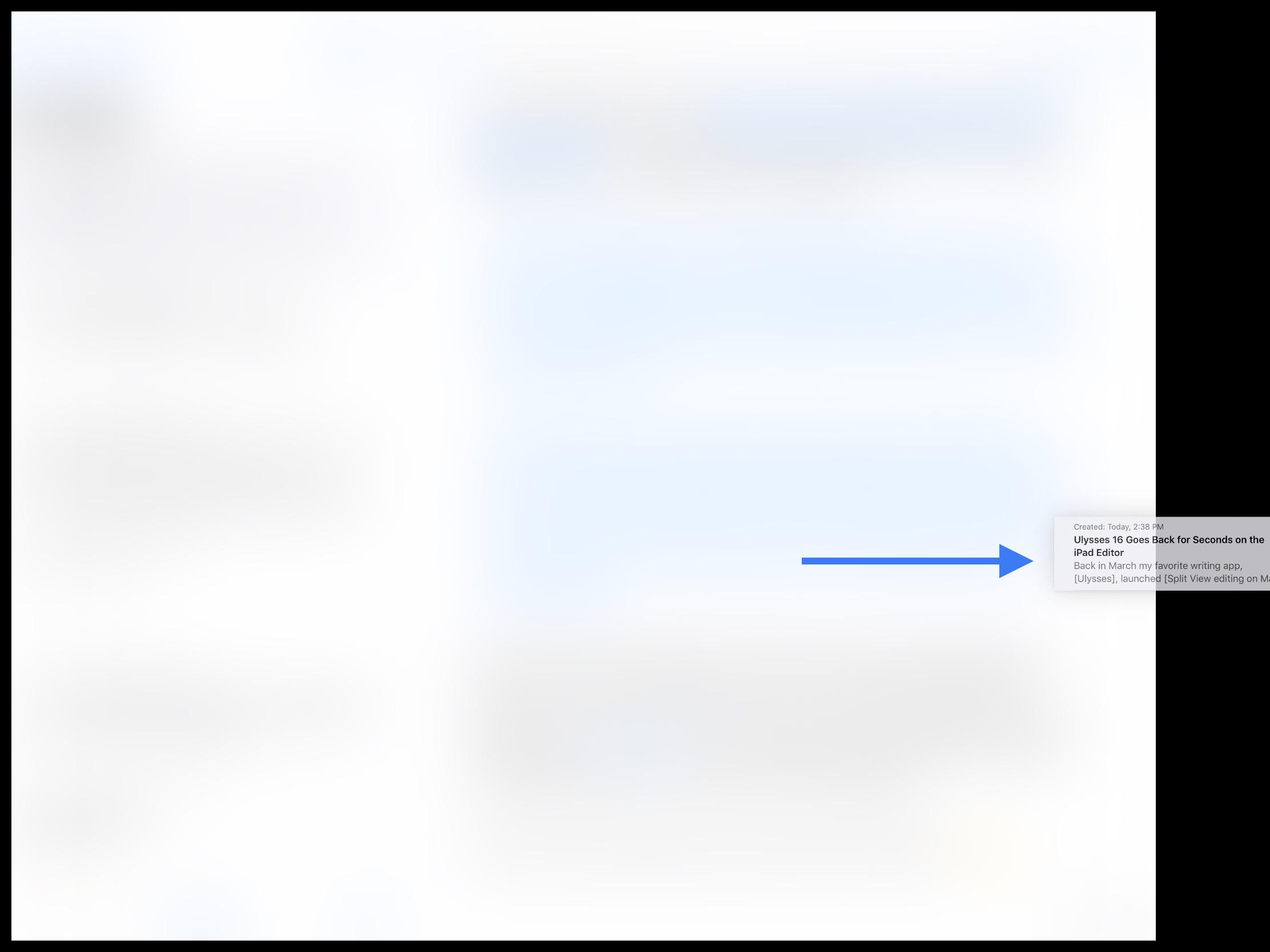
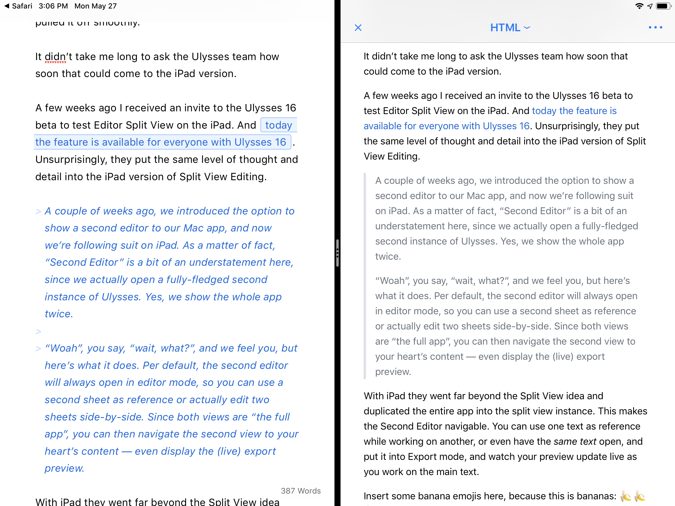
A few weeks ago I received an invite to the Ulysses 16 beta to test Editor Split View on the iPad. And today the feature is available for everyone with Ulysses 16. Unsurprisingly, they put the same level of thought and detail into the iPad version of Split View Editing.

A couple of weeks ago, we introduced the option to show a second editor to our Mac app, and now we’re following suit on iPad. As a matter of fact, “Second Editor” is a bit of an understatement here, since we actually open a fully-fledged second instance of Ulysses. Yes, we show the whole app twice.

“Woah”, you say, “wait, what?”, and we feel you, but here’s what it does. Per default, the second editor will always open in editor mode, so you can use a second sheet as reference or actually edit two sheets side-by-side. Since both views are “the full app”, you can then navigate the second view to your heart’s content — even display the (live) export preview.

With iPad they went far beyond the Split View idea and duplicated the entire app into the split view instance. This makes the Second Editor navigable. You can use one text as reference while working on another, or even have the same text open, and put it into Export mode, and watch your preview update live as you work on the main text.

Split view of Ulysses 16 on iPad, with a live preview of the active text.

Split view of Ulysses 16 on iPad, with a live preview of the active text.

Insert some banana emojis here, because this is bananas: 🍌🍌🍌

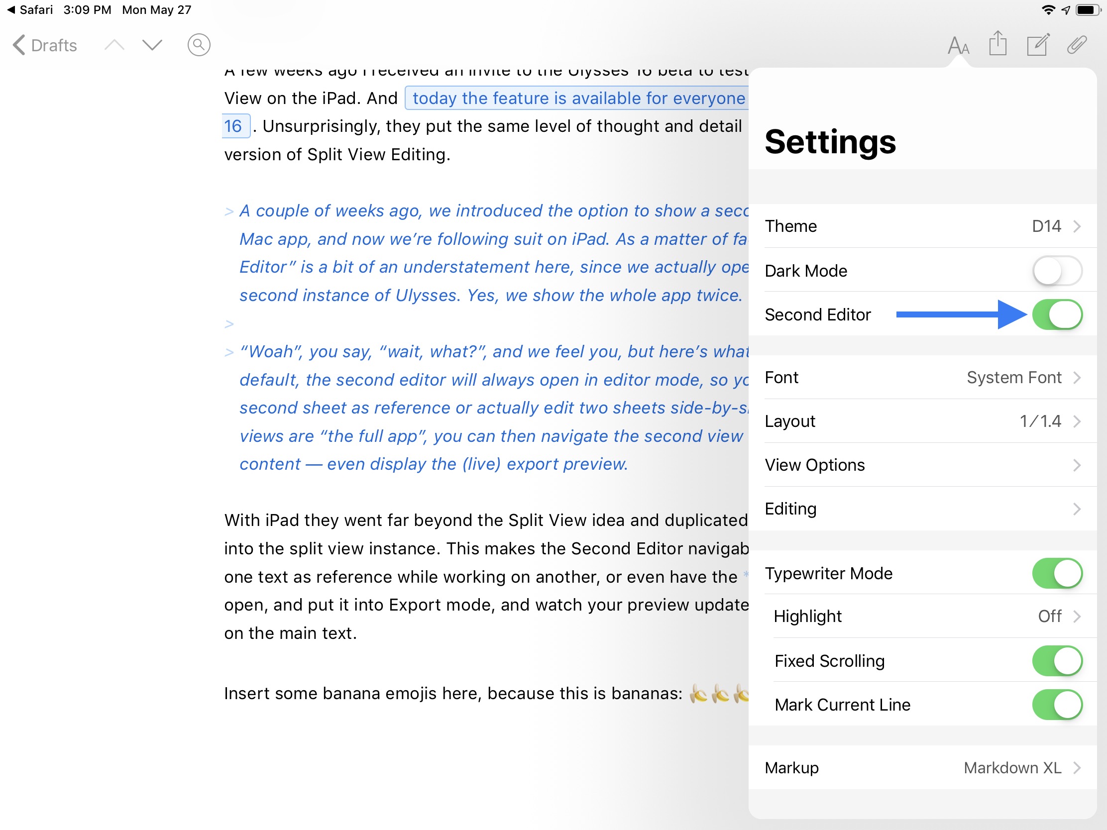
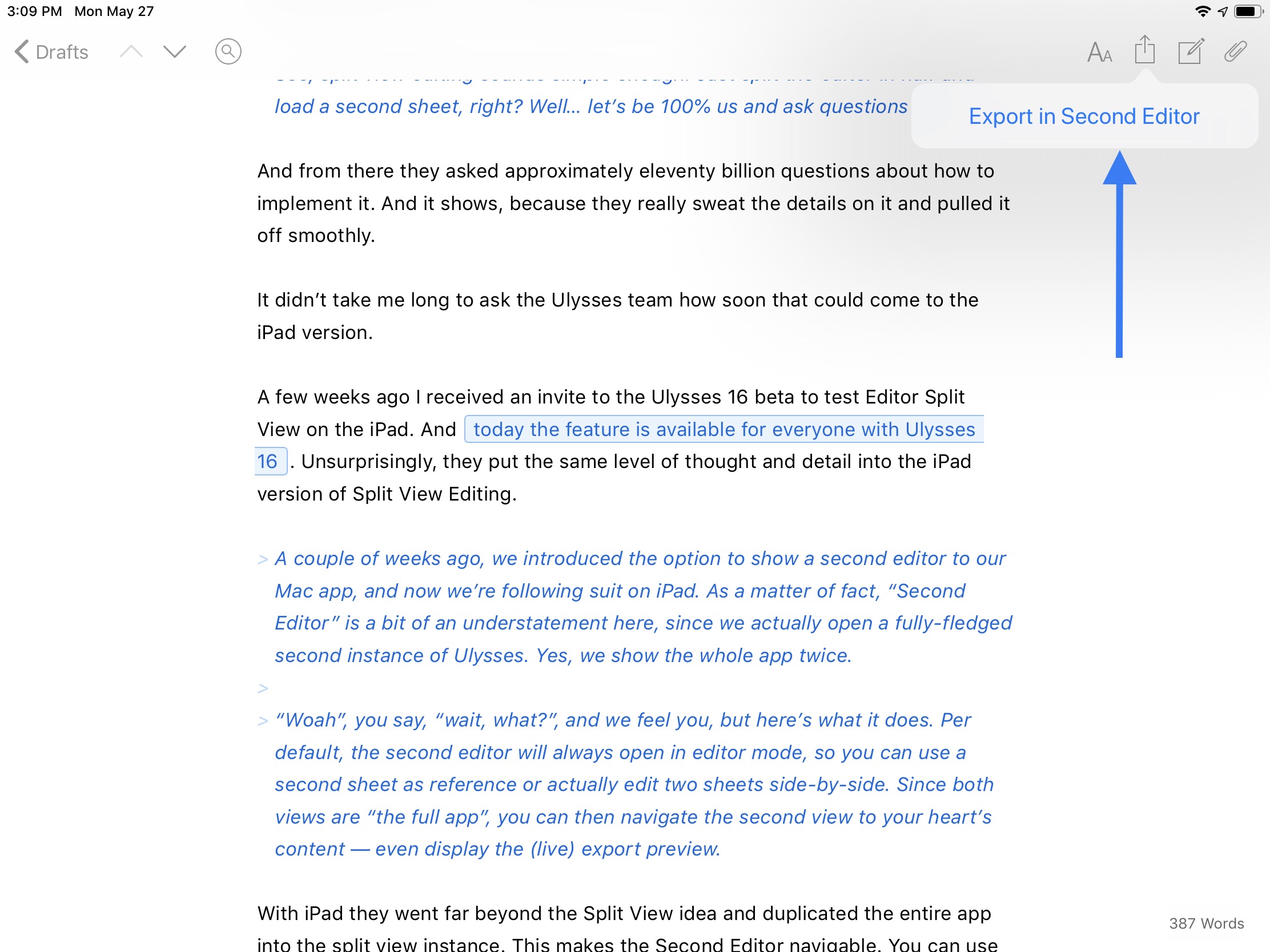
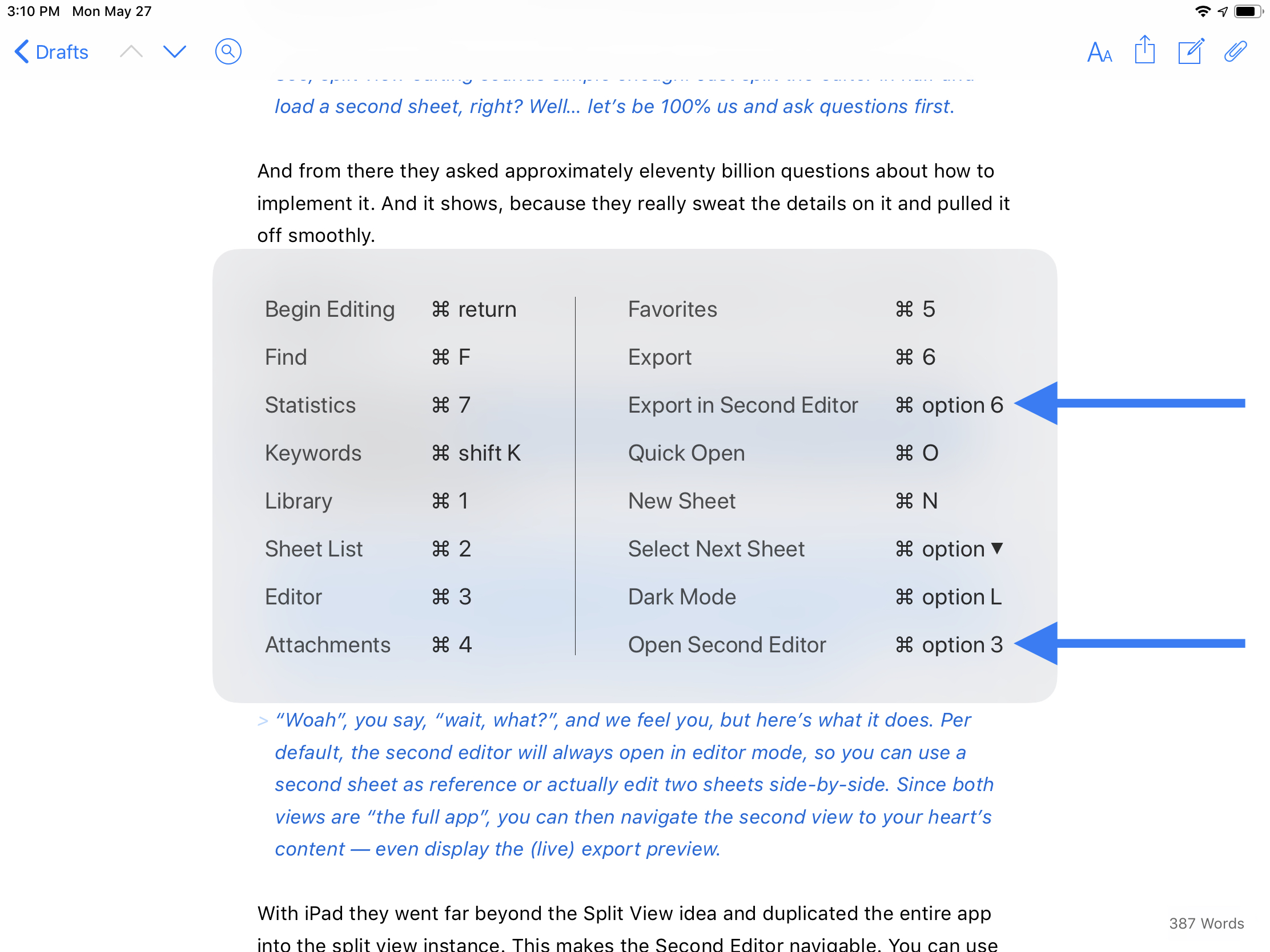
There are four different ways to open the Second Editor, covered in the gallery below.

And finally, the split view instance is adjustable. It defaults to a 50/50 split, but can be adjusted to a 70/30 split. You can tap and hold the drag handle to bring up more options, including a sneaky way to swap the views around or to dismiss one side. You can also dismiss a view by just dragging the drag handle to the edge.

Tapping and holding on the grab handle brings up some neat options, such as a way to swap the editors.

Tapping and holding on the grab handle brings up some neat options, such as a way to swap the editors.

I hope what Ulysses has made possible with their take on in-app split view is a foreshadowing of what Apple may someday do to enhance Split View. Safari has been able to open an pseudo-instance in Split View for a while now, but it cannot be resized or swapped. Ulysses has created a better, more powerful Split View within an app than Apple has done with Safari, and it is now the gold standard to reach for.

Safari’s rudimentary in-app Split View.

Safari’s rudimentary in-app Split View.

If you write regularly for any reason, I highly recommend Ulysses. It is worth every penny of its subscription that enables the Mac, iPhone, and iPad apps. They even offer a discount to students. If anything, check out the 14-day free trial.

I am overjoyed to have this feature on iPad. Even though I love my Mac, my iPad is where my writing juices really flow.

Twitterrific for macOS: A Phoenix from the Ashes

For me, Twitterrific has always been synonymous with using Twitter. I used it first on the Mac in March 2008. I even downloaded the app first, then signed up for Twitter to use it! And Twitterrific was the first app I installed from the App Store on iOS when it launched in July 2008. I tried a couple other clients when they came around, namely Tweetie and Tweetbot, but Twitterrific’s unified timeline always brought me back to the nest.

For the past several years, the Mac version has fallen by the wayside, and I got used to only using Twitterrific on iOS. Then, earlier this year, the Iconfactory set up a Kickstarter to resurrect Twitterrific for Mac as a fresh, modern client. I couldn’t sign up fast enough. The campaign was successful, and all summer I have been enjoying the weekly beta releases as the new Twitterrific took shape.

Twitterrific_macOS_logo.png

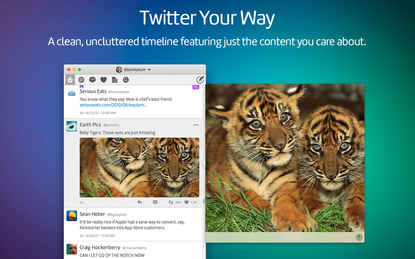
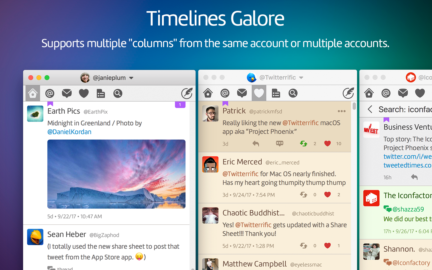
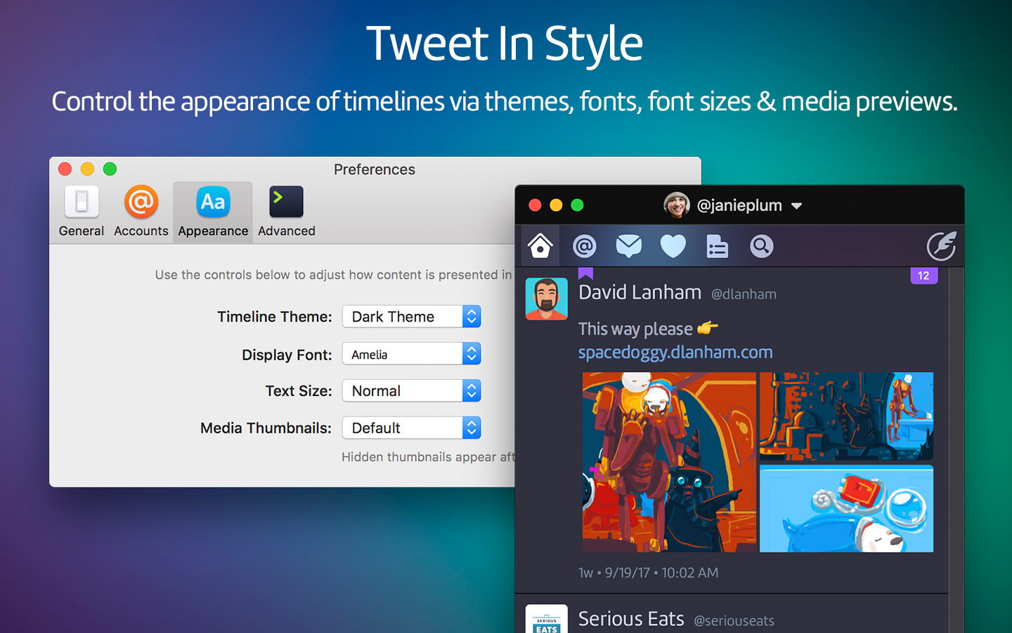
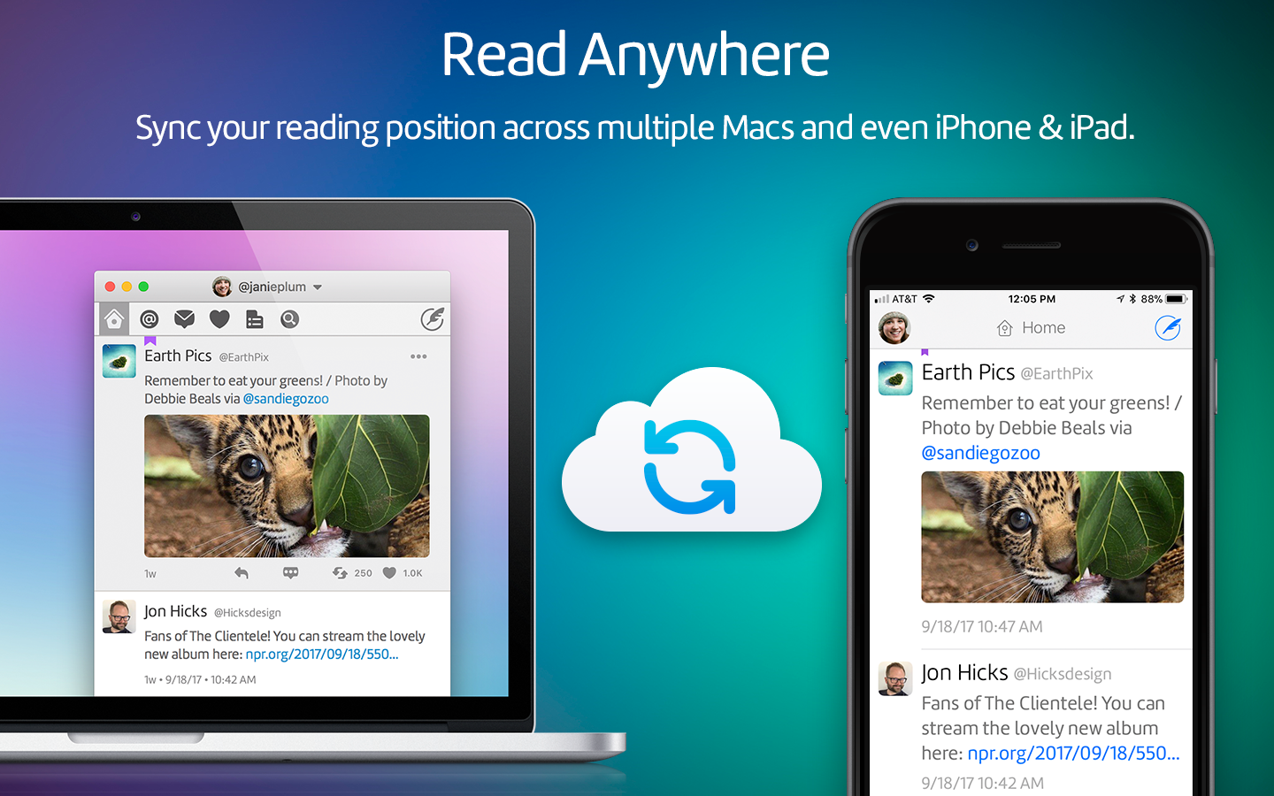
Today, Twitterrific 5.0 for macOS is available for everyone on the Mac App Store. It packs a ton of features into the new app, stays in sync with the iOS versions using iCloud, has fantastic keyboard and accessibility support, delightful sounds, and a few nostalgic Easter eggs from past incarnations.

Beyond any feature, though, is the care that the folks at the Iconfactory put into Twitterrific. It is clearly a labor of love, and the people behind it are genuinely fantastic. I suggest you follow a few of them on Twitter, and say hi. The best part about the Apple community isn’t just the apps we use to change our life and work, it’s the people and friendships made along the way.

In a sea of one-off money-grab apps, there are a precious few with a human story behind them. Twitterrific is one of them. And that’s why it is well worth supporting the team by purchasing Twitterrific for macOS.

Twitterrific for macOS re-hatches with Project Phoenix

I’ve been using Twitter for nearly a decade now and Twitterrific for Mac was what first got me hooked on the service. Over 72,000 tweets later and I still use Twitterrific (on iOS) every day. It’s safe to say that this app is my most used app.

I loved Twitterrific on the Mac, and while I understand why it was put in the parking lot of development to focus on iOS, I have always missed it. And I know its creators at The Iconfactory have missed it as well.

That’s why I’m excited to see that they want to bring it back with Project Phoenix on Kickstarter.

If funded, The Iconfactory plans to have a minimal app ready around August 2017 with t he following features:

  • Unified home timeline
  • Multiple account support
  • Composing, replying, and quoting tweets
  • Muffles and mutes
  • Streaming
  • Themes
  • Delete and edit your own tweets
  • Sync timeline position with iOS
  • VoiceOver Accessibility
  • Keyboard control
  • Attaching images to tweets
  • Timeline search (text filter/find)
  • Open links to other tweets, profiles and media in your browser

If they reach the stretch goal, they’ll add these in a major version release:

  • Direct messaging
  • Read, create, delete saved searches
  • Read lists
  • Built-in Twitter search
  • Built-in quick media viewer (images, GIFs, videos)
  • Built-in conversation and threaded tweet viewer
  • Built-in viewer for user profiles
  • Alt-text attachment when tweeting images
  • Searching for and getting suggested users while composing

And finally, if they reach a victory lap goal, they’ll add:

  • Simple list management (create, edit, delete)
  • Manage drafts and sync them with iOS
  • Dock-less mode
  • Built-in profile editor so you can change your bio, avatar and more
  • Trends
  • Video upload
  • Geolocation

That would pretty much bring it to feature parity with the amazing iOS version of the app. I chipped in, and if you love using Twitter and want to support a team that truly cares for the platform, you should too.

Iconfactory's Spooky Sticker Packs

Halloween has always been a favorite festivity of mine. My parents would go all-out for Halloween parties for me and my friends when I was a kid. I loved dressing up, gathering up a horde of candy, and going to local science museum which transformed into a haunted house every year. Halloween carries a lot of traditions for me.

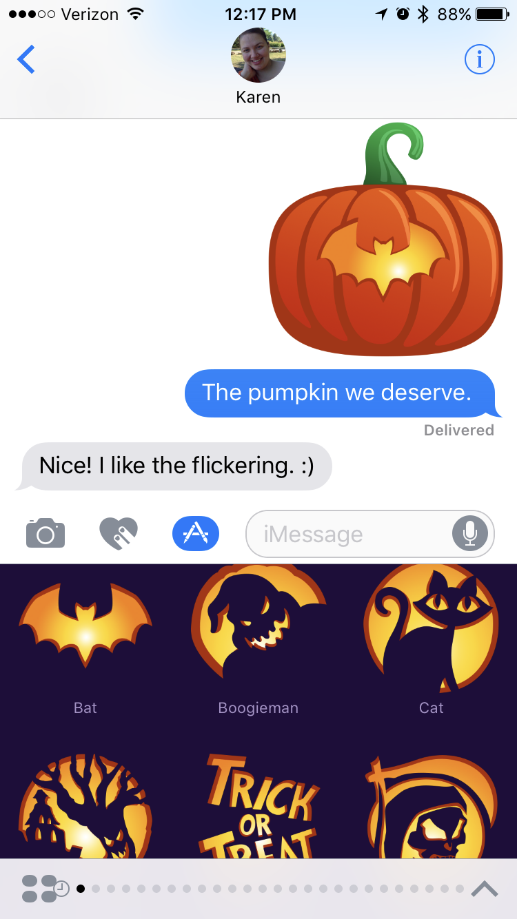
One tradition I have come to appreciate over the years is when The Iconfactory dresses up its website to celebrate the spookiest of holidays. This year the gang has gone further by dressing up iMessage with a trick-or-treat bucket’s worth of Spooky Sticker Packs.

Ravenswood, Macabre, & Spook On

First up are Ravenswood, Macabre, & Spook On. These packs feature ghastly portraits from Ravenswood Manor, familiar faces of this frightening holiday, and spooky stickers that are eerily realistic with their peeled edges.

All three packs are 99¢ when purchased separately, or $1.99 when purchased in a bundle. As of this writing, the bundle was still in review with iTunes.

BoneHeadz

Have you ever wondered what lies beneath the yellow skin of the smiley emojis? BoneHeadz goes beneath the surface to reveal the horrors and hilarity underneath! This pack makes no bones about it and can be yours for 99¢.

Hack-O-Lantern

As I mentioned before, I love traditions around this time of year and there isn’t a tradition more well known than carving a Jack-O-Lantern. It is something my family does every year and it is a fond memory of carving out a pumpkin with my mom.

I don’t always get to see mom around Halloween, and now we can have fun long distance with Hack-O-Lantern. It’s easy as pumpkin pie to do: pick a pumpkin and get hacking with various carvings and accessories. Scooping out the guts of an innocent pumpkin will run $1.99, which is cheaper than going to the pumpkin patch.

Lore

I think I’ve saved the best for last. One of my favorite podcasts the past year or so has been Lore. Each episode is thrilling and draws you in deep right before…the end, mwahaha! Seriously, though, Lore is amazing and you should listen to it. The Iconfactory and Lore have teamed up for hunt of the peculiar with a special Lore sticker pack. The artwork is amazing and fits right in with the podcast, so be sure to get this pack for $1.99…before it gets you.

Wallpapers

Each of these sticker packs comes with an wallpaper for your iPhone. To get the wallpaper, scroll down in the sticker pack and tap the pack’s name, then Save Wallpaper. These wallpapers are the perfect decorations for your home screen.

Vanishing Like the Invisible Man

It’s worth noting that most of these sticker packs are limited editions. When October is gone, they will no longer be available to purchase. That said, when you purchase them, you can use them year-round, as they’ll still be available on your device and for re-downloading.

BoneHeadz and Lore will be "sticking" around all year long.

The Iconfactory is making all sorts of amazing Stickers for iMessage, so be sure to grab these limited edition packs, and check out their other packs, as well.

¶ Ulysses 2.5

When I get the urge to write something I either reach for the closest instrument I can or, if available, the one that provides the most comfort. My iPhone is almost always with me and I'll write there if I must, though I much prefer my iPad when lounging in a recliner or my Mac if at a table or desk. Maybe I'm a bit overly particular, but I prefer my writing environment of choice to be as similar as possible across my three devices. This is one reason I love Day One for journaling and why I loved Byword for most anything else.

Yes, I said loved. Past tense.

There are a number of reasons why my beloved Byword fell out of favor with me. The frustrations were mainly with iOS. It started to feel buggy, and sync often bogged down the app, or ended with conflicted copies of files. In short, it became unreliable.

Now, I don't mean to disparage Byword. It will always hold a special place for me. But sentiment isn't something that should keep a tool around of it is no longer working well. It is ultimately only a tool.

Enter Ulysses. I bought Ulysses for Mac some time ago and experimented with it a bit, but I never committed as the story on iOS was only for iPad, and I often start my ideas on iPhone. It felt like an incomplete tool for my writing process.

Of course, hints and rumors have circulated for a while that The Soulmen, the makers of Ulysses, were working on an iPhone version. When they announced a beta, I quickly signed up, and, thankfully, was quickly accepted.

To put it briefly, Ulysses has captured my heart and the words pouring from it.

The Experience

The best apps are the ones that offer an experience. They have a story to tell when you use them, and that story is expressed consistently on each device. Ulysses is such an app. It aims to encourage writing. It has all the tools one could want whether you are jotting a note or penning the next great novel.

Ulysses is powerful when it comes to organizing your writing. First up is the Library, where you create groups, sub-groups, add icons to groups for context, and more. The Library is as sparse or detailed as you want it to be. I use several overarching groups to separate writing for this site, work, and a few other things. Under each of those I typically have some sub-groups for additional context, such as Drafts and Published in my group for Full City Press.

Once you delve into a group you have the Sheet List. Think of Sheets as separate documents. Like a sheet of paper, it is a blank canvas. It doesn't need to have a title or a file name. It just needs words.

Once you create or select a sheet you're in the Editor. This is where the magic happens, and the true joy of writing with Ulysses is found. The Editor is clean, putting your words first. But it also places every tool you'd want within reach, kind of like Batman's utility belt. You can add keywords, set a writing goal, add a note, or even an image via the attachments sidebar. I make use of the writing goals to ensure I don't go overboard on words, and I love using notes to drop links I want to reference without mucking up my main text. I could see a novelist keeping notes about a scene or characters there, as well.

The best part is Ulysses is familiar whether you use it on a Mac, an iPad, an iPhone, or any combination of the three. Every tool you use on one device is found on another, in a sensible place for the size of screen being used.

Write. Anything. Anywhere.

I love the Ulysses’ slogan of Write. Anything. Anywhere. For the 2.5 release The Soulmen focused on the anywhere aspect of it. Bringing Ulysses to the iPhone is easily the capstone feature of this release. As I mentioned earlier, most of my writing starts on my iPhone while I am out and about. An idea hits me and I quickly jot it down, usually with a working title and attaching some notes to capture my general stream of thought. If the occasion permits, I may even tap out the first paragraph or two right there on my iPhone.

Ulysses, by default, leverages Markdown for styling text, which I have long held is the markup language every writer should learn and use. The various symbols you use for Markdown are easily accessible on a hardware keyboard, but can be a bit of a chore when using the on-screen keyboard on iOS. Ulysses again keeps the tools you need close by with the Shortcut Buttons that reside with the iOS keyboard.

Shortcuts are separated into three categories:

  1. Blocks: Headings, Lists, Quotes, Comments, and the like.
  2. Inline styling: Strong emphasis, regular emphasis, links, and more.
  3. Special characters: All the special characters you could shake a stick at.

Ulysses keeps all of these a single tap away while writing, instead of having to toggle the keyboard to symbols and maybe tap and hold on a key to reveal further options, as one would normally need to do things. These are located right in the QuickType Bar on the standard iPad keyboard, and are elegantly placed just above the keyboard on iPhone.

It is astounding how much attention to detail there is to keeping you focused on writing and not worrying about where things are at. Ulysses simply steps out of your way when writing while keeping any tools you may need within reach. To make another superhero reference, Ulysses is the Jarvis to your Tony Stark.

Keeping It All Together

Ulysses can be the one-stop shop for all your writing if you want it to be. It keeps everything organized. And when you use it on more than one device it also keeps everything in sync. Ulysses does this all through iCloud, and requires zero setup. It really just works.

Now, iCloud sometimes gets dirty looks when it comes to sync. Those aren't unwarranted as iCloud has definitely had quirks in the past. That said, I can't say I have had any trouble with iCloud sync in Ulysses. It has indicators in the Sheet List to show whether a particular sheet is uploading or downloading, and everything has always come across on all my devices. I don't even think about it. Ulysses has proven trustworthy that when I close it on one device, my work is there when I open it on another device.

Get to Writing

You don't need a fancy text editor to write. You can use paper, you can use TextEdit, Pages, or any number of tools. Ulysses is not needed for you to write or to write well. I don't think The Soulmen would disagree with that.

That said, when you set out to accomplish something, the caliber of the tool you use matters. There's a tremendous difference between using a generic tool and a precision instrument. Ulysses is the latter. It is designed to make a difference in your writing by taking care of all the things that typically steal away your attention while trying to focus on your writing. While it cannot create focus for you — that part is up to you — it does not create distraction.

Ulysses is the tool I whole-heartedly recommend to serious writers. Whether you write poetry, short stories, reviews, quips, thought pieces, or novels, Ulysses can handle it.

Write. Anything. Anywhere.


Ulysses is available on the iOS App Store as a Universal app for iPad and iPhone for $19.99. The Soulmen told me that price will be going up soon, so now is a great time to buy it. The Mac version of Ulysses is available on the Mac App Store for $44.99.

These apps are worth every penny, and I applaud The Soulmen for pricing them to be sustainable so Ulysses can continue to be the best writing tool for ages to come.

Pedometer++ 2.3

Today Underscore David Smith released an update to Pedometer++ that I've been waiting a while for. Thankfully, I've been beta testing it for a while.

Version 2.3 is entirely focused around building a rich and robust integration between the Apple Watch and iPhone. Letting you track your steps and reach your step goal in a much more complete way. The update focuses around 3 main features: data sync, complications and a workout mode.

David has created a clever system that intelligently merges step count data between the Apple Watch and iPhone based on which device is giving the best data in a given moment. This is in contrast to how Apple does it, where the Health app goes by device priority, falling back to the second device in a list only if the first is unavailable.

In my testing, David's approach seems to paint a terrifically accurate picture of overall step data in a day.

The watch face complications can be nice, but I find I prefer other complications and still don't mind swiping up the app's Glance to get a peek at my progress.

Finally, Pedometer++ adds a workout mode as an alternative to the Watch's included Workout app. It works well, and the only thing I'd like to see added is a mileage goal, as I use that in the Workout app to receive a tap at the halfway point, so I know when I should turn around and head home.

Pedometer++ is free on the App Store and is ad-supported, but David includes a tip jar with varying price points in the settings to remove the ads. Any tip amount will remove the ads. I suggest going for the Amazing tip, because the app is just that good.

Twitterrific 5.12

The past year has seen The Iconfactory really take twitterrific to the next level, building out the feature set and continually refining the overall experience. Today's release of Twitterrific 5.12 is no exception.

Twitterrific now adopts Twitter's new Quote Tweet feature, and it is really great. I've been using a lot while testing this new version these past weeks. Simply tap & hold on the regular Retweet button to compose a quoted tweet.

For anyone who has a tough time reaching the top navigation, you can now optionally move the navigation to the bottom of the screen. Doing so awards you an extra customizable navigation tab. This is honestly quite nice for the iPhone 6, and I imagine even more so for the iPhone 6 Plus.

In-app notifications are less terse, color coded for tweet type, and actionable. Tapping one will open the tweet it references.

Even Twitterrific for Apple Watch saw some speed improvements, and the ability to use Emoji in replies and a list of canned tweets to use, much like you can have in iMessage. You can configure those in the Apple Watch app on the iPhone.

Twitterrific continues to be my Twitter app of choice, and I love that The Iconfactory is making so many quality improvements to it, and I am boggled at how quickly they have been iterating this past year.

You can grab the terrific new update to Twitterrific on the App Store. Be sure to grab the Premium features via in-app purchase, so The Iconfactory can continue to make Twitterrifc the best way to experience Twitter.