¶ Ulysses 16 Brings a Second Helping of Editor Goodness
/Back in March my favorite writing app, Ulysses, launched Split View editing on Mac. The idea is simple: Have the ability to open two texts, what Ulysses calls files, side-by-side within the same view. Of course, while the idea sounds simple, the execution was not, even on Mac. From the Ulysses 15 announcement:
See, split view editing sounds simple enough: Just split the editor in half and load a second sheet, right? Well… let’s be 100% us and ask questions first.
And from there they asked approximately eleventy billion questions about how to implement it. And it shows, because they really sweat the details on it and pulled it off smoothly.
It didn’t take me long to ask the Ulysses team how soon that could come to the iPad version.
A few weeks ago I received an invite to the Ulysses 16 beta to test Editor Split View on the iPad. And today the feature is available for everyone with Ulysses 16. Unsurprisingly, they put the same level of thought and detail into the iPad version of Split View Editing.
A couple of weeks ago, we introduced the option to show a second editor to our Mac app, and now we’re following suit on iPad. As a matter of fact, “Second Editor” is a bit of an understatement here, since we actually open a fully-fledged second instance of Ulysses. Yes, we show the whole app twice.
“Woah”, you say, “wait, what?”, and we feel you, but here’s what it does. Per default, the second editor will always open in editor mode, so you can use a second sheet as reference or actually edit two sheets side-by-side. Since both views are “the full app”, you can then navigate the second view to your heart’s content — even display the (live) export preview.
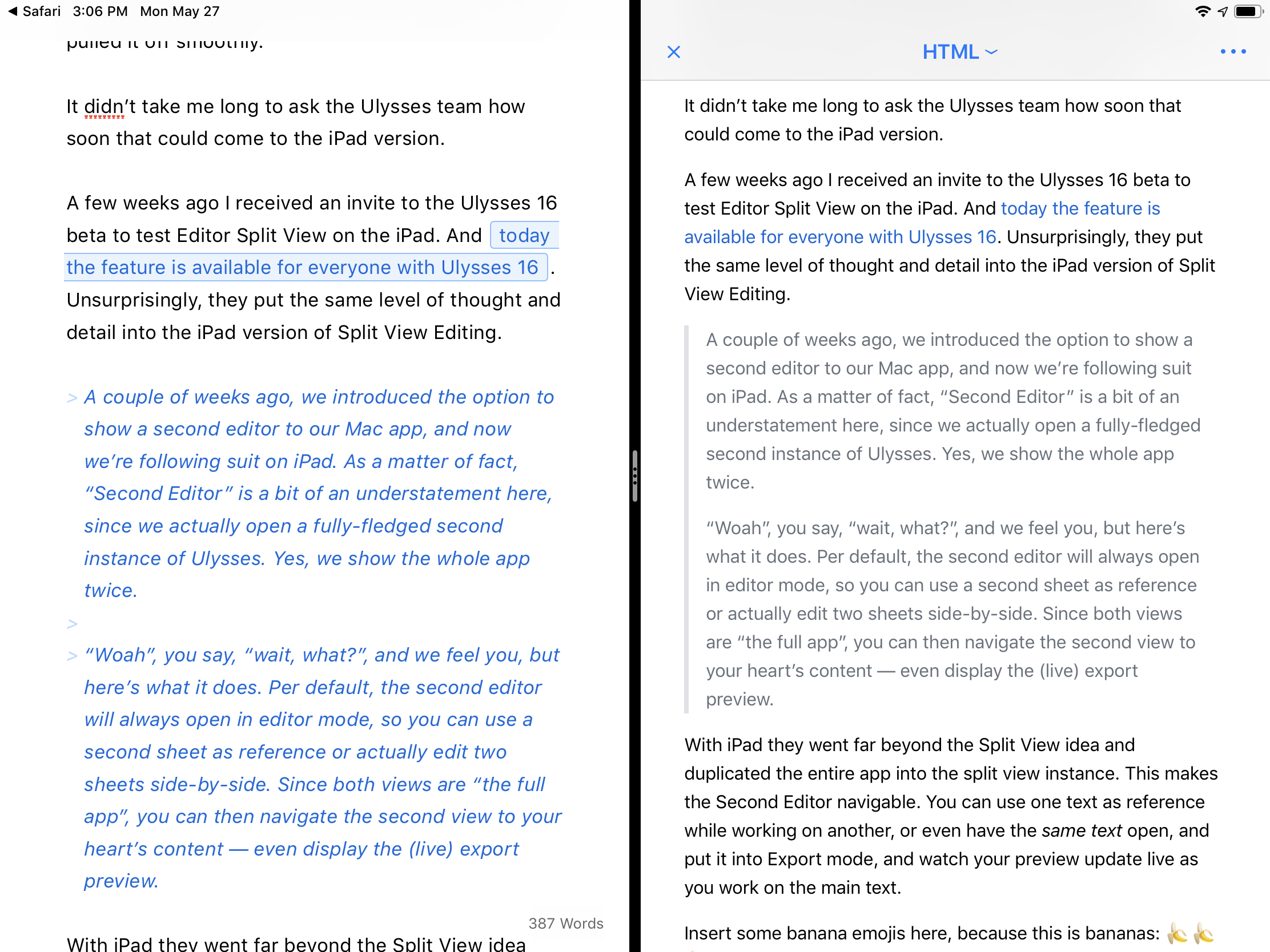
With iPad they went far beyond the Split View idea and duplicated the entire app into the split view instance. This makes the Second Editor navigable. You can use one text as reference while working on another, or even have the same text open, and put it into Export mode, and watch your preview update live as you work on the main text.
Split view of Ulysses 16 on iPad, with a live preview of the active text.
Insert some banana emojis here, because this is bananas: 🍌🍌🍌
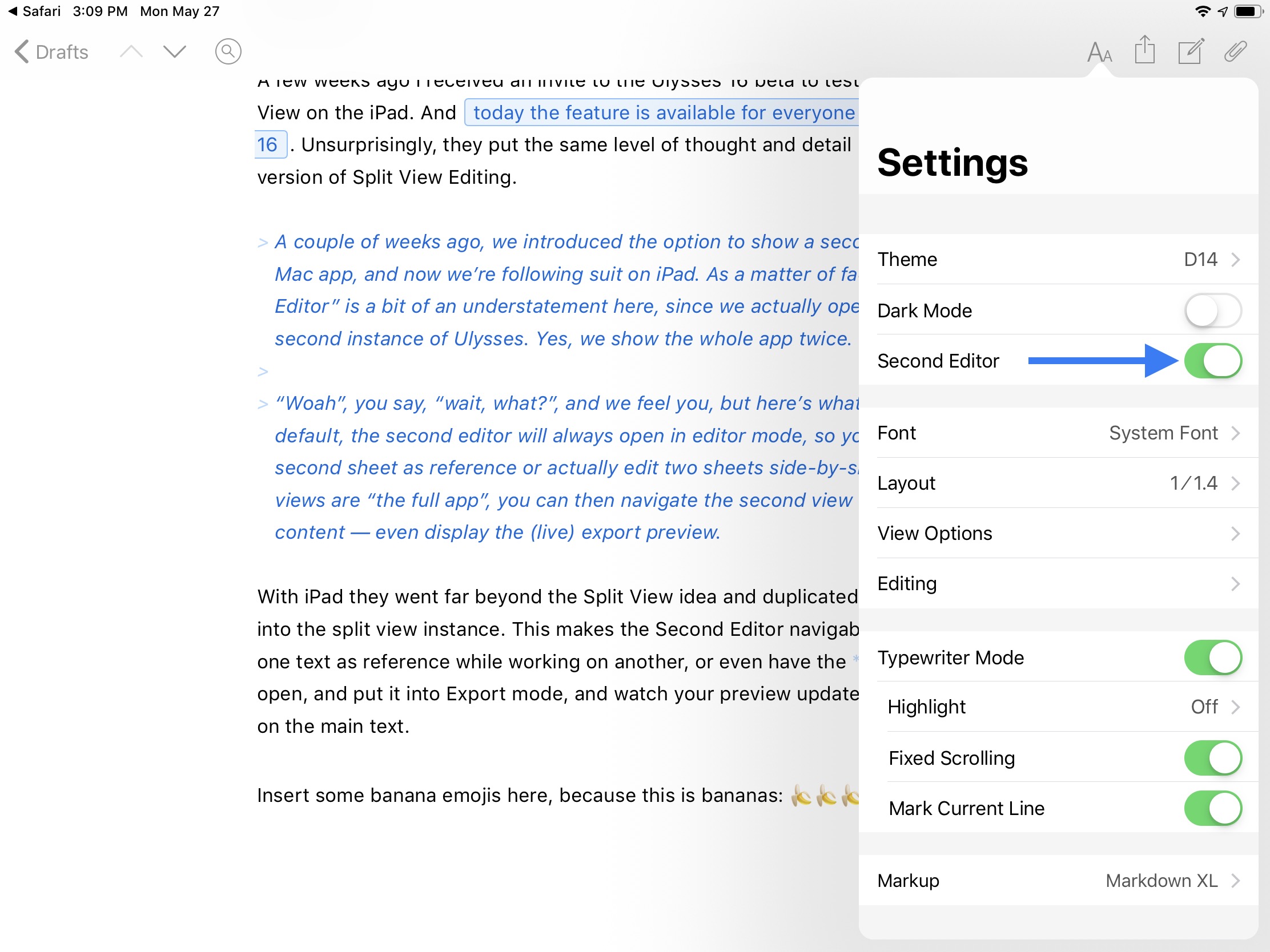
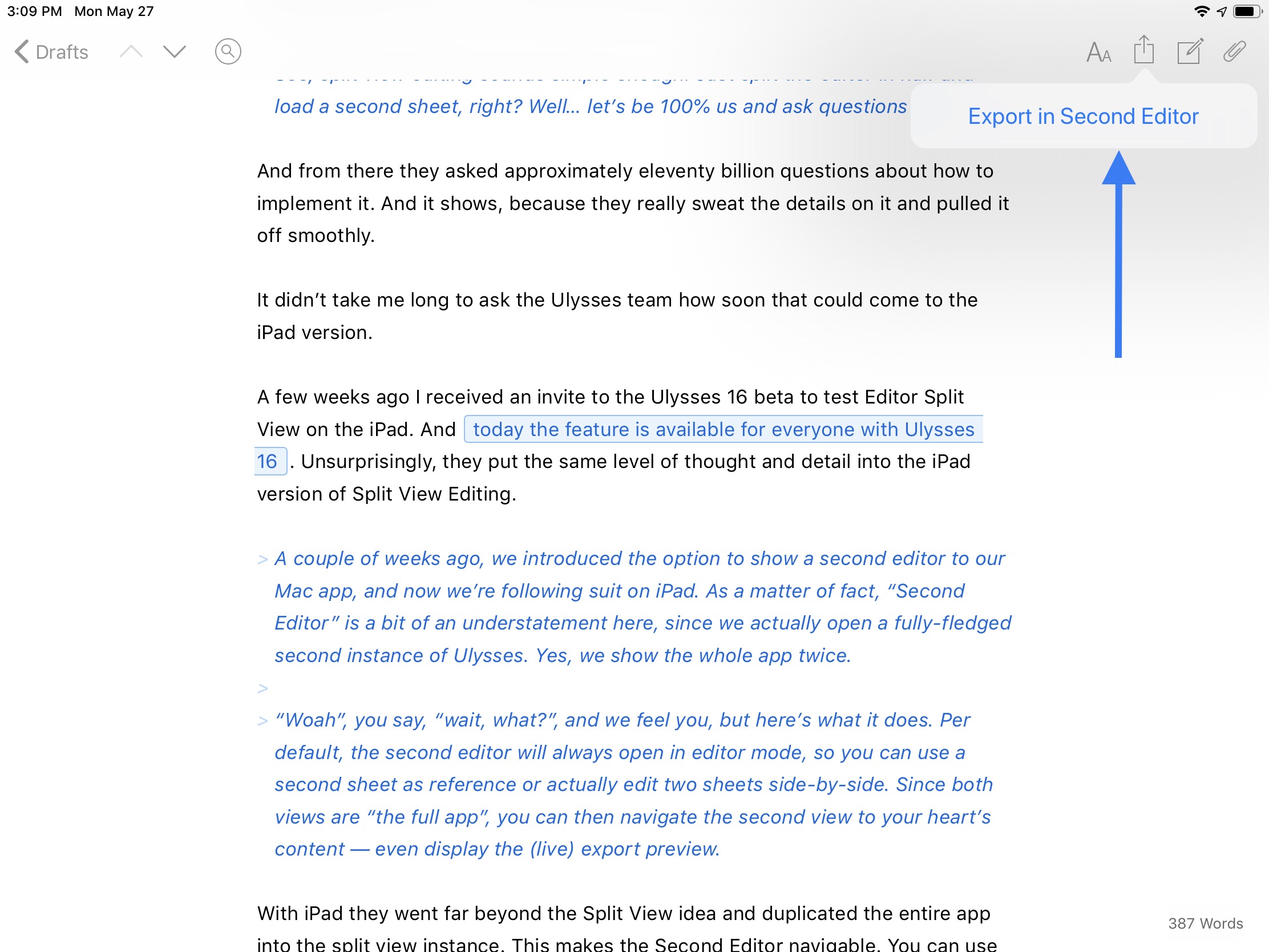
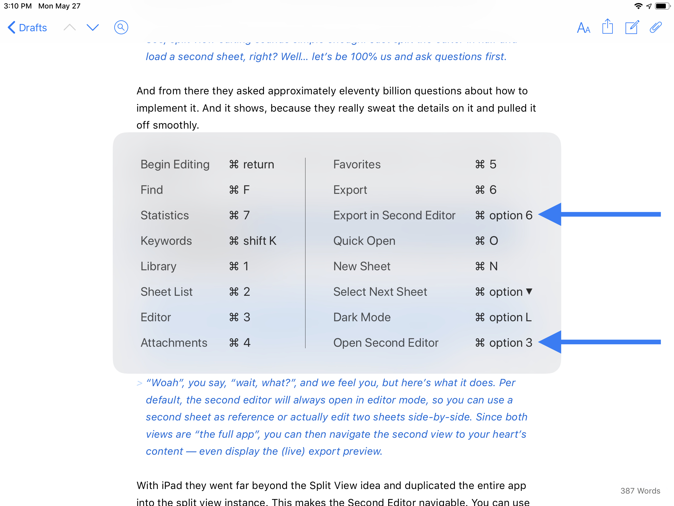
There are four different ways to open the Second Editor, covered in the gallery below.


And finally, the split view instance is adjustable. It defaults to a 50/50 split, but can be adjusted to a 70/30 split. You can tap and hold the drag handle to bring up more options, including a sneaky way to swap the views around or to dismiss one side. You can also dismiss a view by just dragging the drag handle to the edge.
Tapping and holding on the grab handle brings up some neat options, such as a way to swap the editors.
I hope what Ulysses has made possible with their take on in-app split view is a foreshadowing of what Apple may someday do to enhance Split View. Safari has been able to open an pseudo-instance in Split View for a while now, but it cannot be resized or swapped. Ulysses has created a better, more powerful Split View within an app than Apple has done with Safari, and it is now the gold standard to reach for.
Safari’s rudimentary in-app Split View.
If you write regularly for any reason, I highly recommend Ulysses. It is worth every penny of its subscription that enables the Mac, iPhone, and iPad apps. They even offer a discount to students. If anything, check out the 14-day free trial.
I am overjoyed to have this feature on iPad. Even though I love my Mac, my iPad is where my writing juices really flow.


