¶ Twitterrific 5 for iOS | Review
/I love Twitter. Most of my friends over the past few years, both local and afar, started as acquaintances on Twitter. For the years that I have been on Twitter there is one app that I have used primarily to interact with the service — Twitterrific.
Twitterrific has had a mixed past. It started as simple as Twitter itself, and contributed some features back to Twitter that we all take for granted now. While Twitterrific’s roots are on the Mac, it is the iPhone, and later the iPad, where its story really takes flight.
A Brief Overview of the Past
Twitterrific for iOS was my first app downloaded from the App Store as soon as I had purchased my iPhone 3G on launch day in July 2008. The initial iOS app was a basic way to read, tweet, and reply, just like its big brother on the Mac. And it was fantastic in its simplicity.
I have always admired The Iconfactory for their attention to simplicity.
That is why Twitterrific 2 was a little surprising. It packed in just about every feature that could be thought of but the kitchen sink. However, it suffered from feature creep and interface bloat. And The Iconfactory knew it.
When the iPad came out, The Iconfactory was again first to have an app out for the new device. They took the opportunity afforded to them by the short time to develop the app to strip Twitterrific back to basics. Where version 2 had feature overflow, Twitterrific for iPad went back to the bare minimum.
Then Twitterrific 3 (and 4, since 4 was really an evolution of 3) came to the iPhone, actually being an update to the iPad app. It had the same feature set as the iPad app did, and cautiously returned features as needed. However, Twitterrific remained very bare bones compared to other apps, something I enjoyed. As I alluded to earlier, I am a fan of simplicity.
That is not to say I didn’t have some qualms with Twitterrific 3 & 4. It always felt a step behind other clients, and it had really started to show in recent months.
Twitterrific 5
Today we have Twitterrific 5. It is not only an all-new direction for The Iconfactory and Twitterrific, but it is a new direction for the potential of an iOS app.
Twitterrific 5 feels like the intersection of all the great interface aspects of iOS, Palm’s WebOS, and Microsoft’s Windows Phone.
Twitterrific 5 captures the smoothness and fluidity of iOS, a look and feel reminiscent of Windows Phone, and the “sidebar”, browser, Tweet composer, and image popovers pay homage to WebOS’ cards.
The First Run Experience
When you launch Twitterrific 5 for the first time, it will ask you if it can access your Twitter accounts in iOS’ settings. When you allow it to, it will show the avatars of all the accounts you have signed in to iOS. Tap each one you want to add, and Twitterrific handles the rest.
In the past, and in other clients, you would have to be shown an ugly Twitter web form to sign in with manually. Somehow The Iconfactory has cooked up some secret sauce that will take care of business for you.
The Timeline
Twitterrific’s timeline is cleaner than ever. Controls for reply, retweet, favorite, and an ellipses for more items appears on a tap of a tweet. Delightfully, gestures are also integrated. Swipe a tweet from the left to right to reply, and from right to left to see a conversation.
The timeline has a setting to be unified, showing all replies and direct messages in the main timeline. This is Twitterrific’s hallmark since the beginning, and I am glad to see it still there.
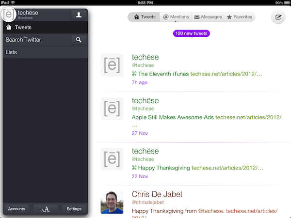
Along the top there is a circle with your profile picture on the left, a capsule navigation for the main timeline, replies & mentions, and direct messages. On the right is the Compose button.
Twitterrific 5 now supports proper gap detection in the timeline, signified by a tiny capsule with an ellipses smack in the middle of the horizontal rule that separates tweets.
That separator also glows purple to serve as the last read point when syncing the timeline either via iCloud or Tweet Marker.
To refresh the timeline, Twitterrific 5 now uses Pull to Refresh. They rolled their own custom pull to refresh and it is adorable. Look below.
I mentioned the unified timeline earlier. In the past the entire cell that contains the tweet would be color coded to show what kind of tweet you were seeing. Green for your own tweets, orange for mentions, and blue for direct messages. In Twitterrific 5 the cell is not colored, but rather the text itself. There are even a couple shades of orange and blue, the first to show whether a mention is just a mention or a reply, and the latter to show whether a direct message is sent or received.
Filtering by direct messages used to be a bit of a chore, because there was not a way to thread the conversation. Now, simply swipe a direct message toward the left and the conversation will thread, just like mentions. This is a huge improvement.
The Sidebar Card, or As I Like to Call It, the Sidecard
Tapping the circle with your profile picture in it will bring up what I am calling the Sidecard. It is pretty much the Sidebar of old, but it literally looks like a floating card. From here you can browse saved searches and lists. You can also tap the search button to search for tweets, or the newly added People. I have been wanting people search in Twitterrific for a long time.
At the bottom of the Sidecard, you will see Accounts, which brings up your various accounts, the format panel, and the Settings panel.
Protip: Tapping and holding the circle with your profile pic at any time will bring up the account switcher. I love this!
The format panel, which is shown by two A’s, sized differently, allows you to change the font, the font size, the spacing between lines, avatar size, dark theme and light theme, and brightness.
I appreciate the ability to choose which size the avatar is shown at, as you can reduce it to nothing. I go to an area of the Middle of Nowhere twice a year, and being able to cut out loading avatars at that time will save on bandwidth, battery, and time.
Settings lets you change the sync service, its behavior, notification sounds (which I love the new sounds), whether or not to have a unified timeline, and my favorite, automatically turning on the dark theme at night. It flips to dark at 7pm local time and back to light at 7am.
The Help button in the Settings panel explains the various gestures available. There’s good stuff there. Be sure to check it out.
Composing
Composing a tweet is rather straightforward. You tap out your tweet. If you don’t like it, tap the character count to bring up a delete circle, tap again to delete it all.
Tap the location glyph to add your location, or the camera to add a photo.
There is no longer a choice of photo services. It is just Twitter’s photo service. I’m okay with that.
However, it is somewhat misleading in that Twitterrific will let you take a video or choose one from the library, but it will not upload anywhere. The Iconfactory told me this is an oversight, and video options will be removed for now in a future update. They didn’t say, but I suspect they think Twitter will have its own video service. Honestly, it makes sense. If that happens, I am sure we will see the return of video uploading to Twitterrific.
Taking Flight
In the week I have had Twitterrific 5, I am enamored with the new direction The Iconfactory has taken their flagship app. It is clean, light, and fun. Delightful and adorable are other adjectives I’ve used so far.
Everything loads fast, looks fantastic, and the gestures have ruined me.
Twitterrific has been and still is my favorite Twitter app. Of course, there is room for improvement, but there always is. The Iconfactory told me streaming is on the roadmap, as well as a Mac counterpart (I can’t even look at the Mac app anymore, that’s how good this is).
Twitterrific 5 is available now (or will be shortly) on iTunes for an introductory price of $2.99. The regular price will be $5.99.
Twitterrific 5 doesn’t have all the bells & whistles. But I do think it has what most people will want out of a Twitter client. Just enough power to do more than before, but not overwhelming where many features go unused.
If you appreciate fantastic design, speed, and overall delight, Twitterrific 5 is for you.


