One of my biggest pet peeves is when video on a phone is shot in portrait. This app aims to make that obsolete.
If there is one thing I'd love to see put into the iPhone's and iPad's standard camera app's video mode, it's this.
One of my biggest pet peeves is when video on a phone is shot in portrait. This app aims to make that obsolete.
If there is one thing I'd love to see put into the iPhone's and iPad's standard camera app's video mode, it's this.
I love Day One, and this new Publish tool that is coming soon to the iOS app looks awesome. It's rare that I want to share something that I have written in Day One, but for the handful of times I have wanted to do just that, I had wished there was something elegant, beautiful, and easy to do so.
I can't wait for this to go live.
My favorite recipe app for the iPhone and iPad, Paprika, got a huge update the other day, bringing an iOS 7 design, autocomplete for when you are adding recipes, AirDrop support, and much more.
Best thing is Paprika is on sale for the rest of November. I have it for iPhone, iPad, & Mac, and their custom sync engine is top notch. If you have any interest in having a digital recipe box, Paprika is hands-down the app to get.
When I launched techese, I had been yearning to get away from the likes of WordPress. I had settled on Squarespace back then and have been with it ever since. I still wholeheartedly recommend Squarespace to folks who ask me what they should use to create a site.
One thing I have always had issue with was their iOS app. It wasn't all that good back on Squarespace 5, and since Squarespace 6, it has been a bag of hurt.
Thankfully, Squarespace has released two new apps to handle the crowded functions of the previous app.
Blog handles the writing and posting part while Metrics handles all your stats. Both apps are gorgeous and work really well. These were worth the wait. I'm really happy that Markdown is a first-class citizen in the Blog app.
I have two issues which will hopefully be taken care of in updates. The first is that the Blog app is missing the social sharing toggles of the web interface. If it had those, I could truly do everything I wanted with posting from iOS, which would rock.
The second issue is that Metrics doesn't have an iPad UI, so it scales up in the ugly 2x mode.
Beyond those two omissions, the apps work great, are fast, and chock full of the feature set you would expect. I hope Squarespace treats these apps as first class, iterating often, instead of letting them languish as the previous app did for so long.
"Underscore" David Smith reflects on the fifth anniversary of his first release on the App Store:
The road I’ve traveled has been long. I’ve had countless late nights, disappointments and trials balanced almost exactly with elations, successes and growth. I’ve met some of my best friends during this process. I don’t know what the next 5 years will hold for me but if it is anything like that last I can’t wait.
It's a fantastic read, and I greatly appreciate David's candidness about his journey. If you are at all involved with app development and are not subscribed to his weekly 15-minute podcast, you should change that.
Knock knock.
Who's there? Your iPhone, that's who. Why? To unlock your Mac.
We all hate having to deal with security because security and convenience just don't always seem to play well together. Thankfully there are many things out there to help them get along. Things like 1Password (which has a smashing new version out for Mac, and is also a major contributor to my lack of writing here last month). Then there is the new kid on the block, Touch ID.
I've used the demo of Touch ID on an iPhone 5s at the Apple Store. It's pretty rad. I can't wait to have it next Fall (I skip the 's' generations), and I was hoping it would come to the new iPads announced a couple weeks ago. And someday I hope it comes to a portable Mac so I can stop typing in a password to login.
But until then we'll have to use creativity, and that is where Knock comes in. Knock is a pair of apps, one for your Mac, one for your iPhone. Together, they create a super duper secure link over Bluetooth 4 Low Energy.
When you wake up your Mac, it checks to see if the iPhone is close by. If it is, a green circle pusles around your avatar on the standard OS X login screen. Then, your just give your iPhone a quick knock-knock, like you're knocking on someone's door. Magically, your Mac unlocks.
The Mac app runs as a menubar utility, easily tucked away by my good friend Bartender. The iOS app just needs to hang out on your iPhone, and doesn't even need to be running. During setup you give it special permission to monitor Bluetooth and CoreLocation so it can detect the Mac and its proximity.
The best part is your iPhone doesn't even need to be unlocked. You can leave it in your pocket and give it a gentle double-tap to unlock the Mac.
I'm really impressed by Knock, and it will be indispensible not only at coffee shops, but around the house, too, as my Mac tends to fall lock down while I step away to AeroPress some coffee.
Knock is a $3.99 iOS app and the Mac app is free on their website.
To say that I had felt a little underwhelmed at iOS 6's unveiling a little over a year ago would be an understatement. There had been rumors of a visual refresh, of changing the standard interface chrome from a steel blue to a grayish silver, and I was looking forward for some fresh paint on the pixels. But that didn't happen. The biggest interface change was tinting the status bar to somewhat match the chrome of the app running. And it looked pretty awful.
For the first time, iOS had felt stale to me.
This year, the rumors weren't of subtle changes. They were of big changes. Pave the land and start anew kind of changes.
With iOS 7, Apple did just that.
When you install iOS 7 on your device you'll quickly realize that there was not a single pixel of iOS itself that was left untouched. Everything and the kitchen sink went out the door, and every design started on a blank canvas. iOS 7 is unabashedly different. More on the design in a moment. There is a lot that did not change. iOS 7 still operates much in the same way as before. If you knew your way around iOS 6, you'll find your way in iOS 7 as very little interaction changed. And what did change is, in my opinion, for the better.
Examples? It used to be that you had to get to your first home screen and then swipe from left to right to do a Spotlight search. Now, from any home screen, just scroll down on the icon area a little and the search field appears. In Safari (and many others apps) you can swipe from the left or right edge of your device to go back or forward a page in the browser, or a level of hierarchy in an app. iOS 7 just feels a bit more elegant in function.
Where iOS 7 really shines in the simplification of its design. Apple has spent a great deal of effort on pushing two things in iOS 7's design: typography and color. Most things that were handled by and icon before are now a simple and straightforward text label. The icons that remain have been redesigned, thinned out, and simplified, yet overall familiar. Color is used everywhere. Icons and labels in Safari are blue, Calendar is red, Notes is yellow, Music is pink, and it goes on.
Design is not the only change in iOS 7, but it certainly is the most apparent. Other features and refinements have been made as well. The lock screen lends itself to being far less cluttered and showing more of the wallpaper image. Also, from the lock screen, you can now pull down the Notification Center, which has been given a new view called Today. The new Today view is really handy. It tells you plainly what is coming up next on your schedule and the weather. It shows a small portion of your calendar for the next few hours, and even tells you want is on your plate for the next day. In the case of an iPhone, it will tell you how long it would take you to drive to your next appointment, if you entered the address in Calendar. And when you are out and about, it will tell you how long it would take to drive home.
While Notification Center is at the top of the screen, the new Control Center is at the bottom. Slide up from the bottom of the screen to show quick toggles for Airplane Mode, Wi-Fi, Bluetooth, Do Not Disturb and Orientation Lock. You can adjust the brightness, audio that is playing, AirDrop and AirPlay, and then buttons to turn the LED flash on as a flashlight, and quid access to the Timer, Calculator, and Camera.
Control Center has become one of my favorite things about iOS 7. And like Notification Center, Control Center can be accessed from the home screen or from within any app.
One of my other favorite things of iOS 7 is the new parallax effect on the lock and home screens. Tilt your device around, and you will notice the icons and wallpaper subtly shift in opposition to each other, giving an effect that is not quite 3D, but decidedly not 2D. It's one of those little attentions to detail that makes iOS 7 feel so great.
Siri debuted with iOS 5 on the iPhone 4S as a beta feature, and remained that way ever since. With iOS 7 Siri loses the beta label, gets a much better voice (and a male voice), and seems overall more responsive and functional. Siri can even now turn certain components like Wi-Fi and Bluetooth on and off. I'm really enjoying the new Siri, and though I still feel it is a little behind Google Now, I think Siri is far less frustrating than in the past.
The last thing I really want to touch on is iTunes Radio. If you've ever used Pandora, you'll quickly understand iTunes Radio. I've been using the heck out of this, and it's really well done. It's impeccably good at finding music that fits with your tastes, and just keeps getting better the more you use it. This is one of those features that is easy to get lost in the shuffle of the new design, but it is truly one of the best features of iOS 7 if you love music.
iOS 7 takes a lot of risks with visual design, and in some areas it is spot on terrific, and other areas it has gone a little too far. I love the overall change, but I also realize that it is far from perfect. iOS 7 is an enormous undertaking, but what it is doing best is laying a brand new foundation to build upon for the future of iOS. As much as I adore iOS 7, I can't wait to see what happens in iOS 8, because it's a whole new ballgame. And even more than looking forward to iOS 8, I can't wait to see what developers do with their apps now that there is a blank canvas to work from.
Apple has made guides for iOS 7 available on iBooks, one for iPad, one for iPod touch, and (presumably) one for iPhone (I'll add the link when it is available).
When iOS 7 was announced, surely everyone's imaginations started to ponder what their favorite apps would do for redesigns to fit in. Out of all my apps, Twitterrific 5 looked like it was all set to just go ahead and blend right in.
I thought to myself, "They probably don't even need to do anything!"
Boy, am I glad the folks at The Iconfactory didn't think the same way.
I've been testing Twitterrific 5.5 for a couple weeks, and I'm blown away by the level of detail. The Iconfactory has taken Twitterrific's already delightful design and lovingly embraced all of iOS 7's strengths.
I have two favorite parts: the new color choices for Dark Mode look like they were pulled straight from Tron: Legacy, and the other is when you have an image or menu popover pulled up, it has the same parallax effect between the foreground and background as iOS 7's home screen. Of course, there are many more nice things.
I've been using Twitterrific as my main client since before iOS was even a thing. By far Twitterrific 5 has been the most iterated and well-thought-out edition yet. Twitterrific 5.5 is a free update for existing Twitterrific 5 owners, and requires iOS 7. This is hands down my favorite app and I hope it becomes yours, too.
Twitterrific 5.5 is out on the App Store and runs for $2.99 if you are new to the app.
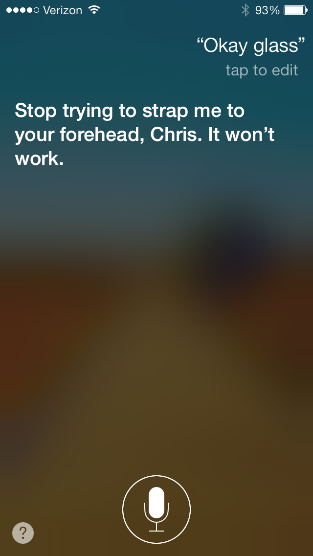
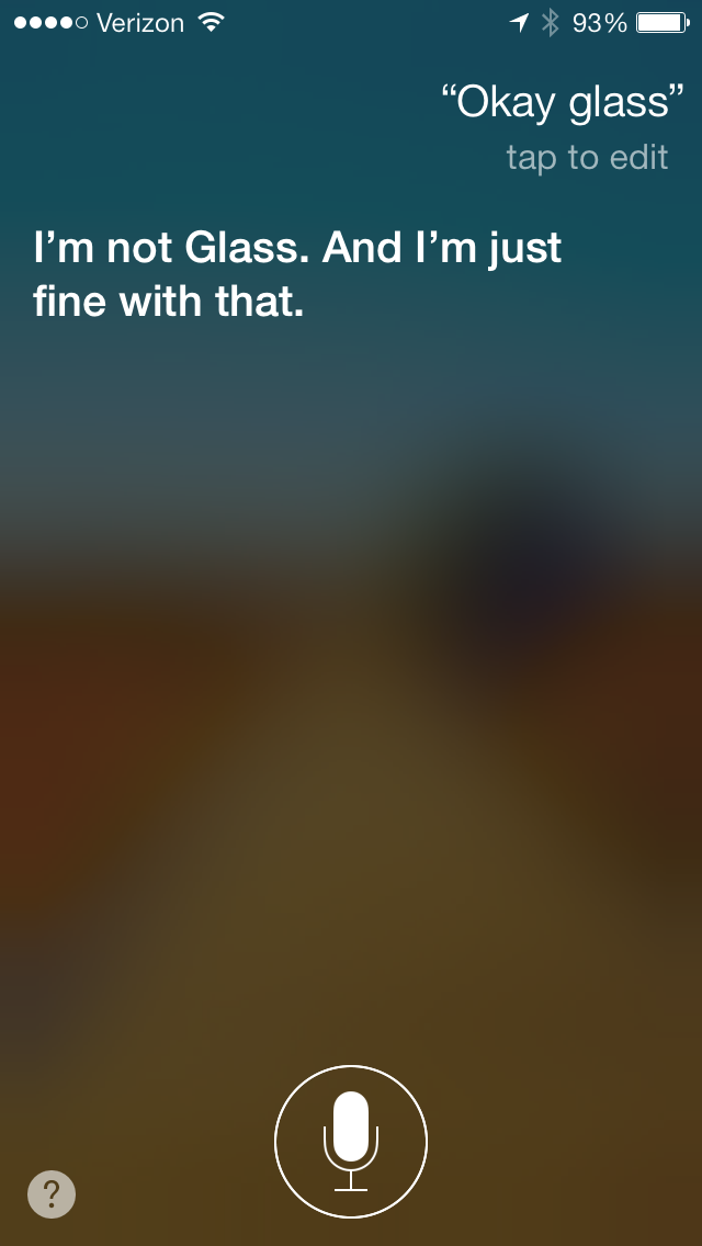
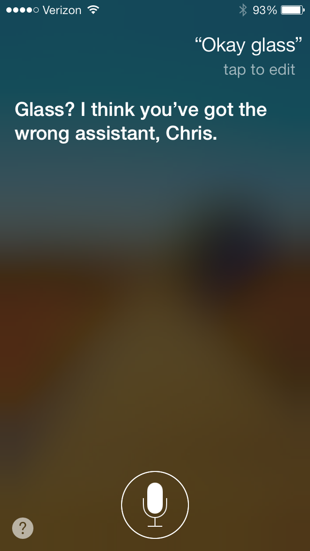
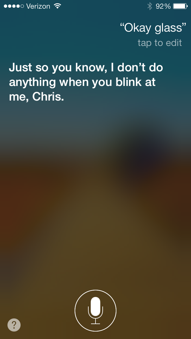
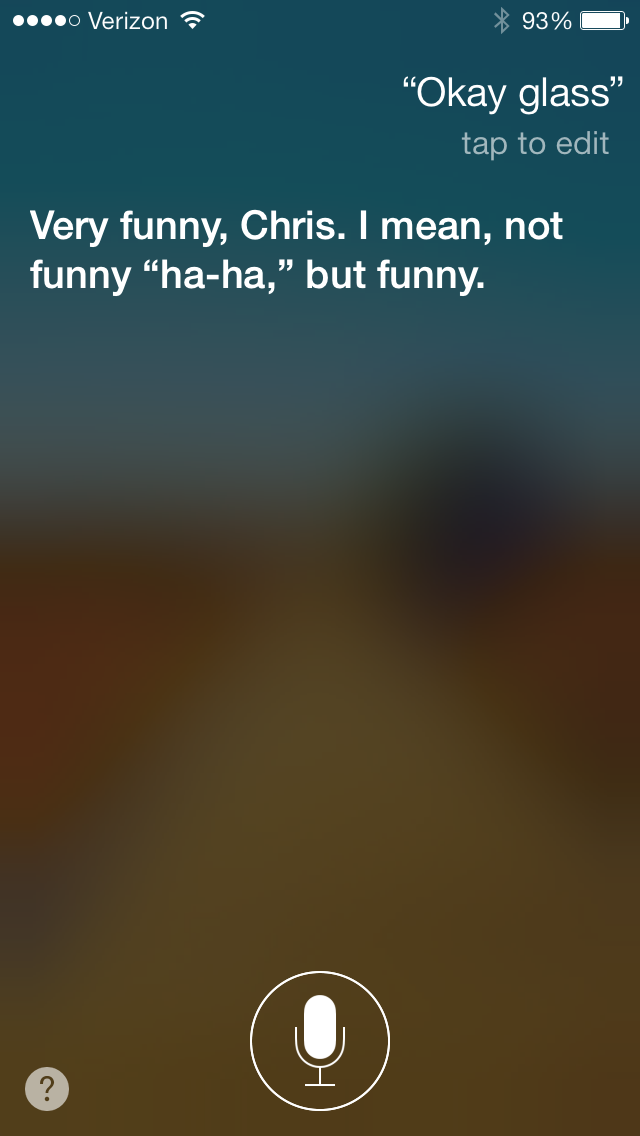
I've seen this a couple places around the web, and had to try it for myself. If you tell Siri "Okay Glass" it will talk some smack about Google Glass.
Back in the day when iPhone OS iOS was still fairly new, we received a fair amount of frequent updates. Not just bug fixes, but feature updates. There would be the March or April preview of a new version of iOS, a June or July release shortly after WWDC, one or two bug fix updates right away, and the big x.1 release with some new feature or significant improvement in the fall when the iPods were updated.
If my memory serves correctly, this trend continued through iOS 4. I remember iOS 4.1 brought HDR images to the Camera app on the iPhone 4. And of course iOS 4.2 brought AirPlay and unified the iPad and iPhone/iPod version numbering. And iOS 4.3 brought better AirPlay, Personal Hotspot on the iPhone 4, and iTunes Home Sharing.
One important thing to remember is we received these fairly frequent updates in a time before delta updates and over-the-air. These were big features and steady bug fix releases that required to to cable to your computer and download the entirety of iOS all over again like a barbarian.
Then iOS 5 came out and brought those delta and over-the-air updates. I thought for sure we'd see even more frequent releases — at least for the bug fixes — now that they could easily be pushed to everyone and would take far less bandwidth.
I was wrong. More or less, the x.1 releases (5.1 and 6.1) were essentially bug fix releases with little to no new features. And we haven't been seeing x.2 releases.
It has seemed these past two years that Apple has done the one big iOS release, and goes a long way between even fixing bugs in it.
One thing I am hoping for in iOS 7, since it is such a drastic change, is that we'll see Apple quicken the pace of improving iOS. I don't want frequent updates and fixes and possibly a new feature here or there for the sake of frequency, but rather to keep Apple on its toes and in the game.
One big release per year may work fine, but keeping the improvements coming between the big releases helps to keep things feeling fresh. I can't imagine Apple implemented these delta and over-the-air updates to just download a gargantuan file once a year and then a couple things here or there in between. That whole system feels like it was made for keeping iOS fresh and at its best.
iOS 7 is a new beginning for just about every aspect of iOS. Refining the details through frequent updates is an old beginning that I hope becomes new again.