¶ Twenty-Thirteen

Happy New Year. I had planned to have some grand post about what is coming up for techēse this year, but I don’t have anything concrete planned. I have an updated design on Squarespace 6 (I’m currently on Squarespace 5) that I hope to launch soon, as long as a couple components on Squarespace’s end fall into place. The new design would include responsiveness for smaller screens, and a few other goodies.

More than anything, I am conscious that most posting has dropped off quite a bit. I’ve had a lot of changes in my life the past few months, and I am still settling into new roles and routines. More so, I have felt a lot like I have been repeating what others are already saying.

I feel like my voice is not my own, and in order to find it I need to write more. I’ve known this, but I have been afraid of it.

And then I read an article today by John Acuff that was a fricken kick in the pants.

So what now?

As we face 2013 down and our fifth year of this blog, what do we do going forward?

That’s the question I’ve been wrestling with for the last three months.

And I think the answer is we get messy again.

We let go of the sanitized ideas, the safe ideas, the easily digestible ideas.

And we open the gates and seize the day. (Newsies!)

Go read John’s entire post, because it’s awesome.

While my site has not become “big”, I have the same fears. I have enough readers to where I feel the compulsion to placate by not challenging any ideas. And that is why I have been another “me too” and I am tired of it.

So, I do not how things will progress this year. But I know I’ve lost my voice (or maybe never fully found it). I need my voice. And maybe in order to find it I need to let things get a little messy.

Merry Christmas

I hope you all have had a wonderfully merry Christmas. I have enjoyed a wonderful day with family, and it was great to witness the delight on my son’s face when he opened his presents.

As a bit of nerdy Christmas cheer, I leave you with this tweet I saw earlier today, which pretty much describes my life as the Family Geek.

P.S. Don’t forget to give the Gift of Geek.

1Password 4 for iOS

I am a little late in posting this, as I've been busy at my day job at AgileBits. A week and a half ago we released the much anticipated 1Password 4 for iOS.

It's really fantastic and we worked a long time on it. It is on sale for $7.99 until the end of 2012, and when 2013 arrives it will go to its normal price of $17.99. If you need a last minute gift for the nerd in your life, go get it on the App Store.

¶ Twitterrific 5 for iOS | Review

I love Twitter. Most of my friends over the past few years, both local and afar, started as acquaintances on Twitter. For the years that I have been on Twitter there is one app that I have used primarily to interact with the service — Twitterrific.

Twitterrific has had a mixed past. It started as simple as Twitter itself, and contributed some features back to Twitter that we all take for granted now. While Twitterrific’s roots are on the Mac, it is the iPhone, and later the iPad, where its story really takes flight.

A Brief Overview of the Past

Twitterrific for iOS was my first app downloaded from the App Store as soon as I had purchased my iPhone 3G on launch day in July 2008. The initial iOS app was a basic way to read, tweet, and reply, just like its big brother on the Mac. And it was fantastic in its simplicity.

I have always admired The Iconfactory for their attention to simplicity.

That is why Twitterrific 2 was a little surprising. It packed in just about every feature that could be thought of but the kitchen sink. However, it suffered from feature creep and interface bloat. And The Iconfactory knew it.

When the iPad came out, The Iconfactory was again first to have an app out for the new device. They took the opportunity afforded to them by the short time to develop the app to strip Twitterrific back to basics. Where version 2 had feature overflow, Twitterrific for iPad went back to the bare minimum.

Then Twitterrific 3 (and 4, since 4 was really an evolution of 3) came to the iPhone, actually being an update to the iPad app. It had the same feature set as the iPad app did, and cautiously returned features as needed. However, Twitterrific remained very bare bones compared to other apps, something I enjoyed. As I alluded to earlier, I am a fan of simplicity.

That is not to say I didn’t have some qualms with Twitterrific 3 & 4. It always felt a step behind other clients, and it had really started to show in recent months.

Twitterrific 5

Today we have Twitterrific 5. It is not only an all-new direction for The Iconfactory and Twitterrific, but it is a new direction for the potential of an iOS app.

Twitterrific 5 feels like the intersection of all the great interface aspects of iOS, Palm’s WebOS, and Microsoft’s Windows Phone.

Twitterrific 5 captures the smoothness and fluidity of iOS, a look and feel reminiscent of Windows Phone, and the “sidebar”, browser, Tweet composer, and image popovers pay homage to WebOS’ cards.

The First Run Experience

When you launch Twitterrific 5 for the first time, it will ask you if it can access your Twitter accounts in iOS’ settings. When you allow it to, it will show the avatars of all the accounts you have signed in to iOS. Tap each one you want to add, and Twitterrific handles the rest.

In the past, and in other clients, you would have to be shown an ugly Twitter web form to sign in with manually. Somehow The Iconfactory has cooked up some secret sauce that will take care of business for you.

The Timeline

Twitterrific’s timeline is cleaner than ever. Controls for reply, retweet, favorite, and an ellipses for more items appears on a tap of a tweet. Delightfully, gestures are also integrated. Swipe a tweet from the left to right to reply, and from right to left to see a conversation.

The timeline has a setting to be unified, showing all replies and direct messages in the main timeline. This is Twitterrific’s hallmark since the beginning, and I am glad to see it still there.

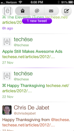
Along the top there is a circle with your profile picture on the left, a capsule navigation for the main timeline, replies & mentions, and direct messages. On the right is the Compose button.

Timeline
Timeline

Twitterrific 5 now supports proper gap detection in the timeline, signified by a tiny capsule with an ellipses smack in the middle of the horizontal rule that separates tweets.

That separator also glows purple to serve as the last read point when syncing the timeline either via iCloud or Tweet Marker.

To refresh the timeline, Twitterrific 5 now uses Pull to Refresh. They rolled their own custom pull to refresh and it is adorable. Look below.

Pull to Refresh
Pull to Refresh

I mentioned the unified timeline earlier. In the past the entire cell that contains the tweet would be color coded to show what kind of tweet you were seeing. Green for your own tweets, orange for mentions, and blue for direct messages. In Twitterrific 5 the cell is not colored, but rather the text itself. There are even a couple shades of orange and blue, the first to show whether a mention is just a mention or a reply, and the latter to show whether a direct message is sent or received.

Filtering by direct messages used to be a bit of a chore, because there was not a way to thread the conversation. Now, simply swipe a direct message toward the left and the conversation will thread, just like mentions. This is a huge improvement.

The Sidebar Card, or As I Like to Call It, the Sidecard

Sidecard
Sidecard

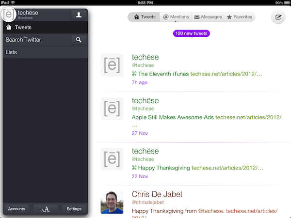
Tapping the circle with your profile picture in it will bring up what I am calling the Sidecard. It is pretty much the Sidebar of old, but it literally looks like a floating card. From here you can browse saved searches and lists. You can also tap the search button to search for tweets, or the newly added People. I have been wanting people search in Twitterrific for a long time.

At the bottom of the Sidecard, you will see Accounts, which brings up your various accounts, the format panel, and the Settings panel.

Protip: Tapping and holding the circle with your profile pic at any time will bring up the account switcher. I love this!

The format panel, which is shown by two A’s, sized differently, allows you to change the font, the font size, the spacing between lines, avatar size, dark theme and light theme, and brightness.

I appreciate the ability to choose which size the avatar is shown at, as you can reduce it to nothing. I go to an area of the Middle of Nowhere twice a year, and being able to cut out loading avatars at that time will save on bandwidth, battery, and time.

Settings lets you change the sync service, its behavior, notification sounds (which I love the new sounds), whether or not to have a unified timeline, and my favorite, automatically turning on the dark theme at night. It flips to dark at 7pm local time and back to light at 7am.

The Help button in the Settings panel explains the various gestures available. There’s good stuff there. Be sure to check it out.

Composing

Composing a tweet is rather straightforward. You tap out your tweet. If you don’t like it, tap the character count to bring up a delete circle, tap again to delete it all.

Tap the location glyph to add your location, or the camera to add a photo.

There is no longer a choice of photo services. It is just Twitter’s photo service. I’m okay with that.

However, it is somewhat misleading in that Twitterrific will let you take a video or choose one from the library, but it will not upload anywhere. The Iconfactory told me this is an oversight, and video options will be removed for now in a future update. They didn’t say, but I suspect they think Twitter will have its own video service. Honestly, it makes sense. If that happens, I am sure we will see the return of video uploading to Twitterrific.

Taking Flight

In the week I have had Twitterrific 5, I am enamored with the new direction The Iconfactory has taken their flagship app. It is clean, light, and fun. Delightful and adorable are other adjectives I’ve used so far.

Everything loads fast, looks fantastic, and the gestures have ruined me.

Twitterrific has been and still is my favorite Twitter app. Of course, there is room for improvement, but there always is. The Iconfactory told me streaming is on the roadmap, as well as a Mac counterpart (I can’t even look at the Mac app anymore, that’s how good this is).

Twitterrific 5 is available now (or will be shortly) on iTunes for an introductory price of $2.99. The regular price will be $5.99.

Twitterrific 5 doesn’t have all the bells & whistles. But I do think it has what most people will want out of a Twitter client. Just enough power to do more than before, but not overwhelming where many features go unused.

If you appreciate fantastic design, speed, and overall delight, Twitterrific 5 is for you.

¶ The Eleventh iTunes

I’ve been using iTunes for a long time. I remember using it when it debuted on Mac OS 9. I remember making the jump to purchasing my music on the iTunes Store when it arrived in 2003. To say I am invested in iTunes is an understatement.

Over the years Apple took that foundation of a music player and kept bolting on new features such as managing iPods, movies, TV shows, iPhones, apps, books, and all sorts of other things on top of the same basic design. iTunes has felt cluttered and stretched to the seams for years.

And for years I have been wanting Apple to do something drastic with iTunes. To trim the bloat — even through reorganization — and make something interesting and fun to use again.

Enter iTunes 11. The first major overhaul to how one uses iTunes that I remember. The sidebar that showed all your libraries, devices, the Store, and playlists is gone. Well, I should say it is gone by default — you can resurrect it in the View menu. If you are reaching for that menu right now, stop it. Give the new design a chance for a week or two. There is a reason the sidebar is gone.

In the past all those things in the sidebar held the same level of significance, even though they aren’t all of the same significance. It was a hodgepodge of where your priorities should be.

Now, whatever you are viewing at the moment is of the utmost significance. The bar along the top has a button on the left to switch the primary context of iTunes — Music, Movies, TV Shows, Podcasts, Books, Apps and Tones. The center of the bar further whittles down the view of each of those categories. Let’s focus on Music, since that is probably the most prominent.

Music

With Music locked and located for the context, the center of the bar displays Songs, Albums, Artists, Genres, Video (that’d be music videos), and Playlists. Songs gives you the old style list of all your music. Albums, however, is now the primary way to interact with music in iTunes.

Albums shows a grid of all your albums and their artwork. This view, at first blush, is not all that new. In iTunes past, you would double click and album and get a song list view of it. Now, a single click on an album cover has a new twist — Expanded view.

If you’ve ever used an app folder on iOS, or in Launchpad on the Mac, Expanded View will seem familiar. The screen splits open to show the content of the album. I also shows the album art a little bigger, and iTunes color matches the view to the colors of the album. I honestly really like Expanded view. It is both beautiful and functional. And when you don’t need it, it is simply out of the way.

Another great part of the Music context of iTunes is Playlist creation. You can use the Playlist view, or, from any other Music view, just start dragging a song or album and a panel slides out with Playlists ready, and you simply drop the music into the playlist. The Panel then scurries away, out of sight.

However, my favorite part of the Music context is Up Next. Start playing an album or playlist and all of it is added to Up Next. However, if you need to satisfy a quick ear worm, you can click on an arrow next to a song and tell it to play next. This jumps it to the top of the queue. When it’s done, you go back to your regularly scheduled programming.

One final great feature I want to mention is the new Mini Player. Activated by a small glyph in the upper right of the screen, the mini player is a great way to have iTunes tucked away into a corner of your screen. The Mini Player has been around for a very long time (maybe since iTunes first debuted?). Though for the first time it is truly useful. You can use search from the Mini Player and queue up more music into Up Next. You can manage Up Next. It shows music information but changes to player controls when you hover over it. The new Mini Player is a tiny powerhouse of musical awesome.

Context, Context, Context

I spent the majority of my thoughts on the Music context of iTunes. But much of what has become iTunes over the years is still there. I cannot escape the idea of context, though. iTunes 11 has taken a page out of iOS. With, say, an iPad, the device is whatever you are using at the moment. The use case of the entire device changes from the context you place on it from the app you are using.

While iTunes 11 doesn’t fully reach this ideal, it gets close. When you want Music, all you see if music. When you want to browse the Store, all you see is the store. When you want to manage an iOS device, that is all you see.

And as I mentioned with Playlist creation, where a panel slides out when you start dragging music — things are only present in the context of them being useful. This is why I am happy to see the obfuscation of the sidebar. I don’t need to see all that stuff when I don’t need to use any of it. Seeing my playlists does not matter when I am managing my iPhone.

A lot of people dislike that Apple is making much of their ecosystem more like iOS. Many nerds are afraid the Finder will someday disappear from OS X. Honestly, I find iOS to be a breath of fresh air. The file system is not something most people know how to deal with, and they often shouldn’t. It is okay to abstract complexity away. Apple has achieved much of this with iOS. They are slowly making inroads toward it with OS X. And now they are bringing the abstract of singular focus and context back to iTunes.

We’ve never been great multitaskers. Be honest. We are really great at switching our context focus quickly. Maybe instead of having anything and everything available at once begging for our attention, we could allow ourselves to slow down with a more singular focus in our computing habits. Singular focus abstracts complexity. And less complexity is more enjoyable.

More enjoyable is exactly what iTunes 11 is.

1Password 4 for iOS Sneak Peek

Disclaimer: I work for AgileBits, makers of 1Password.

The company I work for, AgileBits, gave iMore a sneak peek of 1Password 4 for iOS. Everything that I can probably say about the app at this stage is said in iMore’s article, so I encourage you to go check it out.

We’re all pretty excited to get this out to all of you. It really is an amazing improvement to our iOS app.

Clear for Mac

A recurring theme the past two years or so with Apple’s stance on the future of the Mac is to take the best of iOS and bring it back to the Mac. And in some ways, though fewer, the Mac brings something to iOS.

Inevitably, there are apps that start on iOS and come back to the Mac. One the most shining examples I have seen yet is Clear for Mac by Realmac Software.

Clear is a simple and stylish to-do list manager. The latest iPhone update brought iCloud support in preparation for the Mac. The brand new Mac version of Clear is truly a Mac app inspired by iOS, heavily taking advantage of multi-touch trackpads. Pinching, swiping, and scrolling are the key elements to navigating Clear interface, and it couldn’t be more fun with the nifty sounds accompanying the gesture-driven experience.

Keyboard ninjas will be happy, too, as everything you could do on the trackpad can also be accomplished by keyboard shortcuts.

If you are looking for a quick, easy, and simple to-do manager for iOS and Mac that syncs effortlessly and instantly, Clear is awesome.

You can get it for iPhone for $1.99 and get it for Mac at an introductory price of $6.99 (until Sunday, November 11). After the 11th, the price will increase to around $13.99, I think. I’d get it now.