Review: Griffin TuneFlex AUX HandsFree

I’ve been a longtime user and fan of Griffin Technology’s products. One area Griffin has always excelled in was integrating my iPod, well, now iPhone, into my car. Shortly after I bought my iPhone 3G a couple years ago, Griffin released the TuneFlex AUX SmartClick. The SmartClick had this super handy remote you could attach to your steering wheel to control playback. This was one of the most useful accessories I ever owned. You can read my glowing review from back in January 2009.

Sadly, when the iPhone 4 came out, the SmartClick’s model-specific adapters didn’t accommodate the new shape of the iPhone 4. So I’ve been patiently waiting for a revised TuneFlex.

A couple weeks ago, Griffin released the TuneFlex AUX HandsFree. The main features are an adjustable cradle that can accommodate the various shapes of iPod and iPhone models, even while the device is in a case, and a microphone that will allow you to talk on the phone handsfree. Hence the name.

I saw this pop up on Amazon for $32, which is quite the discount from the $49.99 MSRP, so I ordered it.

In seven years, this is the first time I am disappointed with a Griffin product. Sadly, the HandsFree is four steps backwards in design from the SmartClick. Sadly, I’ll be returning it for the reasons listed below.

  1. The new, adjustable cradle doesn’t apply enough tension to keep the iPhone 4 seated well on the Dock connector. The iPhone wobbles around a lot. With the Dock connector providing the only apparent point of stability, I’m afraid either the connector on the TuneFlex will snap, or worse, the port on the iPhone will be damaged.
  2. On both the SmarClick and Handsfree editions of the TuneFlex, the point at which the gooseneck meets the cradle swivels to the left and right. On the SmartClick, it had ratchet points to provide resistance in swiveling. The HandsFree has a completely smooth action. Too smooth. A modestly hard turn will definitely cause the swivel point to swing and, combined with the loose tension in the cradle, will likely send your iPhone or iPod flying across the cabin.
  3. There is no way to control playback anymore. I do much more listening with my iPhone than talking in the car. Having to fiddle with onscreen controls to skip forward a track or pause is more dangerous. The SmartClick had such an excellent solution to this. The HandsFree offers no solution.
  4. Audio on the SmartClick was line-out via the Dock connector. The HandsFree offers only audio out via the headphone jack, so you first have to adjust the device’s volume, then your stereo’s. What a distraction and a mess. Never mind the fact that if you forget to turn down the device’s volume before you plug in headphones you’ll have hurting ears.

I really wish I had better things to say about this product. It actually kind of hurts to lampoon a Griffin product since I have never had a bad experience from them.

It’s a shame they didn’t just release a $10 adapter for the iPhone 4 for SmartClick owners.

Tracking the Magic

Among updates to its line of Cinema Displays, iMacs, and Mac Pros earlier this week, Apple also introduced a new aluminum & glass clad input device — the Magic Trackpad

I just so happen to have picked one up, just to give you my impressions. If you’ve used any of Apple’s unibody MacBooks or MacBook Pros, you’d be familiar with the gorgeous glass multi-touch trackpad. The Magic Trackpad is essentially a larger version of that, powered by batteries and connected by bluetooth. The idea is that this brings all the current gestures currently available in OS X to desktop users.

Now, I’m a MacBook Pro user, so you may wonder why I’d even want this? Well, I use my MacBook Pro as a desktop replacement, and 90% of the time, it is on a Griffin Elevator on my desk, in order to bring the screen in line of my eyes. Hence, I also have been using Apple’s aluminum wireless keyboard and the Magic Mouse.

The Magic Mouse brought the ability to use two fingers to go back/forward a page in Safari, iPhoto, or other app with gesture support, whereas the built in trackpad on my MacBook Pro was capable of so much more, especially initiating Exposé, something I use often.

Needless to say, I loved, and do still love, the Magic Mouse, but its multi-touch support was limited at best.

Enter the Magic Trackpad into my life. Now there is no need to adjust my muscle memory for gestures on supported peripherals. They are the same whether I am using my MacBook Pro at my desk or in a coffee shop. To be honest, I have been craving this same functionality ever since I ran across this mockup on Flickr.

Now, a bigger question. Why would Apple even make this? Well, if you know anything at all about Apple, it is obvious that everything in their product line is there for a reason. Everything has a specific reason for being there. Regarding the Magic Mouse and now the Magic Trackpad, I look at it this way: The Magic Mouse was used to introduce many desktop mac users to multi-touch in OS X. It is essentially the “missing link” — a hybrid between the past and the future. The Magic Trackpad then unifies the portable and desktop lines in order to make all of the same gestures available to all Mac users. 

But to what end? Well, my guess is the next major version of the Mac OS — presumably Mac OS X 10.7 — will have a predominant focus on bringing multi-touch across most of the system. iMacs already ship with the wireless keyboard and Magic Mouse as the standard. Would it really be surprising to see that change to the wireless keyboard and the Magic Trackpad as the standard by the time 10.7 rolls around? 

Also, Apple is notorious for throwing out things that they feel are obsolete. Floppy disks, anyone? I believe Apple thinks that multi-touch is the input method for the future. That is really evident in the iPhone and iPad. However, traditional keyboard & mouse computers aren’t going to disappear overnight, but Apple could make a significant push towards moving millions of people to multi-touch by putting the mouse on the back burner, and including trackpads as the default for desktop computers.

Overall, I am very impressed with the Magic Trackpad. For me, it seamlessly unifies the mobile and desktop experience of a Mac. And I think it is a preparation of things to come in Mac OS X.

Twitterrific 3: Sharper, Leaner, & Universal

With many major iOS related launches, The Iconfactory is usually present with one of their flagship brands — Twitterrific. Back in July 2008, Twitterrific 1.0 was one of the first apps available on day one of the App Store; Twitterrific for iPad was there for the iPad’s launch; and Twitterrific 3 decided to tag along for the launch of iPhone 4 and the Retina display.

Now if you already have Twitterrific for iPhone, or Twitterrific Premium for iPhone, you can stop clicking “Check for updates” as those versions of the app no longer exist in the App Store. Instead, The Iconfactory elected to combine the new iPhone app with the existing iPad app to simplify development and avoid customer confusion.

This does mean for owners of Twitterrific Premium that this is a paid upgrade if you want the Premium features. I bought Twitterrific Premium 1.0 on day one of the App Store in 2008. When 2.0 arrived, I enjoyed a free update. Now, with 3.0, the universal iPad and iPhone app is free, supported with advertising, and a $4.99 in-app purchase will take away ads and unlock multiple accounts.

If you have an iPad and had previously bought the iPad’s in-app purchase, you simply have to update your iPad app, which now includes the universal iPhone interface, install it on your iPhone, and tap the Buy button for the in-app purchase, and as long as you are using the same iTunes Store account, it will unlock it for free.

Now, why not just stick with Twitterrific 2? Well, Twitter is turning off basic authentication for logging in at the end of August, and switching to OAuth for logging in. This means any app that isn’t using OAuth, such as Twitterrific 2, will no longer work after the cutoff date. But this is just one reason to upgrade.

Here’s a list of reasons to upgrade:

  • Universal application for iPhone & iPad
  • Greatly simplified, easier to use interface
  • Full OAuth support
  • Complete landscape support (new to iPhone)
  • Optimized for Apple’s new retina display
  • Supports fast app switching in iOS 4
  • Increased API calls per hour
  • Supports both official & old-style re-tweets
  • Twitter list support
  • Save Twitter-based searches
  • Expanded media upload services
  • Custom media upload support
  • Improved color-coding of tweets
  • VoiceOver accessiblity
  • Inline picture viewing
  • Reply to all

My impressions? It takes serious stones to scrap all the features from your app and only add back the absolutely necessary ones. But the results are a lean, fast, and easy to use iPhone app. If you are the kind of user who wants everything under the sun including the kitchen sink you may want to look elsewhere.

But if you want a great reading and composing experience you’ll love the new Twitterrific. I honestly believe there is something to be said about a minimalistic app that just brings the essentials to the twitter experience. I think new users will especially love Twitterrific, as a flood of features in other twitter apps can be intimidating. Also, being optimized for iPhone 4’s Retina Display, Twitterrific is absolutely stunning to look at.

I applaud The Iconfactory for taking such a drastic overhaul of their flagship iPhone app, which combines the best and brightest features of Twitterrific 2, and the elegant simple interface from the original iPhone app.

Twitterrific for iPhone and iPad is available as a free download in the App Store, with a $4.99 in-app purchase to remove ads and enable multiple accounts. 

iPhone 4 Changes Everything. Again.

iPhone 4

Apple’s confident slogan for iPhone 4 has been mocked by many who say there isn’t anything special about it compared to the competition (i.e. Android). There is no doubt that in 2007 Apple changed everything for the mobile phone market with the introduction of the original iPhone. But that was a change in what defined a mobile phone. Now every new phone seems to sport a touch screen and apps. How could the iPhone 4 change the game again in such a short time? Allow me to explain through a rundown of the hardware and software.

Hardware

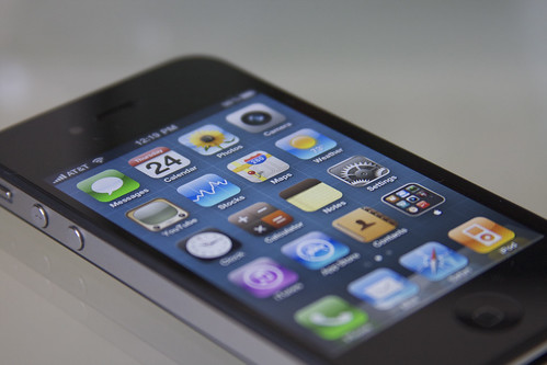
The iPhone 4’s hardware is a masterpiece. The front and back are made of glass, and the stainless steel band around the edge acts as the iPhone’s antenna system for WiFi, Bluetooth, GPS, and 3G. The volume buttons and the ring/silent switch are also metal. The entire phone feels like a handcrafted Aston Martin. Good riddance to the plastic back of the iPhone 3G/3GS.

More Than Meets the Eye

Apple upgraded the display in the iPhone for the first time — and it is a jaw-dropping improvement. The display has four times as many pixels as previous iPhones, and they are calling it the Retina Display. Why? Because at 326 pixels per inch, it is near impossible to distinguish the individual pixels with the naked eye, unless you happen to have superb vision (and even then, I’d be surprised). 

The screen is so sharp that it literally looks as if text and images is printed directly on the glass. View the screen from an oblique angle and the color doesn’t distort in the slightest. It looks like a finely printed glossy page from National Geographic. This makes me wish my iPad had a Retina Display. 

More Horsepower Than an Audi A4

Apple’s A4 chip, which made its debut in the iPad a few months back, has made its way to the iPhone as well. The A4 is a screamer. Everything about the new iphone is fast. The camera snaps shots instantly and successively, games are fast and smooth, web pages load much faster, pinch-zooming on a site re-renders the text instantly, etc. 

I didn’t used to enjoy my games on the iPhone 3G since they often stuttered and crashed. Now, to be fair, those particular games were made after the iPhone 3GS came out and were likely optimized for that hardware. But now those games load and play so much faster and smoother, I can see myself spending more time with them. RampChamp, prepare to knock over some clowns.

Shutterbug

The rear camera on iPhone 4 was also improved, as it now has 5-megapixels, a backside illuminated sensor, and an LED flash. The pictures it takes are phenomenal for a smartphone camera. I imagine that has a fair amount to do with Apple’s superb camera software, as well.

The rear camera can also shoot in 720p HD video. And it looks just as nice as my Kodak Zx1, which I think will need a new owner. 

iPhone 4 has another camera on the front, for self portraits and FaceTime video calls, which I’ll discuss shortly.

Software

Last Monday, Apple released iOS 4 for most previous iOS devices. The iPhone 3GS and 3rd Generation iPod touch received the full gamut of features, whereas the iPhone 3G and 2nd Generation iPod touch received most features, and the original iPhone and iPod touch were put out to pasture. Naturally, iPhone 4 is what iOS 4 was made for, and it even gets a few bonus features.

Multitasking

Many folks in the media have railed Apple for bringing limited multitasking, rather than allowing any and all apps to run simultaneously in the background. I actually think Apple is thinking correctly in using fast-app switching, and allowing several special processes to run in the background, such as task finishing, Voice-Over-IP (think Skype), GPS, and background audio, along with a couple other things.

So far, I love the feature. It’s nice to not have to do the “home screen shuffle” to switch between a few apps. For instance, I have been switching a lot between 1Password and Safari for passwords to various accounts. Now, speaking of the home screen shuffle…

Folders

The home screen now allows you to drag one app onto another app and create a folder. Each folder can hold 12 apps, but it only show 9 mini icons within the folder icon. I took 5 screens of apps down to two. It’s nice having all of my games in a Games folder, and I moved all my social media apps into a Social folder. You get the picture.

There’s No Time Like FaceTime

Let’s talk about that little front facing camera again. The real reason Apple added that is for their new FaceTime feature. Let’s say I am out of town, and I am talking on the phone with my wife on her iPhone 4. I want to see her and my son, so I tap the FaceTime button in the call window, and suddenly, after she accepts, I am seeing my family. This technology works flawlessly. Granted, right now it only works on WiFi, and only iPhone 4 to iPhone 4, but Steve Jobs said a couple weeks ago they will have tens of millions of FaceTime devices in the channel by the end of the year. Gee, I wonder what the next iPod touch will have?

The nice thing about FaceTime is you don’t have to be in a phone call to use it. Around noon today, I opened up my friend Nik’s contact card, and tapped the FaceTime button there, because I know he received one today. Now, Nik lives in England, but upon tapping FaceTime, it buzzed his iPhone 4, and we were seeing each other face to face. I flipped the view to the rear camera and showed him Nebraska, and he did the same and showed me Brighton. 

Apple may call the iPad magical, which it is indeed quite so, but FaceTime is the real magic. Yes, we’ve had this technology for years with webcams and iChat and Skype…but this on your phone, which you can walk around with, and show people things around you and share moments with them. 

For instance, when I flipped to the rear camera and pointed it at my growing son, Nik’s mouth gaped and his hand went to his forehead in disbelief at how big my son become (he’ll be two soon). Never before using iChat have I shared a moment like that. FaceTime is going to bring about a more personal form of communication.

Why This Changes Everything Again

Apple is making a move that few companies can pull off — they are going right for our hearts. Seriously, watch their video about FaceTime and I would be surprised if you weren’t moved by it. I can’t properly describe the enchantment of using FaceTime. It is not like the video conferencing we’ve known. It isn’t anything like sitting in front of a computer. FaceTime is all about sharing moments with others. For me, it is seeing two friends I haven’t spoken with in some time, one across the country, another across an ocean (or The Pond, as he would say). 

And this technology is just in its infancy. I can’t even imagine where we’ll be when my son leaves home in 16 years. All I know is I’ll still be able to see him, and that strikes me to my core.

Apple isn’t just a consumer electronics maker. If you’ve ever spoken with someone who works there, you can tell that they believe they are changing the world for the better. And I’m not just talking about listening to Apple’s top brass spinning PR, I’m talking about the folks who actually come up with these new ideas. FaceTime is absolutely simple to initiate. You don’t have to register for an account, or worry about which program to use. If the basic qualifications are met, it just works. 

So yes, overall, iPhone 4 is an evolutionary step in the new world order of mobile phones that its progenitor started. Being able to see who you are talking to, easily, while showing them important things around you, with half a world between you…that is what is truly magical.

Square - Making Payments Mobile

Square is a service I had been waiting anxiously to come out of vaporware-land and into reality since I found out about it in late 2009. Square allows you to take credit card payments from your iPhone, iPod touch, iPad, or Android 2.1 device — as long as you have a WiFi or 3G connection. 

I did a first look a while back and I have since received my Square Reader. It definitely works as advertised. Once you activate your reader with your account you can instantly take a payment. It is super easy. Launch the app, plug in your reader, enter your items, the price, and hit Payment, select Credit Card, and swipe the card.

Then you’ll hand your device over to the payer for them to sign and enter their email address for their receipt to be sent to them.

It is truly a simple system, and doesn’t require a merchant account, no monthly fees, and they even send you the reader for free. They do, however, take 15 cents off every credit card transaction, and additionally 2.75% for swiped card or 3.5% for keyed in card numbers. All in all, it’s a tiny fee considering the other savings from monthly fees. Also, 1 penny from every transaction fee goes to charity:water, which is completely awesome.

Now, there are some limitations that weren’t revealed until I was able to activate my reader. I’ll just go ahead and make a list:


  • Card payments have hindering caps. As of this publication, card payments are limited to $100 per transaction, and $700 per week. This is lame. I shared some correspondence with Square’s friendly support team about this, and they initially said the first rollout of Square is purely intended for personal use. I told them that is how I intend to use it, and $100 per transaction is too low for even that. Heck, their first video shows a guy selling a couch for $300. Anyway, after pointing that out, Square agreed with me that the limit is too low, and they are planning to raise it after building out their underwriting infrastructure. 
  • If you are intending to use it for business right off the bat, Square is not currently supporting EINs. Also, that aforementioned limit may be a hindrance. Square assured me EIN support is coming soon.
  • They are disparities across the apps. Here I am talking about the iPhone (count iPod touch in there when I say iPhone) and iPad apps, as I haven’t played with the Android app. Mainly, the iPad supports sales tax and inventory, and the iPhone doesn’t. Here’s why these disparities are odd to me: they’re the exact same app, with different user interfaces. The Square app for Apple devices is universal, meaning it is one codebase that displays a different interface depending on which device it is on. So the code is there, but Square didn’t design a user interface element for something like sales tax on the iPhone. I also raised this question with Square, and they said these features are on the list. 
  • Payer signing is a one shot pony. If your payer screws up their signature, there isn’t a clear button to try again. This is a problem, since payers sign using their finger. It is unfamiliar, and it should stand to reason that it might take a couple tries. The only recourse is to take a “signature” that looks nothing like the payers real signature, or to clear out the entire transaction and start from scratch. Unacceptable, and Square offered no comment on this.


I honestly chalk up all of these to start-up jitters. Square is an infant company trying to revolutionize the credit card payment industry. I have no doubt that the issues will be addressed in time. The question is will they be addressed sooner or later?

Overall, Square does allow for drop dead easy payments, and I’ll probably get a ton of use out of it once the limit is raised somewhere in the ballpark of $300 or $400. Let’s face it, I have some previously loved electronics to sell, like, an iPhone 3G on June 24th, when I get my iPhone 4.

If you have any other questions for me, sound off in the comments.

Magical

I awoke this morning with the scheme in my mind of running out and buying a wifi-only iPad. The Best Buy in Fargo, ND (where I am visiting family for the holiday) would surely have some in stock, and it opens at 9 am. At 8:50, I sat in my hotel room, telling myself to let it pass. So at 9:40, I assumed the store would be sold out, but have display models available. So I went to play with a demo unit, just to say I had touched an iPad.

Well, Best Buy had received 30 of each capacity, instead of the rumored 15 total. I called my wife. She said, “It’s up to you.”

iHave an iPad.

Thoughts:

Regarding the Keyboard

The portrait style keyboard is small. Whereas on the iPhone I prefer the portrait style keyboard, the landscape keyboard is superior. The portrait keyboard is too small to treat like a normal keyboard, but the iPad itself is too wide in portrait to hold and thumb-type at the same time.

The landscape keyboard darn near perfect for those of us used to the MacBook family’s keyboard or the Apple Wireless Keyboard. I can nearly touch type.

(Speaking of wireless keyboards, you can connect them via Bluetooth to the iPad. I haven’t tested this as my wireless keyboard is several hundred miles away.)

Regarding iPad Apps

Astonishing. Sure, many that I have tried have slight bugs, but considering nearly all of them were built on a simulator and not actual hardware, I’m amazed. Twitterrific for iPad is fantastic, but you can definitely tell that it was rewritten from the ground up in 60 days. Delivery Status Touch is eye-catching. The Kindle app for iPad is far superior than the Kindle hardware itself! All of this is amazing. It’s inspiring to see how many iPhone apps were made more functional just by allowing a larger canvas on which to paint.

Regarding iPhone Apps on iPad

Garbage. The only pixel-doubled app that looks good is Canabalt, and that’s because it’s intentionally pixely to begin with. Everything else looks like garbage. iPhone apps need to be given a facelift to compete on iPad.

Heck, you can tell the iPhone apps are pretty much running in a simulator on iPad, (akin Rosetta on the Mac) because when you go to enter text you get a pixelated iPhone keyboard instead of the iPad’s keyboard.
Regarding Browsing

Joy. Browsing the web is a fantastic joy. The Facebook app (which hasn’t been redone for iPad) has been all but obsoleted by the fact that Facebook.com works great on the iPad! Except for chat.

Websites render quickly and, most often, correctly. I expect many of the fraction that doesn’t render correctly soon will. Yes, I’m looking at you, Sites Made in Flash.

Regarding Reading

Reading is so nice on the iPad. Even outside. Outside there is glare, but text is still crisp and readable. The Kindle app is very nice, but iBooks takes the cake. It comes with a complimentary copy of Winnie-the-Pooh, which is nice, as I have a toddler. It’s also a classic.

The interface melts away and allows you to focus on reading. And I actually like the page curl animation, and how the page turns only as fast as you turn it.

It doesn’t feel exactly like a paper book, but it’s not supposed to. It does, however, feel like a digital book should — casual.

Final Thoughts

There is so much more to cover on the iPad than I can possibly handle in the first brain dump. Overall, I am convinced that the iPad is the forerunner to the future of computing. I imagine that at the end of this decade, personal computers will look more like the iPad than a laptop.

The iPad feels less like a large iPhone, but rather a more casual MacBook. When Apple first described it as magical, I thought it was a little corny. I stand corrected — the iPad is a truly magical experience.

One More Thing

This review was written in Pages on the iPad, save for then being edited on my MacBook Pro to insert some links and header formatting, as the Squarespace app hasn’t yet been updated with an iPad interface.

Yahoo! Search for iPhone has Inquisitor DNA

Back in the day before Snow Leopard, there was a lovely little search replacement for Safari called Inquisitor. Back in may of 2008, Yahoo! acquired the rights to Inquisitor, and ported the browser extension to Firefox and IE. Unfortunately, due to changes in the Snow Leopard version of Safari, Inquisitor no longer works in Apple’s browser.

About a year later, this handy little app was also made into an iPhone app, which was a quick and easy way to perform a search on the iPhone. Seriously, it was fast and didn’t seem to require as many taps to get things done. However, just as Inquisitor faded into obscurity on Snow Leopard equipped Macs, a change in iPhone OS 3.0 caused Inquisitor to type everything in the search bar in all caps. This didn’t appear to affect search results, but as Yahoo! never addressed the issue, it looked as if this app would be neglected. 

(I’ll admit that I am a stickler for perfection, and an annoying all caps bug was the equivalent of nails on a chalkboard for me. I quit using the app solely for this reason. Yes, I’m a snob)

It appears that Yahoo! has breathed new life into everything but the Inquisitor brand. On March 23, 2010, Yahoo! released Yahoo! Search, and you can definitely tell this app’s daddy is Inquisitor. The similarities are unmistakable. See for yourself.

Even the icon is similar, with only color changes being the obvious difference.

But differences are abundant between the two apps. The new Yahoo! Search can display maps as you search. Entering Starbucks as a search term yielded (ironically) a Google map (I assume using the built in iPhone Maps API) showing Starbucks stores nearly my current location. Enter a stock symbol such as AAPL and you’ll see the current stock price and whether it has gone up or down. Enter a movie title and see showtimes at theaters near you. 

Overall, it is refreshing to see the Inquisitor app live on in this new name. I do, however, find it odd that the original Inquisitor iPhone app is still available on the App Store. As for Inquisitor for web browsers, I haven’t kept up on the news of its support for Firefox and IE (as I don’t use those browsers) but I think it is safe to say that the Safari version has reached the end of its life. And that is truly a shame. 

 I honestly think it is too bad that Apple didn’t acquire the technology long ago. Hopefully Yahoo! can keep it alive.

Why Command-C When You Can Pastebot?

A while back I mentioned a fun little unit converter for the iPhone called Convertbot. The latest Tapbot to arrive is model 0003, a.k.a. Pastebot.

Pastebot’s purpose is to manage a clipboard of text and images that you copy from various content, whether that is the web, or twitter, or…well, anything that you can copy & paste on your iPhone. The things I love about Convertbot — the elegant, simple, yet fun interface and the mechanical sounds as you interact with the UI — are also found in Pastebot.

To use Pastebot, first, you need to copy something to your clipboard on your iPhone. Once an image or some text is copied, simply open Pastebot, and whatever is currently in the clipboard’s cache is imported. From there, you can apply filters to the content (such as black & white on an image, or convert to all lowercase on text), and/or send them in an email. Also, since Pastebot remembers the last 99 things imported, you can recopy something to the iPhone’s general clipboard to repost elsewhere at any time.

The most shining feature of Pastebot is Pastebot Sync, a Mac preference pane that acts as a wireless bridge between your Mac & iPhone. When your iPhone and Mac are on the same wifi network, and Pastebot is running on your iPhone, anything you copy on your Mac will magically be dropped into Pastebot. Likewise, tap and hold on something in Pastebot’s clipboard manager, and that image or text is pasted wherever your insertion cursor is currently on the Mac, whether that be the address bar, TextEdit, Pages, Keynote, or even an iChat window. You get the picture.

Pastebot sells for $2.99 in the App Store and Pastebot Sync is a free utility on Tapbot’s site. 

Quicken Essentials for Mac

Quicken has long been the standard of personal finance for the better part of the last 15 years. If you wanted to digitally keep track of your finances, Quicken was the first name you heard of. Quicken for Windows remains, from what I’ve heard, the gold standard. However, the Mac version had long been put out to pasture with the last version, Quicken 2007, having been released in the Summer of 2006.

 I’ve been using Quicken 2004 for Mac since, well, 2004, because the “upgrades” (read $70 bug fixes) just weren’t justifiable in the 2005, 2006, and 2007 versions. Then, in January 2008, there was the promise of Quicken Financial Life for Mac, with a ship date of Fall 2008. This was to be a rewrite of Quicken for Mac that sport a fresh user interface and finally bring Intel native code.

Sadly, that ship date kept being pushed back again and again. I even started to contemplate alternatives to Quicken, but ended up deciding to just stick with my decrepit 2004 version. Then in October 2009, Quicken bought Mint.com, and put Mint’s head honcho, Aaron Patzer, in charge of the Quicken team. He promptly ousted the much-delayed Quicken Financial Life and put his Mac-savvy Mint team on the job to compile the essentials of finance tracking in a built-from-the-ground up Cocoa version of Quicken for the Mac. And they did it in four months.

Today we realize the culmination of that fresh outlook on financing in Quicken Essentials for Mac. Now, it truly is just the essentials, but it’s the essentials done right. It lacks stock-lot accounting, bill pay, and TurboTax export, among a few other things, I’m sure. However, if all you need is to get a hold of your spending and create a budget then QEM should fit right in for you. 

I’ll admit, I was extremely skeptical about QEM for the past couple months when looking at the multitude of failures and delays of Quicken Financial Life. What really sold me was Aaron Patzer, formerly of Mint, now VP and general manager of Intuit’s personal finance group, getting out and talking to just about any major Mac site that would listen. Keep in mind that he came in to the fray in October 2009. Here’s an excerpt from Macworld:

“When I came in, I looked at the Mac product and said, ‘Holy crap, we haven’t put one of these out in three years,’” Patzer said. “It’s called ‘Mac Essentials’ because it’s got the essential features used by 80 percent of the users we’ve surveyed and talked to. So we had to decide, do we want to put a product out that serves 80 percent of the market and is a vast improvement in so many ways, or do we delay it again? And what I thought was, given the growing popularity of the Mac platform… it was better to get a product out that’s good for 80 percent of the market.”

 Also:

Patzer says that you’ll see more similarities to Mint.com in the desktop Quicken products. Patzer says he “personally specced out” Quicken for Windows 2011. “Over time, you’ll start to see features and functionality for all the platforms come together. It shouldn’t matter if you’re using Mac, PC, iPhone, Android, or online” when it comes to features and data availability. Apps should have a native appearance, he said, but the underlying data structures will be the same and it should be easy to go from using a desktop app to the online service and back again.

It’s obvious to me that Intuit, the maker of Quicken, saw that they were stagnant. When they bought Mint.com, I thought for sure they did so just to kill it off, as it competed with Quicken Online. Instead, the company tossed Quicken Online in the bin, and embraced Mint.com as its replacement. It sounds like they gave the Mint people carte blanche over all of Quicken. It also sounds like the fresh blood has a vision for the future, and it is that vision that persuaded me to embrace Quicken Essentials for Mac.

Whether or not you decide to adopt Quicken Essentials is primarily based on whether you are an 80 or a 20. Thankfully, I fall in the 80 percent of the user base. I leave my investments to my brokerage site, and I like the web interface that provides. So I didn’t feel the need to continue on with Quicken 2004 and wait for another year or two.

Thankfully, my grandpa has Quicken 2006 and I was able to use iChat’s Screen Sharing and my iDisk to convert my 2004 file. From there, QEM worked like a charm.

The Little Blue Bird Becomes a Reality

Ollie the Twitterrific BirdIf you’ve been around twitter for a while now, I’m sure you’ve seen Ollie in many places (though it should be noted, he’s used quite often without consent from his creators). Ollie is the mascot and icon of Twitterrific, the popular twitter client for the Mac and iPhone from The Iconfactory.

Twitterrific pioneered twitter clients on the Mac (where it has unfortunately stagnated, but I’ve been told by Ged from Iconfactory that they are diligently working on a stellar update). It was also one of the first native iPhone twitter clients, and won an Apple Design Award.

Ollie has branched out from software in the past year, as he now adorns a t-shirt (which I own) and now the above pictured collectible figurine. Ollie is made of vinyl and comes in two flavors — straight vinyl or flocked. The flocked version is fuzzy. I opted for the straight vinyl Ollie as I figured he will likely sit on my desk, and the flocking may attract dust.

Overall the build quality is fantastic. It’s neat to see a 2D icon become a 3D figure. And hey, now I have my own Ollie to stare me down with his beady eyes until I check Twitterrific.

You too can have your very own Ollie at the Iconfactory Store. The regular Ollie is $19.95 and the flocked Ollie is $26.95 (you’ll also find that Ollie t-shirt there).