¶ iOS 5 | Review

The original iPhone revolutionized the way we think of mobile computing. Each subsequent version of iOS has been evolutionary, adding some major features each year, but leaving that core part of the original iOS largely untouched. iOS 5 is still evolutionary, but the difference is that there are few parts of iOS that were left untouched this time. To compare Apples to Apples, iOS 5 is to iOS as OS X Lion was to OS X this year. Yes, evolutionary, but make no mistake, this is a giant leap forward.

The Big Features

When Apple announced iOS 5, they focused on a handful of new features. These have been discussed ad nauseum all over the internet, but I do have a couple favorites I want to make sure you know about.

Notification Center

Something that has long been in need of attention on iOS has been notifications. The old way consisted of modal dialogues which disappeared forever when acted upon. And multiple notifications were not handled well. One of the worse parts of the modal system was notifications completely disrupting whatever you ever doing at the time. This was awful for just about everything, but especially nasty in games.

Apple addressed these problems in three ways. When using an app, notifications now drop in at the top of the screen briefly, and roll back away after a moment. You can tap that banner to act on the notification, but if you don’t, it just gets out of the way. However, unlike the old way, the notification isn’t gone forever once it is out of view.

Swiping down from the top of the screen brings in the notification center, which collects all active notification events. From here, you can clear notifications or tap on them to jump to that event.

Lastly, if notifications pop up while you aren’t using the device, they stack up on the lock screen. From the lock screen itself, you can swipe across a notification to unlock the device and jump straight to that event.

So far, I have been loving nearly everything about notification center. One improvement I’d like to see is the ability to set which calendars have their events show up in notification center. I have a couple subscribed calendars that I don’t need to see notifications for.

iMessage

This is probably the one core feature of iOS 5 that I have been looking forward to the most. A fair majority of my friends and family have been moving or are planning to move to iPhones. My wife & I each have the 200 messages/month plan for our iPhones — a plan that no longer exists. Combined, we pay $10 per month to cover our light use of text messaging. And since AT&T now offers unlimited messaging at $20/month ($30 for families) or pay-per-message, we really don’t want to change that plan.

Here is where Apple is helping us use fast and quick messaging more. The Messages app, where SMS and MMS have traditionally been handled, has become a little smarter. When selecting who you are sending the message to, Messages does a quick check with Apple to see if you are sending to an iOS 5 device. If you are, the interface subtly changes from a green Send button and Text Message placeholder text to a blue Send button and iMessage placeholder text.

If you have any experience with RIM’s Blackberry Messenger service, iMessage is basically a super up counterpart for Apple devices. iMessage is free, sends text, pictures, videos, map locations, contact information and more via Wi-Fi or 3G. It also shows whether the message has been delivered, read, and whether or not the other person is typing back. It’s awesome. And, it even works internationally. I’ve been using it a lot the past week to have quick chats with friends in the UK.

By the way, iMessage isn’t just for iPhones. It works for iPad and iPod touch, too. In those cases, you use your Apple ID address. And if you set up your Apple ID on your iPhone as well, you can start the conversation on one device then pick up again on another. iMessage keeps track of the conversation for you.

iMessage has already changed how frequently I keep in touch with friends.

Reminders

Reminders is a built-in to-do list with a kick — it can use location reminders. Location reminders have already been incredibly useful for me. Of course, so has a reminder list that stays up to date on whichever device I’m using.

Twitter

The built-in Twitter integration is great. I love that apps are already using the single-sign-on feature so I don’t have to go look up my password all the time in 1Password.

I’ve mostly been using it for sending pictures to Twitter without having to launch Twitterrific, but I have also shared a couple links from Safari. You can also share things from YouTube and Maps.

Camera & Photos

Besides iMessage, I’ve been very excited for the improvements to how the Camera app works. From the lock screen, a double-tap to the home button brings up quick access to the camera. Also, pressing the volume up button now works as a shutter release for pictures and starting/stopping video recording. As an added bonus, you can use the volume up button on the in-line remote on the earbuds in the same fashion.

The Photos app also has minor editing capabilities such as crop, rotate, remove red-eye and auto-enhance.

The Attention to Detail

All the big features are really great. But the real joy of iOS 5 for me has been the little things. The super subtle refinements to nearly every nook & cranny of iOS. I’m just going to list things off in no particular order.

  • In Messages, you can swipe the keyboard down on the iPhone & iPod to see the conversation easier (iPad has a dedicated button for dismissing the keyboard any time).
  • From Camera, you can swipe from the left to see the pictures you just took.
  • Weather can now use geolocation to show condition where you’re at. You can also tap in the daily forecast list to expose an hourly forecast.
  • In Settings > General > Keyboards you can now specify shortcuts. Think of this as a rudimentary version of TextExpander.
  • Maps now offers alternate routes.
  • On the iPad, you can resurrect closed tabs in Safari by holding down on the + button.
  • You can split and reposition the keyboard on iPad by either holding on the dismiss keyboard button or placing your thumbs in the center of the keyboard and pulling it apart. You can merge it back together by holding on that dismiss button again.

    I have found the split keyboard to be perfect when typing anything in Portrait orientation.

  • In Music, it’s always been annoying when a song title is too long to fully display. Tap & hold on that song for a moment and the full song information appears in a popover.
  • In the weather widget of Notification Center, you can see a daily forecast by swiping the current weather to the side.
  • When you select a word, there is now a define option in addition to cut, copy, & paste. Define only appears if iOS is able to actually define the word.
  • Ever accidentally add someone to the To: field in Mail when you meant to add them to Cc: or Bcc:? Me too. You used to have to delete them then retype in the appropriate field. Now you can tap and drag recipients between the fields.
  • You can now select multiple messages in Mail to make as read/unread, and new to the game is the ability to flag a message for follow-up.
  • Ringtones can now be used for any notification tone. Heck, the ability to customize any alert tone is fantastic.
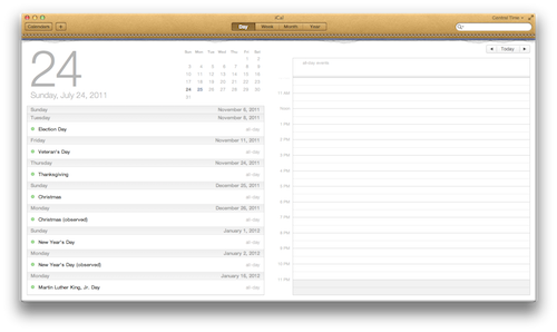
  • Calendar on iPhone and iPod can now show week view when held in landscape. The iPad now has a year view with a heat map.
  • If you put an address into the location field of a Calendar event, that location is now linked out to Maps. I have been wanting that for years.
  • Tapping and holding briefly on a calendar event in day or week view allows you to adjust its length via grab handles, or you can move the event entirely by dragging it.
  • As I mentioned earlier, you can now associate an Apple ID address as a recipient and caller ID on for FaceTime on iPhone. This used to be restricted to only the phone number for iPhones.
  • The iPad now has multi-touch gestures. Use all fingers and thumb to “pinch” apps shut and go back to the home screen. Four finger swipe up and down shows and hides the multitasking switcher, and four fingers left or right switches between currently open apps, in order of most recently used.
  • Tapping and holding on the hyphen now adds an en-dash in addition to the em-dash and bullet, for all you fellow typography nerds.
  • In Clock, the timer function now has a pause button.
  • The Reader ability in Safari is great, especially on smaller screens like the iPhone and iPod touch.

I’m sure there is much more to iOS 5 than I have found on my own or read about. This really does feel like the most polished version of iOS yet and it is incredibly stable and fast. This is pretty incredible, considering how many changes have been made and how ambitious some of those were.

So, should you upgrade? If your device is capable of running it, then yes. I’ve even heard from 3GS owners, which iOS 4 bogged down quite a bit, that iOS 5 has given new life to their iPhone.

This is simply a fantastic update.

¶ OS X Lion

I have been a Mac user for over 20 years. I was 5 when my parents brought home a Mac Classic. Eventually, a few years later, they traded out for a Power Mac, which, as my obsession into computers grew, so did that PowerMac, via upgrades to the CPU, Memory, various PCI cards to bring USB and FireWire to it, and of course, Mac OS upgrades. Though at the advent of Mac OS X, my parents & I pretty much stopped upgrading. All our programs were made for Mac OS 9.

I remember poring through MacMall catalogs and dreaming of someday owning one of Apple's shiny, non-beige Mac OS X machines.

That day came when I was preparing to leave for college in 2003. I purchased an eMac, which was sporting Mac OS X 10.2 Jaguar. That was probably a good time to make the leap from Classic Mac OS, as Jaguar was really the first truly stable version of OS X. Luckily, a couple months into my college career, OS X 10.3 was released, and I ordered on day one. Exposé seemed like a revolutionary new feature, and has been a feature I have used numerous times every day on each subsequent iteration of OS X.

From that day on, I have promptly kept with the times as new versions of OS X were released. I simply don't like living in the past.

Paradigm Shift

When I made the jump from Mac OS 9.2 to OS X 10.2, it was a paradigm shift. There was a definitely learning curve, as there were some hints to the past, but many things required relearning a little bit.

And as much as Exposé blew my mind, Apple kept adding new features with each iteration, polishing OS X a little bit more. Things like Dashboard & Spotlight in 10.4 Tiger, and Spaces & QuickLook in 10.5 Leopard.

10.6 Snow Leopard was a bit of a conundrum. It was truly a polish of OS X, as it had virtually nothing in the way of new features. It simply refined the existing features, and carved away some cruft in the underpinnings of what makes OS X tick. It made a great system even better.

And hear we are, in 2011, with OS X Lion. At a first glance of a computer running Snow Leopard and another running Lion, with just the desktop being shown, you probably wouldn't be able to tell the difference. But start using it, and you will find that Apple has changed the game again. Yes, Lion is still OS X, but something new and amazing has happened to it — another paradigm shift has occurred.

Simplification

When Apple first showed off Lion in October 2010, the theme was "Back to the Mac". What Apple meant by that is they were taking many of the fantastic concepts of iOS — the iPad, especially — and bringing them back to the Mac. OS X Lion is the culmination of those efforts, and simplification is the main driver of the paradigm shift that has just happened in the world of desktop computing.

Say Goodbye to Plastic

The most obvious way to kick off simplification in Lion is with how you purchase it and install it. With previous versions of OS X, you either had to have a disc shipped to you, or go to a store. Then you had to put a disc in your computer, a disk you may never look at again, and run an installer.

Lion foregoes the plastic disc altogether. Snow Leopard users simply purchase Lion on the Mac App Store, and it downloads directly to your computer. It is a hefty download at 3.7GB. It took about a half hour via cable internet for me. After it downloads, you simply run the installer, and about another half hour later OS X will have undergone a serious upgrade in almost every way.

Apple has also simplified all but the most catastrophic forms of troubleshooting your Mac. Instead of having to keep a disc around, all your recovery tools are stored on a recovery partition that the installer created during the upgrade. If your hard drive dies, then things aren't as convenient, but that deserves a post all on its own.

One more simplification of Lion being distributed on the Mac App Store is its licensing terms. It used to be that you had to buy either a single license or a most expensive family pack, even though the discs were the same (Apple generally operates off the honesty model). With Lion, the App Store rules apply, and those state that you can install Lion, or any apps your purchase on the App Store, on all the computers you own.

Obfuscation of the File System

When I think of the average person using a computer, I tend to establish my baseline as that person being my mother-in-law, Gayle. Gayle is the sweetest person you'll ever meet, hands down (truly, I'm blessed to say that I have a wonderful relationship with my mother-in-law). She travels a lot to see her five kids, and she never really learned computers. That isn't to say that she doesn't try; she absolutely desires to learn how to use her MacBook Pro.

But being a person who grew up on typewriters, and then occasionally used a Windows PC only for Word and email, she never truly grasped the basics of how a computer works. And that's understandable, as computers are pretty fussy, fickle things.

One of the biggest hurdles I have had explaining to Gayle since she switched to the Mac last year is how the Finder is the end-all, be-all repository for everything on her MacBook Pro. Honestly, if an app isn't in her Dock, she forgets how to find it.

That's where Launchpad comes in. Launchpad is the saving grace for Gayle and finding her apps. Click one icon her Dock, and all her apps are visible, just in the same way they are on her iPod touch. She can even group them into the same style of folders, just like on her iPod.

The nerds may balk at Launchpad as a dumbing down of the computer, but I think Launchpad is huge for the non-nerds of the world. Computers should be simplified and approachable.

Another obfuscation of the Finder is Auto Save & Versions. I wish this were in OS X when I was in college, as I remember losing a numerous hours of work on papers that I forgot to save as I wrote when the app crashed.

Just like on iOS, you don't need to worry about a save button. Every time there is a pause in your work, or every 5 minutes, whichever comes first, OS X will automatically save your work. And not only does it save automatically, but it makes a version of your document, so if you want to go back and recover a paragraph you edited out an hour ago, you can browse back in a Time Machine-like manner through your revisions.

One more thing that isn't new to Lion, but worth mentioning in this section is the Mac App Store. One of the most difficult things I have ever had to explain to a novice Mac user is what in the world a disk image is. Installing apps before the Mac App Store was not the easiest thing in the world if you didn't know the right procedure. I can't tell you how many times I've seen someone launch an app from their Dock, only to see a disk image load first because they never copied the app to the Applications folder. The Mac App Store takes all that hassle away by providing a one click purchase, and then the computer handles the mundane task of downloading the app and moving it to the proper place. Heck, the Mac App Store even handles updating the app.

The best way I can think of to sum up the obfuscation of the file system as a good thing is that there are a lot of complex things that we simply shouldn't have to care about — tedious and mundane things that computers should have been able to manage for a long time, but simply weren't required to. The time has come for our computers to become more approachable.

Mission Control

Another way Apple has simplified OS X is by consolidating some features. As I mentioned earlier, several major features have been introduced over OS X's iterations — Exposé in Panther, Dashboard in Tiger, and Spaces in Leopard. In Snow Leopard, Apple refined Exposé a bit, bringing better organization.

In Lion, Apple took all three of those features and rolled them into one new design, called Mission Control. Mission control gives a bird's eye view of all the open windows on your desktop — even grouping them by app — and displays Dashboard and all your Spaces and full-screen apps along the top, along with easy access to the Dock.

So far, I really am loving Mission Control. As a person who used Exposé so often to switch contexts in my workflow, I think Mission Control is a fantastic next step.

Interaction

One thing I love about iOS is how you interact with apps. You simply touch the screen and move the interface to scroll. Well, Apple has made it clear that OS X is not going to get a touchscreen any time soon, and that they believe the best way to interact these days with the Mac is through a multi-touch trackpad.

Now, I know some of you may have a Magic Mouse which is, technically, multi-touch capable and supported in Lion. But trust me, Lion was designed around the trackpad on the MacBooks and the Magic Trackpad. If you're using the Magic Mouse, or a third-party mouse, why don't you go treat yourself to a Magic Trackpad for the full Lion experience?

Natural Scrolling & Gestures

One of the modifications to the way users interact with OS X in Lion is that Apple has reversed the scrolling direction. This was done to be a bit more iPad-like. The best way I found to adjust to the reversed scrolling (or natural scrolling, as Apple calls it) is to imagine that you are directly touching the interface through the trackpad, just like touching the screen on an iOS device.

It took about 6 hours of using my Mac with the new natural scrolling before my brain rewired and adapted. A few days in, and I don't even think twice about it. It really does feel natural. I should note that you can change the scrolling behavior back to the old way via a simple toggle in System Preferences.

That said, give natural scrolling a good week of use before you make up your mind. It really does feel right once you adjust. If you don't adjust after a week, then by all means, throw that switch.

I think there is another reason why Apple changed the way we scroll in Lion beyond just being more iPad-like. See, another influence from iOS that Lion now sports are minimal scrollbars that fade away when they aren't needed. In the past, scroll bars were always visible, and before our mice had scroll wheels, we clicked on the scroll bar and dragged it down. Later, we used the scroll wheel on a mouse as a level of abstraction to still move that bar downward. Apple has simply shifted our focus off the scroll bar, and directly onto the content. Now, with natural scrolling, we're moving content, not a scroll bar.

Lion also revamps multi-touch gestures, mainly adding the ability to swipe between spaces. But there are a few other gems added, such as double-tapping (not clicking) with two fingers in Safari will auto zoom on content, just like in Safari on iOS. You can also use the pinch gesture to fine-tune that zoom control. Double-tap with three fingers on a word in just about any app will invoke a popover with dictionary, thesaurus, and Wikipedia entries.

Full-Screen Apps

Now this feature almost sounds ridiculous at first blush. I mean, Windows has maximized apps to fill the screen for what feels like eternity. To be honest, maximized windows are one of the reasons I loathe Windows. They hide everything else behind them, and switching between them can sometimes be burdensome.

Apple has taken a different approach. Full-screen apps are not maximized windows. Apple's approach ties full-screen apps with Spaces, giving every full-screen app its own space. Since all spaces exist in a horizontal plane which can be swiped through, or seen easily via Mission Control, moving between them is fairly easy. Apple gives developers a way to easily implement full-screen capability in their apps, which more or less works well. But the real joy of the full-screen experience is when an app takes advantage of the extra space by transforming its interface into something more usable or fun. iPhoto takes the cake in the usable department, giving you an interface filled with just the tools you need to focus on working on photos. Photo Booth, on the other hand, becomes even more fun as its standard OS X chrome transforms into curtains and switches and panels.

I have found a lot of utility from full-screen apps already. I used to use Spaces on Leopard and Snow Leopard to segregate apps that needed a lot of screen real estate, like iTunes and iCal. Now I am finding that I only need one true desktop (though I could create more in Mission Control if needed) and I toss apps like Safari, Mail, iTunes, iCal and Byword into their own full-screen space. I couldn't be more pleased.

I do feel, however, that full-screen apps is meant for a notebook computer experience, and not so much for the 27-inch iMac or Thunderbolt Display experience. But, I also don't think is a mistake. I'm fairly confident that Apple 11- and 13-inch MacBook Air will reign supreme as the company's best selling Mac for the foreseeable future.

Minutiae

With all the big, showcased features of OS X Lion, there seem to be so many little things that really bring out the awesome. For instance, a Mac can now be restarted with a bunch of apps open, and when you log back in, they all will still be open, even down to any text you may have highlighted. That's simply one of those "why hasn't it always worked like that?" features.

Another is AirDrop, which allows seamless file transfer to another Mac nearby you. At the beginning of the year, I switched my church from PC to Mac, and AirDrop will be great for sending files around the office that are too large to feasibly do through Dropbox.

QuickLook is now available in Stacks, and from Spotlight, which is incredibly handy.

Resizing of app windows can be done from any edge or corner now, instead of just the lower-right corner.

Mail has an all new interface inspired by the iPad, and I simply love it. It also sports a conversation view that really helps with keeping context in lengthy back-and-forths. Data detection also goes beyond contact information and calendar events. Hover your cursor over a link, and click the QuickLook triangle that appears next to it to get a peek at the site without having to hop into Safari. This is a great tool for investigating a link you aren't entirely sure about, as QuickLook is incapable of accepting any downloads.

iCal now has a year view, a highly useful day view, and a quick entry model for adding events — you simply type in natural language like "Lunch tomorrow with Karen at noon at Olive Garden" and iCal will parse that out into the appropriate fields in the event. In fact, I love almost everything about iCal now except one thing — the new coat of paint. See for yourself:

iCal
iCal

And if you think that is bad, you better not look at Address Book:

Address Book
Address Book

At least with iCal, it just looks bad. It's still functional. But Address Book looks bad and has lost much of its ease of use. To view groups, you have to click the red bookmark and a page flips. I highly doubt many normal folks will appreciate the change, let alone nerds.

In the end, though, if I have found only two things that truly rub me the wrong way after a number of days, that's not terrible. I imagine if enough people agree with me, we'll see a toggle to make those apps look a little more standard by 10.7.1.

The Epic Conclusion

Lion has some great headline features that are not only impressive, but define — and sometimes redefine — how we should approach our computers. Even more than the headliners, Lion is a beast made great by the sum of many little refinements. I've noticed very few things untouched by Apple's engineers. There are so many I couldn't hope to go through all of them here.

For $29, I don't see why you shouldn't upgrade. This is the best version of OS X yet, and I think you'll appreciate the exhaustive attention to detail that Apple has given to it and to you.

Byword 1.3

Byword is a fantastically simple typing interface for the Mac. I picked it up when version 1.2 came out, which introduced Markdown support. I held off on publishing my thoughts after having a brief discussion with the developers about Markdown support getting a lot better in 1.3. Well, Byword 1.3 made its way onto the Mac App Store today, and I thought I'd share my thoughts on what has become my go-to tool for writing on my Mac.

Syntax

When Byword 1.2 introduced Markdown support a while back, the furthest it reached was the ability to convert your markup into HTML and preview or export it. This was all well and good, but having come from using the abandonware of TextMate, I missed being able to see my Markdown syntax take effect while I wrote. Meaning that by surrounding a word with an asterisk on each side, it would italicize. Well, Byword 1.3 takes care of that. Emphasis and strong emphasis, headers, ordered and unordered lists, and more all render in real time, aiding in visualizing your final work at a glance.

The export options have even expanded to include PDF, RTF, Word, & LaTeX in addition to HTML.

Preferences

I have always enjoyed Byword's minimal preference pane, which offers a light or dark theme, text width choices of narrow, medium, or wide, and the font chooser. Thankfully, one crucial preference was added, and that is the ability to set a default text format of rich text, plain text, or Markdown. And the Markdown choice even uses the .md file extension.

Miscellaneous Niceties

When tapping out a list, whether ordered or unordered, tapping return once now adds the next row with the appropriate marking. Also, there is a new typewriter scrolling mode which keeps the current line centered vertically in the window, so you can watch one area while typing, instead of traveling down the length of your screen as your type.

Ready to Roar

Byword 1.3 also adds support for OS X Lion, which should be arriving any day now. Once running on Lion, Byword will trade its custom full-screen support for Lion's native Full-Screen App support, along with Auto-Save, Versions, and Resume.


As someone who writes almost exclusively in Markdown anymore, Byword has grown to become the tool I reach for when I go to write. Today's enhancements to how Byword handles Markdown syntax has sealed it. In my book, Byword has become the tool that every serious writer using Markdown should use.

If you are looking for an app that is clean and simply gets out of your way so you can write, I can't recommend Byword enough.

Byword is available on the Mac App Store for $10.

Capture — An App That Does One Thing Well

I can't tell you how often I miss shooting a video of my boy doing something great because I have to do the following:

  1. Unlock my iPhone.
  2. Find the Camera app.
  3. Wait for the Camera app to load.
  4. Toggle the switch from still photo to video.
  5. Tap record.

The above process can take anywhere from 5 to 30 seconds, which, by the time I am ready to record, I have missed the moment.

Apple is hoping to alleviate some of this by adding a camera button to the lock screen in iOS 5, but that still seems like it will be best suited for quick access to taking still photos (which is also welcome).

Enter Capture, a great little app that does one thing, and does it very well. Tap Capture's icon on the home screen, and it instantly begins recording video as it launches. Simply press the home button to stop recording, and the video is saved to your camera roll.

Capture is 99 cents well spent if you are also frustrated with the slow performance of the built-in camera app.

Marco Arment pretty much speaks for me on that front:

By the way, it's embarrassing that Camera is so slow to launch and be ready to capture videos or photos that apps like this are necessary.

I guess that is a good reason to have a third-party developer community.

Make sure to pick up Capture for 99 cents over at the App Store.

¶ Seamless

Nearly ten years ago, Apple introduced the original iPod. In their first ad for the iPod, before the silhouette dancers, we are introduced to a guy jamming out to a song on iTunes, which he then drags onto his iPod in the source list, stuffs headphones in his ears, clicks play on his iPod, and seamlessly continues jamming out to the song.

That was the dream, wasn't it? To seamlessly pick up where you left off. Unfortunately, that dream has never been a reality — until now.

Enter Seamless, a new app for iOS and your Mac. Seamless allows you to transfer what you are currently playing on one device to the other, without skipping a beat. Press one button, and music fades out on one device as it fades in on the other.

The dream has been realized. And I can't believe this isn't a feature found in iOS and iTunes already.

Seamless works completely as advertised. It is pure magic.

Seamless for iOS is a buck in the App Store and the companion Mac app is free in the Mac App Store.

They even have a great video which, like all great app videos these days, is done by Adam Lisagor.

Hat tip to a tweet from my close friend and fellow writer, Samantha.

Take Five for Mac

It's starting to feel like Iconfactory central around here, but the company has been on a roll these first few months of 2011. They've released a major overhaul of Twitterrific for Mac, a new photo app called Flare, the unveiling of their game-changing development kit called The Chameleon Project, and now one of their iOS originals has come to the Mac.

Take Five for Mac is a simple utility that pauses your music for 5 minutes (or whatever you set in preferences), then gracefully fades it back in when time is up.

You may be asking why anyone would need something like this. The answer is simple: we all have distractions. I can be on a roll working on something while listening to music or a podcast when my phone will ring, or my wife or son needs my attention for a moment. So I pause iTunes and deal with the issue at hand. And then, more often than not, I listen to absolutely nothing for the next 45 minutes (and often with my headphones attached to my ears). Take Five solves this.

I've been beta testing the Mac version for the past couple weeks and it works really well. I never did buy the iOS app because I didn't want to switch apps just to pause what I am listening to, especially since I often pause with the in-line remote on Apple's headphones.

The Mac app makes perfect sense, though, as it works as advertised while staying out of the way. An added bonus is that is pops up slightly with track info when tracks advance.

Take Five for Mac is available in the Mac App Store for $3.99. However, it is half off for a launch special of $1.99 for a short time.

If you listen to stuff via iTunes while sitting at your desk, you need this app.

2

I've spent the weekend gathering my thoughts and impressions of the iPad 2 compared to the original iPad, and I have to say, I'm very impressed with the iPad 2.

Speed

The iPad 2 feels considerably faster than the original iPad. To me, this is most noticeable in iBooks. When opening a large, image-heavy eBook on the original iPad, it would take a while to load, and turning the pages would often be a bit choppy. On the iPad 2 loading is fast and page turning is super smooth and responsive.

Apps load much faster, and more apps stay in memory for multitasking. Also, Safari keeps all 9 tabs cached, whereas the original iPad kept 3-4 of the 9 tabs cached, needing a refresh of the page otherwise.

I don't have any games that would challenge the 9x faster graphics, so I can comment on that aspect.

Build

The iPad 2 is incredibly thinner than the original iPad. It is also marginally thinner than an iPhone 4.

I find the iPad 2 to be much easier to hold than the original iPad. I attribute this mostly to the thinness rather than the iPad 2 being 0.2 lbs. lighter than the original iPad, even though I'm sure that helps. The original iPad had a curved back, which I always had a hard time finding the sweet spot for holding it in a balanced manner.

The iPad 2 curves only on the edges, and has a flat back. Combined with the thinness, holding the iPad 2 is akin to holding a notepad (though, obviously, heavier than a notepad). The iPad 2 also has two more advantages over the original iPad that I have noticed over the past couple days. The first is that the iPad 2 feels more balanced than the original. I suspect the internal components are arranged specifically for this (I haven't compared any teardowns between the two). Second, the aluminum back, although it looks like the exact same finish, feels different. The original iPad's finish felt almost slippery, and made the iPad hard to casually hold. The iPad 2 definitely feels slightly, and I mean slightly, rougher. But this slight difference makes all the difference. I find the iPad 2 to be a night and day difference of being able to hold the device comfortably.

Screen

It is exactly the same. I wasn't disappointed that the iPad 2 didn't have a retina display, as that seems impossible with current technology whilst keeping the price the same. I am, however, a little disappointed that the iPad 2 doesn't have the LCD bonded to the glass like the iPhone 4. Hence, in the right lighting, a little bit of shadowing can occur at the edge of the screen because the bezel sits a few millimeters above the screen.

I really would have loved having the screen bonded to the glass to give that effect of the pixels being painted on the glass like the iPhone 4.

Cameras

The cameras are indeed sucky resolution, but perfectly fine for FaceTime, which is their intent. My kid absolutely loves Photo Booth.

Cover

The Smart Cover is probably one of my favorite things about the iPad 2. I abhorred the look and feel of Apple's case for the original iPad (but I loved its function for inclining the iPad for typing, and propping it up for viewing video). The Smart cover replicates the incline for typing and the propping for viewing video, all while dismissing the things I hated: added thickness & weight. The Smart Cover is barely there. And it is wonderful.

I also love how the Smart Cover locks the iPad 2's screen when closed, and instantly wakes the device when opened. It is also easy to remove, unlike the original iPad's case.

If you're buying an iPad without a Smart Cover (or a similar third party case, when those arrive), then you are doing it wrong.


The iPad 2, in my book, is a true second generation device. Not because of any one thing (except maybe the case), but a sum of all the little things. After only a couple days, I can say without a doubt, that I like the iPad 2 far more than the original iPad.

iTrip DualConnect

I've been a big fan of Griffin Technology's accessories for Apple kit ever since I bought my first iPod. One of the first things I scout out every time I buy a new iPod (or these days, iPhone) is a way to hook it up to my car.

Back in the day, I used their iTrip device to broadcast music from the iPod to my car's stereo via FM. But having to change stations gets old quickly when driving a decent distance. Griffin has mitigated that over the years with new iTrips that scan for open frequencies, but I hopped ship to AUX ports when those became popular.

My all time favorite car accessory was the TuneFlex AUX with Smartclick for my old iPhone 3G. The best part was the remote that attached to the steering wheel. Fantastic device. Unfortunately, that doesn't work with my iPhone 4.

So I tried their new TuneFlex AUX Handsfree. That didn't work out so well.

Finally, I've settled on a simpler solution. The iTrip DualConnect. It can connect via either FM or AUX. I took the AUX road. It charges your iPod or iPhone and acquires the audio as line-out via the Dock connector. I'm a big fan of line-out.

The play/pause, forward, backward controls are nice (but I do miss my steering wheel remote).

All in all, it works as advertised, unlike the TuneFlex AUX Handsfree. Consider it highly reccommended.

Griffin's USB Mini Cable Kit

One of my Christmas gifts was the Griffin USB Mini Cable Kit. The kit includes three small cables measuring about four inches long. Each features a standard USB plug for your computer on one end. One cable sports mini-USB for cameras, portable hard drives, etc. Another has micro-USB for devices that utilize that, such as Amazon’s Kindle. Finally, the third cable features a Dock connecter for your iPhone, iPod, or iPad.

These cables are very convenient for my laptop bag, and minimizes the clutter in my bag. Now I carry three small cables for quick connectivity, instead of three long cables that become a tangled mess. I highly recommend them. If you feel so inclined, buying the kit through this link gives me a little kickback.

I think I’ll post a few more short reviews over the next couple days of things I received as gifts for Christmas or acquired out of necessity last month.

Blast Off to Fun with Astronut!

The Iconfactory today released their long-awaited hyperjump back into iPhone gaming Astronut! You play Jacques the Astronut, leaping planet to planet through 24 levels across 6 sectors. Astronut is also Game Center compatible, sporting 40 achievements and leaderboards.

Needless to say, The Iconfactory has boldly gone into the super high resolution territory of the Retina Display, bringing graphics so sharp it’d make Buzz Lightyear jealous.

You get the first 4 levels for the steep price of free, and then an in-app purchase of $1.99 gets you the rest of the game. This is a great compromise for a sort of demo try-before-you-buy. If you like the first 4 levels, you’ll really love the rest.

I’ve had a hard time putting Astronut down today, and my twitter followers are probably tired of hearing about my achievements. I can’t recommend this game enough. Go get it.

P.S. Don’t forget to grab the gorgeous free wallpaper pack for Astronut.

P.P.S. Astronut’s arrival totally makes up for Apple’s yawn of an announcement regarding The Beatles earlier.