iOS 7 Settings

Louie Mantia imagines what iOS 7 may look like from the Settings app. I love his use of Avenir, a font that I have absolutely fallen in love with. I use it in any app I can (e.g., Day One and Twitterrific 5).

Louie makes a lot of other smart decisions, and I think I would love it if iOS got a bit of a makeoverin this style.

Some related reading would be Chairman Gruber's little birdies.

Innovation Through Simplicity

Chairman Gruber:

The utter simplicity of the iOS home screen is Apple’s innovation. It’s the simplest, most obvious “system” ever designed. It is a false and foolish but widespread misconception that “innovation” goes only in the direction of additional complexity.

I use a lot of complex software and tools. I can say from experience that the ones that I most enjoy are the ones that work towards simplicity over time.

Mountain Lion without Skeuomorphism

When Lion released its cockamamie Address Book and iCal UI, I found the apps to be far less usable than the Snow Leopard counterparts.

Mountain Lion made the functional again while renaming them to Contacts and Calendar, respectively, but the apps still have a cockamamie look to them.

These UI edits by Shtekeris over at The Verge’s forums are elegant, functional, and simply beautiful.

Apple, please hire this guy.

¶ Elevation Dock | Review

I don't think anybody really likes using just the cable that comes in the box when they set their iPhone down at night to charge. I'm certainly no fan of just laying my phone down flat on my nightstand.

And since the iPhone's first day, Apple has known this, too. They included a charging dock in the box with the first iPhone. A year later, with the iPhone 3G, they realized people would probably drop a cool $30 on one, and they decided to instead sell it as an accessory.

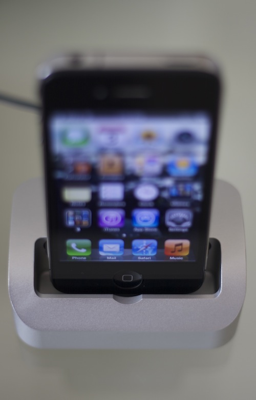
When I had an iPhone 3G, I used Apple's dock on my nightstand. It sucked. It wasn't heavy enough in comparison to the iPhone, so the slightest bump would tip it over. And when you are fumbling for your phone in the early hours of the morning, you're probably going to bump it before you grasp it.

Not only that, but taking the iPhone out of the dock required both hands. Lifting the iPhone single-handedly would bring the dock along with it. That gets old fast.

So, with my iPhone 4, I have been in search of the perfect dock. I've tried many things, and for the past year, I had settled on the Bluelounge Refresh. That was okay, but still required both hands to disconnect the iPhone, and it was a little too large for my small nightstand.

And then, about six months ago, the Elevation Dock was announced on Kickstarter. Its creator, Casey Hopkins, had the same frustrations as me. So he set out to make a dock to vanquish those problems.

It took a long time, but the wait was definitely worth it. Yesterday, two Elevation Docks (one for me and one for my wife) arrived.

Elevation 5
Elevation 5

This dock is awesome. It works exactly as advertised. Here's a few more pictures.

Elevation 1
Elevation 1
Elevation 2
Elevation 2
Elevation 3
Elevation 3
Elevation 4
Elevation 4

There really isn't a whole lot more to say about the Elevation Dock. It is, after all, just a dock. It does one thing and it does it extremely well.

The machining and precision of craftsmanship on the Elevation Dock is outstanding. This is the dock you would have expected Apple to make.

Now, there has been one concern recently surrounding the rumors that Apple may change the dock connector on the next iPhone. Hopkins has assured should that happen, Elevation will make new circuit boards that users can purchase and install themselves (the board is held in by three little screws).

I can't recommend the Elevation Dock enough. It's beautiful. It does what a great dock should do. Elevation Lab is still fulfilling Kickstarter orders, but you can preorder one from their site.

With that, I'm going to leave you with their Kickstarter pitch video, which I think illustrates Hopkins' drive and passion well.

Rethinking the iPhone's App Switcher

Shortly before going to bed last night, I saw that *The Verge had featured something from one of their forum posters. Brent Caswell, aka brentcas, had a pretty neat concept of how the iOS multitask tray could be improved. He focuses mainly on the iPhone, and I really like what he came up with.

By adding another row of apps, I think the multitask tray would gain much more utility in easily switching between several apps. I also really like how he keeps the status bar visible and adds Spotlight search.

I love iOS’s Spotlight search, when I remember it is there. I think it would become much more notorious for use in Brent’s mockup.

I’m also loving his idea for dedicated music and settings sections. As far as his settings mockup goes, I applaud his toggles for Airplane Mode, Bluetooth, Wi-Fi, and 3G (or 4G/LTE, depending).

What I don’t like about his settings mockup is the Clear All button for killing every app. I know many of my friends swear their iPhone performs better when they tediously kill off every app int he multitask tray, but I still subscribe to it being unnecessary. Sure, there is the occasional errant app, but that is the exception, not the rule. In my experience, iOS is very good at managing itself.

In the comments to the post, user ThomasEvans makes the suggestion that instead of Clear All the button should be for activating Personal Hotspot. I’m much more on board with that idea.

I’m sure if someone important at Apple saw this mockup and was inspired to add it to iOS, it would be a little late in the game to include it in iOS 6. Maybe for iOS 7. Or maybe Apple has something better up its sleeve.

Version Three

Earlier today, when my host, design, and content management system Squarespace unveiled an overhaul their styling & theme structure, I got the drive to scratch the redesign itch I have been feeling for quite a while.

I like to stay current with things, and after perusing their revamped styles, I could see that there was a lot more room for customization. So, I settled on the updated and re-envisioned fork of the theme I originally started with, and went to town hacking and tweaking. (I have so much more to learn about CSS).

After a few hours, here we are at techēse v3. Content is front and center. Nav is back up top, instead of being the only thing in an otherwise wasteful sidebar. Generally, everything has been cleaned up. Let me know if anything looks weird, and I’ll do my best to tweak it into submission.

Enjoy the third design of techēse as we head into its third year of existence.

Responsive

Today the Boston Globe launched a redesign. This design is utterly amazing in that it is responsive. What is responsive web design? Well, go visit the Globe's site on your iPhone. Looks great, right? Now turn your iPhone on its side and watch the design adapt to the new width. The same works for your iPad. Or your traditional browser on your computer (go ahead and resize your browser window a bunch and see what happens).

To celebrate, A Book Apart has knocked 20% off their 4th installment — Responsive Web Design — using the code BOSTON today only. I hadn't picked up this book yet, but grabbed it today. I trust it will be stellar, just as A Book Apart's previous publications.

Seeing the Boston Globe embrace something like responsive web design is inspiring. The real treat is how when the screen or window is smaller, the Globe puts content first by sending the ads below the scroll.

More of this, please.

Classic Color Meter

For reasons unknown to anyone outside Cupertino, Apple handicapped their previously wonderful Digital Color Meter utility in Lion. Many folks are probably unaware of its existence, but Digital Color Meter, which resides in the Utilities folder, was great for locking onto a pixel and getting the hex code or just about any other color syntax. I used this all the time.

But Lion's version removes nearly all of its usefulness. I was pretty peeved when I went to use it and it didn't work for my usage anymore.

Thankfully, there's an app for that. A developer named Ricci Adams made Classic Color Meter and put it on the Mac App Store for a buck. Let me tell you, that is a buck well spent.