¶ Apple Finally Fixed the MacBook Keyboard

Back in 2015 Apple released the 12-inch MacBook with a new keyboard mechanism they called the Butterfly Keyboard. One of the advantages of this design was it provided a great deal of stability to the key caps. It also allowed for extremely shallow key travel, which enabled Apple to push its obsession with thinness even further.

But there were disadvantages, too. While this is subjective, the extremely shallow key travel was probably swinging the pendulum too far. While initially excited by the purported awesomeness of the MacBook’s butterfly keyboard, I remember feeling slightly repulsed by the minimal 0.5mm travel when I first tried it out in the Apple Store. I wasn’t confident that I had actually pressed the keys.

And it didn’t take long for reports to start coming out from MacBook owners about reliability issues. It seemed the slightest particulate could wreak havoc on the butterfly mechanism and break it. And, beyond all expectations, Apple went all-in with the flawed design. In 2016 it spread like a cancer to the MacBook Pro line, and then to the beloved MacBook Air line in 2018. All the while, Apple kept revising the butterfly keyboard with new generations to try to mitigate the reliability issues.

In June 2018 Apple began a Keyboard Service Program for any and all notebooks that had the butterfly mechanism, covering repairs for 4 years after the date of purchase. Perhaps most embarrassingly, every new release of a MacBook/Pro/Air was automatically added to the Service Program day and date. This was probably the closest we will ever get to an admission from Apple that the butterfly keyboard was incredibly, deeply flawed.

I have been so cautious about this keyboard that I am still clinging onto my 2012 MacBook Air, hoping it will last until the butterfly keyboard is phased out of a future MacBook Air.


Enough history. I’ve done enough burying of the lede. This morning Apple unveiled the new 16-inch MacBook Pro with all sorts of great specs that I’m sure many pro users will care about, but most importantly they fixed the keyboard!

Apple has returned to traditional scissor switches, and they say they took inspiration from another keyboard that was introduced in 2015 — the Magic Keyboard. I have owned a Magic Keyboard since it was introduced and have used it without issue for years. It feels great to type on and has adequate travel. It’s honestly the best keyboard I have ever used. And I’ve long been a proponent that Apple should just stick that in the MacBook line. I couldn’t be happier at the news.

The new Magic Keyboard adapted for the MacBook Pro has a full 1mm of key travel, increased key stability, backlighting — the works. Apple also eschewed the full-height left and right arrow keys and returned to half-height keys in an inverted-T layout, which should make it easier for many people to quickly orient their fingers for directional navigation. I personally haven’t had an issue with the full-height keys on my external Magic Keyboard or my iPad Smart Keyboard cover, but undoubtedly the inverted-T layout is the better choice for mass appeal.

I enjoyed this particular take from John Gruber’s review over at Daring Fireball:

Calling it the “Magic Keyboard” threads the impossible marketing needle they needed to thread: it concedes everything while confessing nothing. Apple has always had a great keyboard that could fit in a MacBook — it just hasn’t been in a MacBook the last three years.


I have been very grateful for the Apple of 2012 designing the MacBook Air of that era for the long haul. For most of my purposes, my MacBook Air continues to do most of the I need it to, albeit slowly, and despite my eyeballs bleeding on the chunkiness of its non-retina display.

I honestly would have replaced it with the Retina MacBook Air in 2018 if that computer had not come equipped with the butterfly keyboard. I just didn’t (and still don’t) trust that design. The butterfly keyboard tarnished the reputation of the entire MacBook product line.

Marco Arment said it perfectly in his review today:

Following in the footsteps of the fantastic iMac Pro, updated Mac Mini, and upcoming Mac Pro, the release of the 16-inch MacBook Pro ends a painful chapter of neglect and hubristic design of the Mac. Apple has finally turned the ship around.

I fully expect that in 2020 Apple will bring this new Magic Keyboard design to the smaller MacBook Pro and the MacBook Air. And I honestly can’t wait.

¶ Ulysses 16 Brings a Second Helping of Editor Goodness

Back in March my favorite writing app, Ulysses, launched Split View editing on Mac. The idea is simple: Have the ability to open two texts, what Ulysses calls files, side-by-side within the same view. Of course, while the idea sounds simple, the execution was not, even on Mac. From the Ulysses 15 announcement:

See, split view editing sounds simple enough: Just split the editor in half and load a second sheet, right? Well… let’s be 100% us and ask questions first.

And from there they asked approximately eleventy billion questions about how to implement it. And it shows, because they really sweat the details on it and pulled it off smoothly.

It didn’t take me long to ask the Ulysses team how soon that could come to the iPad version.

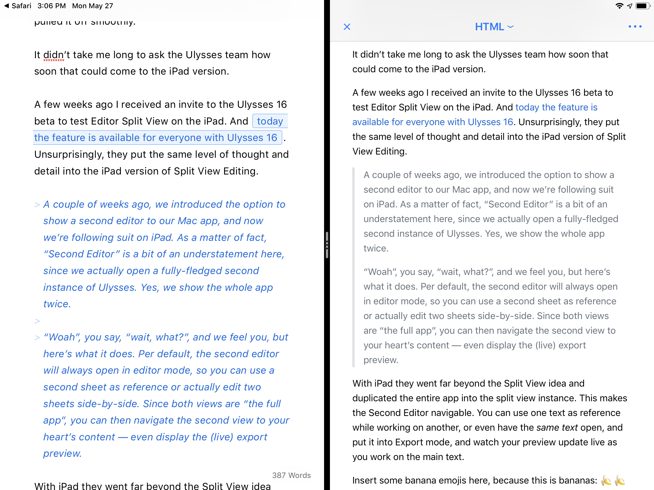
A few weeks ago I received an invite to the Ulysses 16 beta to test Editor Split View on the iPad. And today the feature is available for everyone with Ulysses 16. Unsurprisingly, they put the same level of thought and detail into the iPad version of Split View Editing.

A couple of weeks ago, we introduced the option to show a second editor to our Mac app, and now we’re following suit on iPad. As a matter of fact, “Second Editor” is a bit of an understatement here, since we actually open a fully-fledged second instance of Ulysses. Yes, we show the whole app twice.

“Woah”, you say, “wait, what?”, and we feel you, but here’s what it does. Per default, the second editor will always open in editor mode, so you can use a second sheet as reference or actually edit two sheets side-by-side. Since both views are “the full app”, you can then navigate the second view to your heart’s content — even display the (live) export preview.

With iPad they went far beyond the Split View idea and duplicated the entire app into the split view instance. This makes the Second Editor navigable. You can use one text as reference while working on another, or even have the same text open, and put it into Export mode, and watch your preview update live as you work on the main text.

Split view of Ulysses 16 on iPad, with a live preview of the active text.

Split view of Ulysses 16 on iPad, with a live preview of the active text.

Insert some banana emojis here, because this is bananas: 🍌🍌🍌

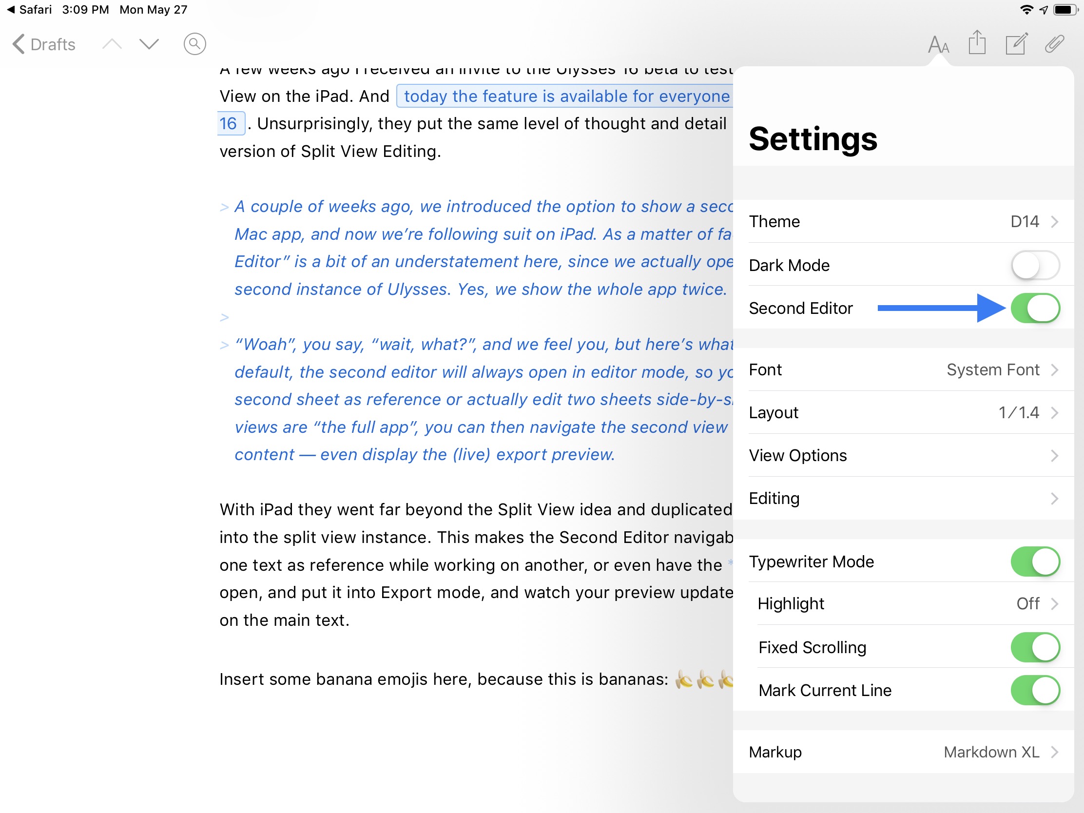
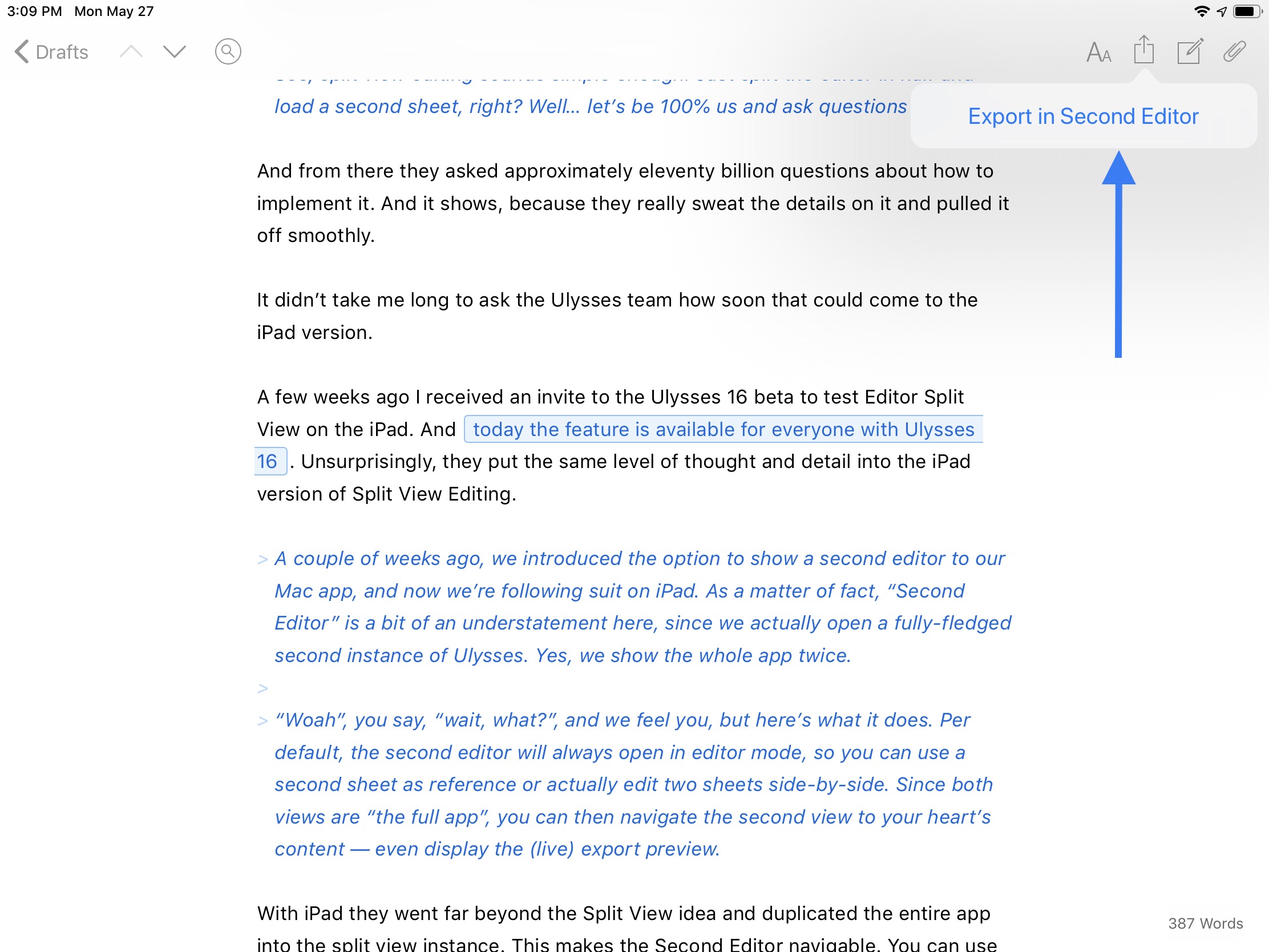
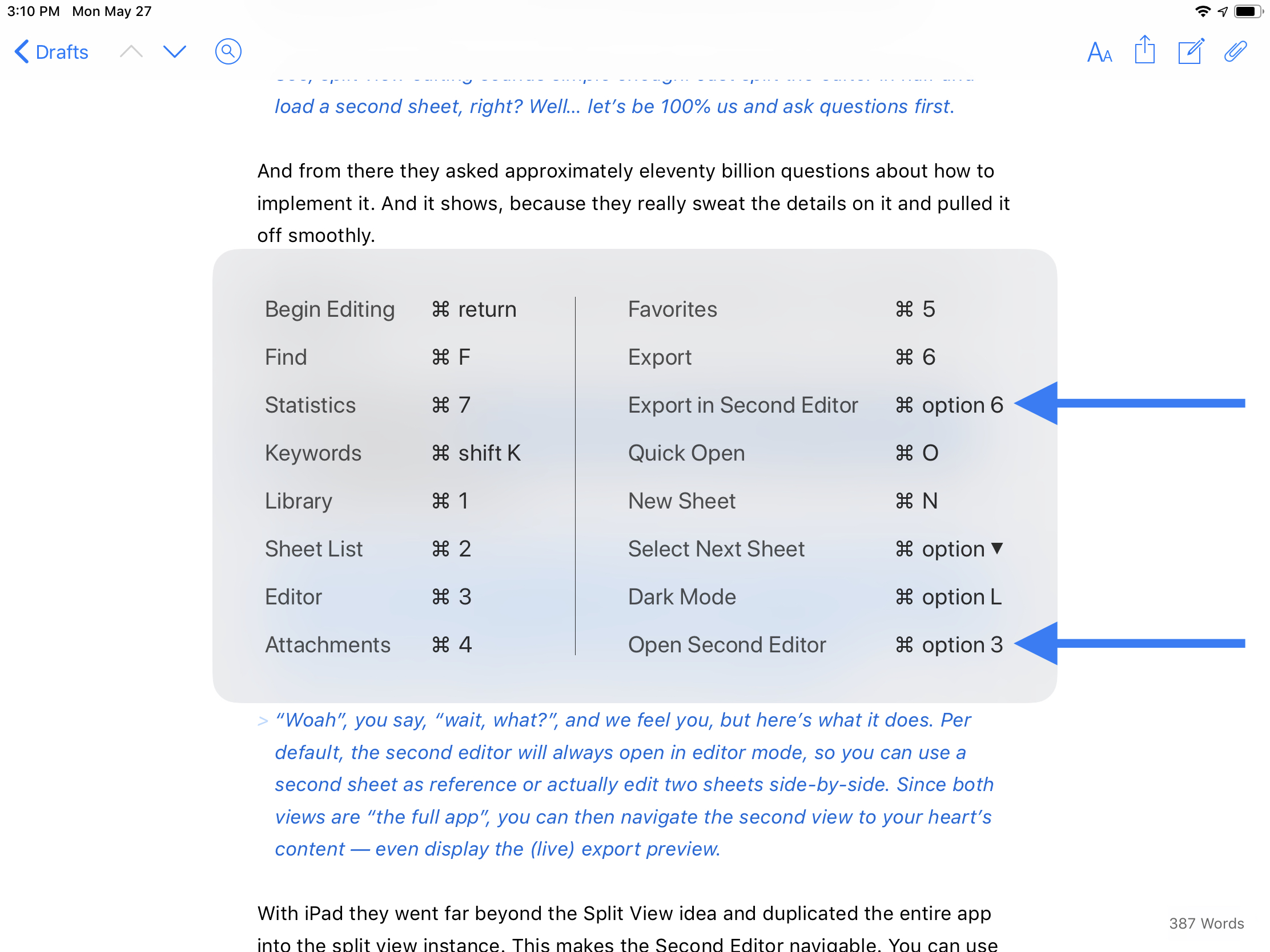
There are four different ways to open the Second Editor, covered in the gallery below.

And finally, the split view instance is adjustable. It defaults to a 50/50 split, but can be adjusted to a 70/30 split. You can tap and hold the drag handle to bring up more options, including a sneaky way to swap the views around or to dismiss one side. You can also dismiss a view by just dragging the drag handle to the edge.

Tapping and holding on the grab handle brings up some neat options, such as a way to swap the editors.

Tapping and holding on the grab handle brings up some neat options, such as a way to swap the editors.

I hope what Ulysses has made possible with their take on in-app split view is a foreshadowing of what Apple may someday do to enhance Split View. Safari has been able to open an pseudo-instance in Split View for a while now, but it cannot be resized or swapped. Ulysses has created a better, more powerful Split View within an app than Apple has done with Safari, and it is now the gold standard to reach for.

Safari’s rudimentary in-app Split View.

Safari’s rudimentary in-app Split View.

If you write regularly for any reason, I highly recommend Ulysses. It is worth every penny of its subscription that enables the Mac, iPhone, and iPad apps. They even offer a discount to students. If anything, check out the 14-day free trial.

I am overjoyed to have this feature on iPad. Even though I love my Mac, my iPad is where my writing juices really flow.

¶ iPhone Batteries and Performance

A little over a week ago Apple addressed the perception some users had about their iPhones running slower. Apple’s statement then:

Our goal is to deliver the best experience for customers, which includes overall performance and prolonging the life of their devices. Lithium-ion batteries become less capable of supplying peak current demands when in cold conditions, have a low battery charge or as they age over time, which can result in the device unexpectedly shutting down to protect its electronic components.

Last year we released a feature for iPhone 6, iPhone 6s and iPhone SE to smooth out the instantaneous peaks only when needed to prevent the device from unexpectedly shutting down during these conditions. We’ve now extended that feature to iPhone 7 with iOS 11.2, and plan to add support for other products in the future.

Put simply, Apple stated (admitted?) that they began limiting the power draw on the battery during peak performance in January 2017 on iPhones with aged batteries that couldn’t handle the load.

I believe Apple in that the goal of this software feature was to prevent unexpected shutdowns, thus extending the useful life of an older iPhone, even if that meant it wasn’t as performant as it was when brand new.

The rest of the Internet seemed to disagree, and took this as proof of the age-old conspiracy theory that Apple intentionally plans the obsolescence of iPhones to drive sales of newer models.

That idea is folly, and ridiculous. Full stop.

This evidence is in the history. Apple offers software and hardware support for older models of phones far longer than anyone else in the industry. They also sell older models brand new at more affordable prices to make sure there is an iPhone model for almost anyone.

It simply does not make any sense that Apple would plan to slow down a brand new older model to push someone to buy a newer, more expensive model. That works directly against Apple’s best interests for itself and its customers.

That said, the perception that Apple intentionally hobbles devices out of greed is one that is rampant, and has been for years. I have family who outright believe it. And Apple’s lack of communication and clarity at the outset of rolling out this feature only helped to sow more distrust.

This afternoon, Apple blinked. They issued an open letter apologizing for their lack of clarity.

We’ve been hearing feedback from our customers about the way we handle performance for iPhones with older batteries and how we have communicated that process. We know that some of you feel Apple has let you down. We apologize. There’s been a lot of misunderstanding about this issue, so we would like to clarify and let you know about some changes we’re making.

First and foremost, we have never — and would never — do anything to intentionally shorten the life of any Apple product, or degrade the user experience to drive customer upgrades. Our goal has always been to create products that our customers love, and making iPhones last as long as possible is an important part of that.

I very much believe Apple in that second paragraph. It fits in line with the history of their actions. To drive the point home further, Apple concludes with action.

We’ve always wanted our customers to be able to use their iPhones as long as possible. We’re proud that Apple products are known for their durability, and for holding their value longer than our competitors’ devices.

To address our customers’ concerns, to recognize their loyalty and to regain the trust of anyone who may have doubted Apple’s intentions, we’ve decided to take the following steps:

  • Apple is reducing the price of an out-of-warranty iPhone battery replacement by $50 — from $79 to $29 — for anyone with an iPhone 6 or later whose battery needs to be replaced, available worldwide through December 2018. Details will be provided soon on apple.com.
  • Early in 2018, we will issue an iOS software update with new features that give users more visibility into the health of their iPhone’s battery, so they can see for themselves if its condition is affecting performance.
  • As always, our team is working on ways to make the user experience even better, including improving how we manage performance and avoid unexpected shutdowns as batteries age.

At Apple, our customers’ trust means everything to us. We will never stop working to earn and maintain it. We are able to do the work we love only because of your faith and support — and we will never forget that or take it for granted.

Apple is making the right moves here. They are carving themselves off a giant piece of humble pie. The forthcoming update to iOS with greater transparency for battery health is how this feature should have been introduced. The $29 battery replacement fee should probably be permanent instead of just for 2018. We’ll see what happens there.

I can’t sum up my thoughts about Apple’s misstep with communication better than John Gruber did earlier today:

The funny thing about Apple is that their communication problems tend to happen only when they don’t communicate at all. This whole iPhone battery controversy erupted only because Apple had never explained what was going on, which opened them up to accusations of nefarious intent. When they do communicate, they do so with clarity, plain language, and honesty. And, when called for — as in this case — humility.

Twitterrific for macOS: A Phoenix from the Ashes

For me, Twitterrific has always been synonymous with using Twitter. I used it first on the Mac in March 2008. I even downloaded the app first, then signed up for Twitter to use it! And Twitterrific was the first app I installed from the App Store on iOS when it launched in July 2008. I tried a couple other clients when they came around, namely Tweetie and Tweetbot, but Twitterrific’s unified timeline always brought me back to the nest.

For the past several years, the Mac version has fallen by the wayside, and I got used to only using Twitterrific on iOS. Then, earlier this year, the Iconfactory set up a Kickstarter to resurrect Twitterrific for Mac as a fresh, modern client. I couldn’t sign up fast enough. The campaign was successful, and all summer I have been enjoying the weekly beta releases as the new Twitterrific took shape.

Twitterrific_macOS_logo.png

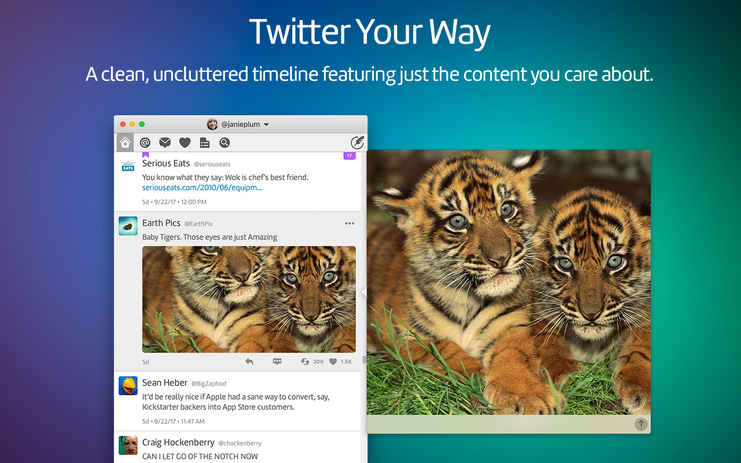
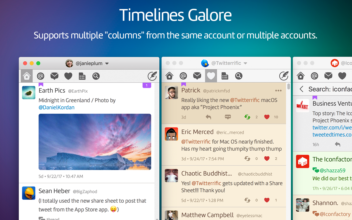
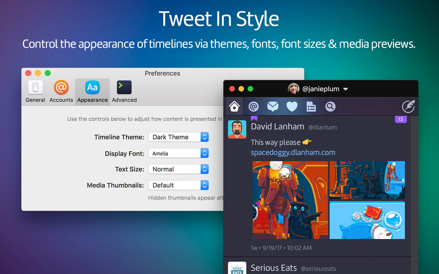
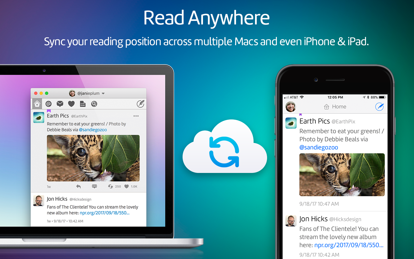
Today, Twitterrific 5.0 for macOS is available for everyone on the Mac App Store. It packs a ton of features into the new app, stays in sync with the iOS versions using iCloud, has fantastic keyboard and accessibility support, delightful sounds, and a few nostalgic Easter eggs from past incarnations.

Beyond any feature, though, is the care that the folks at the Iconfactory put into Twitterrific. It is clearly a labor of love, and the people behind it are genuinely fantastic. I suggest you follow a few of them on Twitter, and say hi. The best part about the Apple community isn’t just the apps we use to change our life and work, it’s the people and friendships made along the way.

In a sea of one-off money-grab apps, there are a precious few with a human story behind them. Twitterrific is one of them. And that’s why it is well worth supporting the team by purchasing Twitterrific for macOS.

Squarespace's New Apps

When I launched techese, I had been yearning to get away from the likes of WordPress. I had settled on Squarespace back then and have been with it ever since. I still wholeheartedly recommend Squarespace to folks who ask me what they should use to create a site.

One thing I have always had issue with was their iOS app. It wasn't all that good back on Squarespace 5, and since Squarespace 6, it has been a bag of hurt.

Thankfully, Squarespace has released two new apps to handle the crowded functions of the previous app.

Blog handles the writing and posting part while Metrics handles all your stats. Both apps are gorgeous and work really well. These were worth the wait. I'm really happy that Markdown is a first-class citizen in the Blog app.

I have two issues which will hopefully be taken care of in updates. The first is that the Blog app is missing the social sharing toggles of the web interface. If it had those, I could truly do everything I wanted with posting from iOS, which would rock.

The second issue is that Metrics doesn't have an iPad UI, so it scales up in the ugly 2x mode.

Beyond those two omissions, the apps work great, are fast, and chock full of the feature set you would expect. I hope Squarespace treats these apps as first class, iterating often, instead of letting them languish as the previous app did for so long.

Twitterrific 5.2 Gets Pushy

Ever since Iconfactory released a long awaited rewrite to Twitterrific last year, they have been hard at work on bringing the classiest Twitter app out there to being extremely powerful.

Their previous update, 5.1, added Muffling, which is muting for users, hashtags, and links done with a spin that only Iconfactory could come up with. And when 5.1 was released, the release notes subtly teased the next update with an auspicious phrase:

Ollie will return in…OCTOPUSHY

Today’s 5.2 update to Twitterrific features Push Notifications. You can receive notifications for Direct Mentions, Replies, Mentions, Favorites, Retweets, and Follows. They even have fantastic little color symbols that show in the notification itself, which I have found handy to know the type of message at a glance.

Right now Iconfactory is launching Push as a beta, with only the first 1000 accounts gaining access today, though they will be rolling out availability over the next couple weeks. This is being done to ensure their servers are able to handle the load. If you weren’t able to activate push yet, try again the next day to see if you can. Once your account is enabled, it can be enabled on any other number of devices.

There are all sorts of other updates in 5.2. A couple other new features are profiles now show Twitter’s banner images (and look great!) and discussions can be shared via email or Storify.

Some of the improvements are that the timeline can now show 600 tweets at a time up from 400, improvements to username autocomplete, and the load more button now animates as loads, along with a laundry list of other improvements and fixes.

If you are looking for the friendliest Twitter client out there, you need Twitterrific. Everyone’s favorite blue bird costs just $2.99 in the App Store.

Watch Apple's October Event Live Today

A couple years ago Apple live-streamed a couple of their events, which was amazingly awesome. Then they stopped — until now.

Today at 10:00 am PDT, you can watch the Apple Event live from an iPhone, iPod touch, iPad, or a web browser or you can watch on a special Apple Event channel that appeared on Apple TVs all over this morning. (You may need to reboot the Apple TV to see the channel appear).

I’m glad to see the return of live-streaming, and I’m pretty thankful to be a remote worker from home.