¶ WWDC 2017 Wish List

With Apple's Worldwide Developers Conference kicking off tomorrow, it seems to be about the right time to put out the good old last-minute wish list. There have been a number of rumors swirling about, including rumors of some hardware announcements, but surprising few (if any?) actual leaks.

It’s natural to expect previews of Apple’s next iteration software platforms: macOS, iOS, watchOS, and tvOS. I also expect to hear about updates to Apple Music, Apple Podcasts, and iCloud.

This year my wish list rests chiefly on one topic: the iPad Pro.

iPad Pro

I’ve been rocking an iPad mini for quite a few years now. I’m using it more as my main personal computer, and the Mac as the occasional truck for increasingly rare heavy tasks. As the iPad has taken a larger role in my day-to-day, I find I am wanting a bit more room to spread out. I’m ready to move to an iPad Pro.

The 10.5-inch iPad Pro

While I’m not all that interested in going from an iPad mini to the gargantuan 12.9-inch iPad Pro, I am very interested in the rumors of a 10.5-inch iPad Pro taking the place of the current 9.7-inch iPad Pro. And the rumors make a great deal of sense.

Dan Provost made a great observation when the 10.5-inch iPad Pro rumors began.

When the original iPad Pro 12.9" was introduced in September 2015, Phil Schiller demonstrated the reasoning for that sizing by illustrating that the width of the new iPad is the exact same dimension as the height of the 9.7" iPad.

This has the advantage of essentially having two full height iPad apps, side by side.

Now, imagine Apple doing the exact same thing, but with the iPad mini.

The math works out perfectly. This new 10.5" iPad would have the exact same resolution as the 12.9" iPad Pro (2732 x 2048), but the same pixel density of the iPad mini (326 ppi instead of 264 ppi). Crunch the numbers, do a little Pythagorean Theorem, and you end up with a screen 10.5" diagonal (10.47" to be precise, but none of Apple’s stated screen sizes are exact). In terms of physcial dimensions, the width of this 10.5" screen would be exactly the same as the height of the iPad mini screen.

The ability to run two full portrait iPad apps in Split View would be a great distinguishing feature between the iPad Pro line and the regular iPad line, in addition to the Apple Pencil and Smart Keyboard accessories. I foresee the 9.7-inch iPad Pro we know today going away, and the latest refresh to the regular iPad being the sole occupant of the 9.7-inch form factor.

3D Touch

I love 3D Touch on my iPhone 7, and greatly miss it when using my iPad. 3D Touch feels like right-click on a traditional computer — a quick shortcut to common tasks. Having this available on a larger screen would really open up some options for iOS to shine on iPad hardware.

Physical refinements

I feel like it is time for Apple to move on from the chamfered edges on the iPad. They feel like an overused and outdated design detail in 2017, considering the look debuted on the iPhone 5 in 2012. I’d rather see the glass curve slightly to meet the aluminum like the iPhone 7. Bonus points if the iPad Pro comes in black aluminum like the iPhone 7.

iOS 11

Putting the Pro in iPad Pro

The mass consensus I have seen on other sites and heard on podcasts is that it is time for iOS to embrace the iPad in a significant way. As much as I love my iPad, iOS has always taken the iPhone form factor as a priority. With iOS 9 in 2015 Apple bolted on some iPad-only features with Split View and Slide Over, but those features remain today as they were when the launched. They still feel like they were bolted on instead of custom designed.

I’d like to see iOS bring a lot of polish to a refined iPad experience. No one outside of Apple has envisioned this better than Federico Viticci in his iOS 11 Wish List. I encourage you to read the entire post for his deeper explanations around his ideas, but you absolutely must watch the Concept Video he and Sam Beckett created, which I have also embedded below.

Federico has many terrific ideas in this video. It's safe to say that the most prominent is drag & drop between apps in Split View. This has felt like a missing piece to the puzzle ever since Split View was introduced.

Amazingly, not long after Federico's concept was released, app developer Readdle updated its suite of productivity apps with their own implementation of Drag & Drop between their apps when running in Split View.

It is freaking magic. It works exactly as you would naturally think, and it is done some seamlessly you would it was a built-in feature of iOS.

Beyond Drag & Drop, I'd like to see iOS add a better app picker in Split View on iPad. Federico's concept of that is terrific.

Finally, John Gruber had pondered the idea of putting a trackpad on the iPad Smart Keyboard. At first, I scrunched my nose at the idea, thinking he was insinuating adding a traditional mouse cursor to the screen, but he cleared that up right away. He first talks about using it to move the text insertion point around. That would be welcome, as using the current two-finger gesture on the screen when using an external keyboard is cumbersome.

I was far more intrigued by John's second thought:

tvOS’s UIFocusEngine. That’s the interface framework that allows Apple TV to be controlled by a trackpad or game controller without an on-screen mouse cursor. On Apple TV, you don’t move a cursor around, you move the selection around. Two years ago Steven Troughton-Smith discovered that an incomplete version of UIFocusEngine was built into iOS 9.

This makes so much sense. tvOS uses a lovely 3D animation to icons and buttons to give them depth and tell the user that item is selected. It would feel right at home on iOS if using a trackpad on a Smart Keyboard.

In Summary

I'm practically drooling for a 10.5-inch iPad Pro. I really hope 3D Touch is added to its gorgeous screen. I hope the enclosure gets with the time and receives a nice update to where the glass meets the metal.

I want iOS to leap ahead on the iPad and help the platform take off. It needs to bring a few more paradigms over from traditional computing but reimagine them for the world of touch. Drag & Drop,easier access to apps and data, and embracing the Smart Keyboard even further would all be welcome additions.

Here's to seeing what apple brings us tomorrow.

How to Shoot on iPhone 7

Apple built a terrific page on its website with a variety of short videos showing how to take better photos with iPhone 7. Each of the 16 videos focuses on one brief lesson, demonstrating a photography tip in 3-5 steps.

The videos are produced well, fun, and above all practical. I think there is at least one technique everyone with an iPhone will benefit from in these videos.

Many of the videos illustrate the use of exposure control, which is a technique I think many people don't know about on iPhone. It is easily one of the best things for anyone to learn to make their photos better, and these videos explain the benefits very well.

My favorites of the videos are How to shoot without flash and How to shoot with street light. They both show how a great photo can be taken in low light without using the obnoxious flash.

Check out the videos and then put them into practice. If you shoot something you are especially proud of, let me know on Twitter.

LEGO Ideas Saturn V Launches in June

Just in time for my birthday.

The Saturn V simply looks incredible. The attention to detail is — for lack of a more appropriate word — stellar. Moon exploration has fascinated me since I was a young boy. I had a giant poster of the Moon in my bedroom, a Saturn V pog container (remember pogs?), and many space themed LEGO sets. Ask my folks.

I hope to add this to my collection soon.

Twitterrific for macOS re-hatches with Project Phoenix

I’ve been using Twitter for nearly a decade now and Twitterrific for Mac was what first got me hooked on the service. Over 72,000 tweets later and I still use Twitterrific (on iOS) every day. It’s safe to say that this app is my most used app.

I loved Twitterrific on the Mac, and while I understand why it was put in the parking lot of development to focus on iOS, I have always missed it. And I know its creators at The Iconfactory have missed it as well.

That’s why I’m excited to see that they want to bring it back with Project Phoenix on Kickstarter.

If funded, The Iconfactory plans to have a minimal app ready around August 2017 with t he following features:

  • Unified home timeline
  • Multiple account support
  • Composing, replying, and quoting tweets
  • Muffles and mutes
  • Streaming
  • Themes
  • Delete and edit your own tweets
  • Sync timeline position with iOS
  • VoiceOver Accessibility
  • Keyboard control
  • Attaching images to tweets
  • Timeline search (text filter/find)
  • Open links to other tweets, profiles and media in your browser

If they reach the stretch goal, they’ll add these in a major version release:

  • Direct messaging
  • Read, create, delete saved searches
  • Read lists
  • Built-in Twitter search
  • Built-in quick media viewer (images, GIFs, videos)
  • Built-in conversation and threaded tweet viewer
  • Built-in viewer for user profiles
  • Alt-text attachment when tweeting images
  • Searching for and getting suggested users while composing

And finally, if they reach a victory lap goal, they’ll add:

  • Simple list management (create, edit, delete)
  • Manage drafts and sync them with iOS
  • Dock-less mode
  • Built-in profile editor so you can change your bio, avatar and more
  • Trends
  • Video upload
  • Geolocation

That would pretty much bring it to feature parity with the amazing iOS version of the app. I chipped in, and if you love using Twitter and want to support a team that truly cares for the platform, you should too.

¶ AirPods | Review

The iPhone 7 famously removed the 3.5mm headphone jack that has long been on most audio devices for as long as I can remember. In its stead, Apple offered three solutions:

  1. A Lighting-to-3.5mm adapter, included in the box.
  2. An updated version of EarPods, now featuring a Lightning connector, also included in the box.
  3. Go wireless with bluetooth headphones.

To emphasize the third option Apple unveiled their new wireless AirPods. They look nearly identical to EarPods, as if someone had taken a scissors and snipped the cables off. For storage and charging the AirPods slide into a case not much larger than a container of floss, which houses a battery for on-the-go charging and a Lightning connector to recharge the case itself.

Apple promised to deliver the AirPods in October, shortly after the iPhone 7 launched, but something came up that necessitated a delay. Consequently, they launched right before Christmas. And thanks to some quick action by \Santa\ my wife, I had a very nice Christmas gift under the tree.

The Setup

AirPods are ridiculously easy to setup. With my iPhone unlocked I just flipped open the charging case with the AirPods inside it. I brought the case about an inch from my phone and a little card slid up from the bottom of the screen with a Connect button. Tapping that instantly paired them to my iPhone.

And since I use all Apple devices for my computing, iCloud synced that pairing to my iPad, Apple Watch, MacBook Air, and (presumably) the MacBook Pro I use at work.

Switching between devices is as easy as selecting the AirPods from the audio output list on the device I want to use them with. Sure, it’s not as easy as unplugging the standard headphone jack and plugging it into another device, but it’s also not difficult and the AirPods switch between devices pretty quickly.

The Fit

I’ve been using Apple’s iconic white earbuds since I bought my first iPod back in college. Those initial earbuds didn’t fit great the sound was subpar. Nonetheless I wore them because they were iconic. They were a status symbol, and college-me was a bit vain.

In 2012 Apple revised their earbuds when they introduced the EarPods alongside the iPhone 5. EarPods promised a better fit and better sound. For me, they delivered on both fronts. I’m willing to entertain the thought that one night Jony Ive snuck into my room while I was sleeping in order to take an injection mold of my ears. That’s how well EarPods fit me.

My wife, on the other hand, cannot use EarPods. They fall right out of her ears. And if she can manage to keep them in for any length of time, her ears begin to hurt. You’re mileage will vary.

In short, AirPods fit exactly like EarPods. If you like the fit of EarPods, you will love the fit of AirPods. If EarPods won’t stay in your ears, then AirPods likely won’t either.

The Experience

AirPods sound great. The audio quality is a little richer than regular EarPods, as they have a bit more bass to them. It’s not a dramatic improvement, but it is noticeable. And that bass isn’t too heavy; it is just enough to give a nicer sound.

One place I’ve longed to have wireless headphones is at the gym. Inevitably I always catch the EarPods’s cable and painfully yank them from my ears. AirPods solve this completely. They are truly wireless, and they stay put in my ears no matter how much my head jostles.

One part of the gym I hadn’t considered before is when I am changing back to my regular clothes. Normally I would need to pause whatever I am listening to so I could change, as the cable is in the way. With AirPods, I can change my shirt without any issues, so I can keep listening.

AirPods also do the right thing in my car. While listening to music as I left the gym, I got into my car, started it, and plugged my iPhone into my Griffin iTrip Aux. The audio switched from my AirPods to my car stereo without skipping a beat. A moment later I double tapped the right AirPod, the music paused, and Siri activated via the AirPod. I asked Siri to call my wife, and it connected the call through the AirPods. When I finished the call, the music resumed through the car’s speakers. Perfect.

Another nice touch is removing just one AirPod from my ear pauses playback, which is handy when I am ordering coffee and want to pause my music and show the barista I am listening to him or her. Popping the AirPod back in resumes playback.

The Aesthetics

AirPods are nice looking, however, they do look a bit dorky in your ears. Family members have joked that it looks a bit like I have Q-tips hanging out of my ears. It is kind of amazing how removing the cable from the earbuds drastically ups the nerd factor.

I have to wonder how the AirPods would look in a Jet Black finish. I bet that would look pretty sweet.

The Battery

Each AirPod has a tiny battery in it that is supposed to last up to 5 hours of use. The case they slide into is their recharging station, itself having a battery in it that provides up to another 24 hours of charge. The case recharges via a Lightning port on the bottom.

So far battery life seems to meet expectations, but I haven’t given everything a thorough rundown yet.

What is really nice is that the AirPods recharge quickly. 15 minutes in the case will give them 3 hours worth of juice.

The Downsides

There is one major downside to the AirPods compared to EarPods. The EarPods have an inline remote with volume and playback controls. These controls are really handy and quick to use.

With AirPods there’s only a single control gesture: double tap. This can be set to Play/Pause or to activate Siri. That’s it. And it is one or the other. There is not a way to quickly adjust volume or go forward or back a track. To do that you need to activate Siri, speak a command, then wait for Siri to do what you asked.

What I have decided to do instead is tap the side button on my Apple Watch, tap Now Playing, and use that to adjust volume or track selection. It works, but it is a bit of a pain. That said, it is faster than having Siri accomplish the same task.

I hope Apple can add more tap gestures to the AirPods via an update. I’d really like to see taps mimic the inline remote of AirPods. Single tap for Play/Pause, double tap for track forward, triple tap for track backward, and tap & hold for Siri.

Maybe single tap is not available so you don’t get a false positive on activation. If that is the case, perhaps double tapping the left AirPod could handle Play/Pause and double tapping the right AirPod could handle Siri.

Wrapping Up

AirPods are probably one of the neatest gadgets I’ve used in recent memory. There’s a ton of technology packed into these tiny earbuds and that allows them to do things the way you’d expect in almost every situation. It’s clear that Apple spent a lot of time sweating the details to make AirPods delightful to use.

If the standard EarPods fit your ears, I think the AirPods are a must own for any iPhone user. The experience is magnified if you use other Apple products like an iPad or Mac.

In the wake of the uproar over the iPhone 7 removing the 3.5mm headphone jack, the AirPods succeed in completing Apple’s story of a wireless future.

On Apple’s Nostalgia

This morning Apple announced a new photo book chronicling roughly the past 20 years of Apple's designs. It is dedicated to the memory of Steve Jobs. I've seen some folks on Twitter taking umbrage with that dedication, noting that Steve Jobs was adament to not dwell on the past.

I enjoyed Stephen Hackett's thoughts on Apple being nostalgic:

The point is that while nostalgia was not part of Jobs’ DNA, it has resurfaced in Apple’s. The company is changing, and part of that includes things like this new book.

Some find it troubling or uncomfortable, but I don’t think it is. A photo book of Macs and iPhones isn’t what is keeping Apple from releasing a Mac Pro. A promo video including the iBook G3 didn’t force the company to remove MagSafe from its new notebooks.

Apple can continue to push ahead, even as it allows itself the occasional glance in the rearview mirror. The company has an amazing history, and it’s okay to be proud of it.

It is absolutely okay for Apple to be proud of its history. I'll go a step further and say that in the post-Jobs Apple, it is necessary for Apple to remember the roots established by Steve Jobs.

This wasnt necessary when Steve was with us. He was present to continue driving the vision — his vision — of Apple. Steve is gone. If Apple doesn't take moments to look back and remember that vision, then Apple may lose its way.

As long as the of today and the Apple of tomorrow continues to glance back at its roots, I think it will stay true to course.

Iconfactory's Spooky Sticker Packs

Halloween has always been a favorite festivity of mine. My parents would go all-out for Halloween parties for me and my friends when I was a kid. I loved dressing up, gathering up a horde of candy, and going to local science museum which transformed into a haunted house every year. Halloween carries a lot of traditions for me.

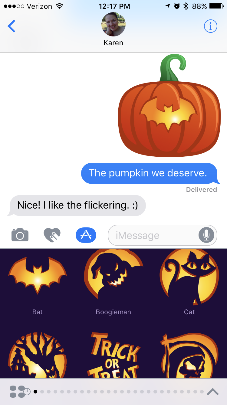
One tradition I have come to appreciate over the years is when The Iconfactory dresses up its website to celebrate the spookiest of holidays. This year the gang has gone further by dressing up iMessage with a trick-or-treat bucket’s worth of Spooky Sticker Packs.

Ravenswood, Macabre, & Spook On

First up are Ravenswood, Macabre, & Spook On. These packs feature ghastly portraits from Ravenswood Manor, familiar faces of this frightening holiday, and spooky stickers that are eerily realistic with their peeled edges.

All three packs are 99¢ when purchased separately, or $1.99 when purchased in a bundle. As of this writing, the bundle was still in review with iTunes.

BoneHeadz

Have you ever wondered what lies beneath the yellow skin of the smiley emojis? BoneHeadz goes beneath the surface to reveal the horrors and hilarity underneath! This pack makes no bones about it and can be yours for 99¢.

Hack-O-Lantern

As I mentioned before, I love traditions around this time of year and there isn’t a tradition more well known than carving a Jack-O-Lantern. It is something my family does every year and it is a fond memory of carving out a pumpkin with my mom.

I don’t always get to see mom around Halloween, and now we can have fun long distance with Hack-O-Lantern. It’s easy as pumpkin pie to do: pick a pumpkin and get hacking with various carvings and accessories. Scooping out the guts of an innocent pumpkin will run $1.99, which is cheaper than going to the pumpkin patch.

Lore

I think I’ve saved the best for last. One of my favorite podcasts the past year or so has been Lore. Each episode is thrilling and draws you in deep right before…the end, mwahaha! Seriously, though, Lore is amazing and you should listen to it. The Iconfactory and Lore have teamed up for hunt of the peculiar with a special Lore sticker pack. The artwork is amazing and fits right in with the podcast, so be sure to get this pack for $1.99…before it gets you.

Wallpapers

Each of these sticker packs comes with an wallpaper for your iPhone. To get the wallpaper, scroll down in the sticker pack and tap the pack’s name, then Save Wallpaper. These wallpapers are the perfect decorations for your home screen.

Vanishing Like the Invisible Man

It’s worth noting that most of these sticker packs are limited editions. When October is gone, they will no longer be available to purchase. That said, when you purchase them, you can use them year-round, as they’ll still be available on your device and for re-downloading.

BoneHeadz and Lore will be "sticking" around all year long.

The Iconfactory is making all sorts of amazing Stickers for iMessage, so be sure to grab these limited edition packs, and check out their other packs, as well.

Further Spitballing on Pairing Over Lightning

John Gruber, spitballing on what wireless headphones from Apple may look like in the charging and pairing department:

Spitball: What if Apple is planning on Bluetooth earbuds that include a Lightning jack, like the Pencil? Plug them in to the device you want to pair them with, click “Pair”, and you’re done. Easy to charge, too.

It's worth noting Apple has done this with more than the Pencil. The new Magic Keyboard, Magic Trackpad 2, and Magic Mouse 2 all pair to a Mac, and charge, via a USB to Lightning cable.

Further, I wonder if such headphones would have a female Lightning port on them, rather than male, so they could pair to a Mac via Lightning like the keyboard, trackpad, and mouse do. The solution for pairing on iPhone and iPad may be a cable with male Lightning ports on both ends.

Either way, I think pairing to a device over a cabled connection is far more elegant than doing it via Bluetooth settings.

Iconfactory's 20 Years of Pushing Pixels

Iconfactory is easily one of my favorite companies in the Apple community. And today they are celebrating 20 years of honing a hobby into a craft.

I have used a lot of their apps over the years and still do today. Twitterrific is my go-to Twitter client. xScope is godsend when you need precision designing a site or graphic. Their new app BitCam is just plain fun, and today they launched Exify, which looks like a great tool for serious photographers.

Some of their now-retired apps that are still near and dear to my heart are CandyBar, Ramp Champ, Astronut, and Frenzic.

And beyond their apps, they have made an impact on the technology community as a whole with their impeccable icon design services. Even if you don't know of The Iconfactory I guarantee you'll recognize their work. They made the iconography for Windows XP and the emoji for both Twitter and Facebook Messenger.

I have long admired the work of the fine folks at The Iconfactory, and wish them another successful 20 years.

¶ Instagram’s New Colors

About 6 months after iOS 7’s release, I started to roll my eyes when an app would be updated and its icon still looked like it belonged on iOS 6. With Instagram, my eyes did a lot of rolling. For years.

Until yesterday.

Yesterday Instagram updated its iconic (har har) icon. And the reaction from the Internet was, as one would expect with such a drastic change, visceral. Some loved it, and most really did not.

My initial reaction was actually quite pleasant. It’s a daring departure for Instagram, but I like the approach. It’s fresh. Nonetheless, I thought I’d let my thoughts marinate overnight to have more than a 30-second knee-jerk reaction. And you know what?

I still like the icon. It looks at home on iOS. It’s not blue like so many other icons. It stands out on my home screen. I like it.

As a quick aside, Buzzfeed applied Instagram’s new gradient color to other company logos. Most of them look pretty good. I especially like it with Starbucks and Coca-Cola.

The icon isn’t the only change, though. The app itself has effectively been rid of color aside from the photos. While I wonder if the pendulum swung a bit too far on this, I don’t mind the change. The focus is really on the photos, and they really pop now. I imagine some hints of color in the interface will make their way back with time.

Overall, I am really digging the visual refresh in Instagram. The only way this update could have been better in my eyes is if Instagram added an iPad version.