Clear for Mac

A recurring theme the past two years or so with Apple’s stance on the future of the Mac is to take the best of iOS and bring it back to the Mac. And in some ways, though fewer, the Mac brings something to iOS.

Inevitably, there are apps that start on iOS and come back to the Mac. One the most shining examples I have seen yet is Clear for Mac by Realmac Software.

Clear is a simple and stylish to-do list manager. The latest iPhone update brought iCloud support in preparation for the Mac. The brand new Mac version of Clear is truly a Mac app inspired by iOS, heavily taking advantage of multi-touch trackpads. Pinching, swiping, and scrolling are the key elements to navigating Clear interface, and it couldn’t be more fun with the nifty sounds accompanying the gesture-driven experience.

Keyboard ninjas will be happy, too, as everything you could do on the trackpad can also be accomplished by keyboard shortcuts.

If you are looking for a quick, easy, and simple to-do manager for iOS and Mac that syncs effortlessly and instantly, Clear is awesome.

You can get it for iPhone for $1.99 and get it for Mac at an introductory price of $6.99 (until Sunday, November 11). After the 11th, the price will increase to around $13.99, I think. I’d get it now.

¶ Five

The original iPhone fundamentally changed the way we think about phones. And not just cell phones — all phones. I’d even go so far to say the iPhone changed how we think about computers in general. Just look at how iPhone-like OS X has become over the past five years.

The iPhone changed how we interact with computers and devices, touching our content directly rather than abstractly using a cursor. It made the things of science fiction become science fact. The iPhone, thanks to being a monolithic slab of glass, literally becomes whatever is displayed on the screen. It becomes a communication device. It becomes a source of information. It becomes a compass, a level, a video editor, an assortment of instruments, a photo album, and any number of insanely imaginable things. It becomes the portal with which we are connected to people all over the world.

Undoubtedly, the iPhone fundamentally changed everything.

The iPhone 5 fundamentally changes the way we think about the iPhone.

If the iPhone of yesteryear becomes whatever is on its screen and is a portal to connecting us with the world, and the iPhone 5 is the first iPhone to change the size of that portal — even by a half of an inch — that is a significant, fundamental change that forever changes what the future of the iPhone will be.

We’re already starting to see it reflected in the App Store. Most developers are simply expanding their apps’ content area to fill up the screen. But some developers are rethinking how their app looks and works with that extra space.

Apps like CNN and Dark Sky have embraced new layouts on the iPhone 5. The interaction model hasn’t greatly changed, but there is more room for the imagination to consider how to make the best app for a new generation of devices.

I’ve read many articles saying the iPhone 5 is simply “more of the same” and that it isn’t revolutionary. Honestly, on first blush, it is absolutely an iteration. But if the people making the apps we love allow their imaginations to drift a little further, I believe a whole new breed of amazing ideas will come to fruition.


I began by talking about the original iPhone. I remember my first time using one in an Apple Store in Seattle, just a couple weeks after it launched. It was remarkably beautiful. That design was amazing, and I loved the metal back.

The next year, when I was able to get an iPhone, I was sad to see the metal back exchanged in favor of plastic on the iPhone 3G. A little bit of the feeling of luxury had been taken away. Two years later, with the iPhone 4, the luxury was back, better than ever, with the all-glass design and the metal band.

The iPhone 4 was amazing. But I did still miss the original iPhone’s style from the brief moments I spent trying one. Those moments had really stuck in my mind.

The iPhone 5 feels like the perfect marriage of the best of the original iPhone and the best of the iPhone 4. Everything about the physical feel of the iPhone 5 is unbelievable. It is incredibly thin. So thin that you may, at first, think it could easily be snapped in half. Yet the metal unibody structure contradicts that notion.

But what really seems impossible is the lightness.

I can’t get over the lightness.

The iPhone 5 is so light that when I took it out of the box it felt like a hollow shell. Yet every part of it doesn’t feel like something that was assembled. It really feels like it is one solid piece — that it was always just the finished form. Far and away, I have never owned anything made with this level of precision.


Cameras are precision instruments. I cannot believe how complex the lenses are to my Canon 40D. Even the 40D itself is a product of precision.

And I love taking pictures. I don’t use the 40D as much as I’d like. With a young child, it is often difficult to wield a large, bulky camera everywhere we go.

With the iPhone 4, it felt like the camera in the iPhone finally became something serious. Its photos were comparable to many point & shoot cameras — sometimes better. It was at this time I started taking more pictures with my iPhone than a traditional camera.

The iPhone 5 camera is shockingly good. It performs an order of magnitude better in low-light. It captures quickly, is sharper, and the colors come out better (even under those awful fluorescent lights).

Face detection is fantastic for focusing quickly on my son, who can never seem to sit still for more than a few seconds.

My favorite feature is the panorama mode. It is ridiculously easy to do. What impresses me the most is that as soon as I’m done capturing the pano, it is ready to be viewed. There is zero additional processing time, unlike taking an HDR. And they look incredible.

They say the best camera is the one you have with you. One of the things I look forward to with each iPhone I’ve had, more than anything, is the improvements to the camera.

I doubt an iPhone will ever replace the quality of shots I can get from my DSLR, but for my iPhone being the camera that is always with me, I have every confidence that the quality of the photos on the iPhone 5 can stand the test of time.


There is simply no better device out there right now that you could spend your money on. The iPhone 5 is the most well-made, beautiful, and functional item I have ever purchased.

There is not a doubt in my mind that if you are in need of a phone that is more than a phone — but also an excellent camera and a multitude of anything imaginable thanks to the imagination of people’s apps — that you should get the iPhone 5.

¶ Day One

On and off over the years I have tried my hand at journaling. It has never stuck. I have several reasons behind why it I have never done well with it.

  1. I’ve never really set a clear purpose for journaling, hence motivation to do so wanes quickly.
  2. I hate writing by hand, partly because my penmanship is terrible.
  3. I never felt motivated to really try journaling via a text file or an app, directly related to reason 1.

Then I read Shawn Blanc’s review of Day One. I had seen Day One in the App Store before, but hadn’t given it much thought, because I never had a clear reason to journal.

Then Shawn wrote this:

As a writer, I believe journaling on a regular basis is critical. It’s writing that will never be judged. It’s writing that doesn’t require an editor. It’s the only place where I am completely free to write for my truly ideal reader: a future me. I have my own inside jokes, my own running story arc, my own shorthand. I love the freedom to write whatever I want, however I want, with no need to make it tidy or clear or concise. And I have no doubt that it makes me a better professional writer.

I realized I had always attempted journaling with the thought that my audience would be someone who would eventually read it. It had never crossed my mind that I could just write for myself and not worry about that writing being judged or analyzed. I could have fun with it.

So I’m giving Day One a shot. I bought the Mac & iOS apps, and after a couple weeks I’m happy to say I have stuck with it.

Being able to attach photos is a nice touch to tie words more vibrantly with memories. I love the automatic tagging of location and weather. Most of all, though, I like brig able to journal from anywhere. I can be at my Mac, or use my iPhone or iPad. iCloud keeps it all in sync.

Most of all, I think I am learning how to approach writing more casually and have more fun with it. Journaling is a new avenue for me, one I like taking a daily stroll down.

You can get Day One for Mac for $5 on the Mac App Store and Day One for iOS for $5 on iTunes.

¶ OS X Mountain Lion | Review

Intel adopted a development strategy in 2007 called “Tick-Tock”, which essentially consists of a “tick” — a shrinking of process technology of the previous microarchitecture — and a “tock” — a new microarchitecture. One year they do a tick, the next year they do a tock.

For the past 5 years, Apple seems to have adopted the spirit of this strategy, except they tend to move in more a tock-tick fashion — something big, then refinement.

We have seen this strategy in two high-profile areas at Apple:

  • iPhone hardware — think iPhone 3G (tock) to iPhone 3GS (tick), iPhone 4 (tock) to iPhone 4S (tick), and
  • OS X — Leopard (tock) to Snow Leopard (tick), Lion (tock) to Mountain Lion (tick).

OS X Leopard changed many things in OS X. Snow Leopard followed and didn’t present too many changes visible to the user, but laid groundwork behind the scenes for big changes.

Those big changes came just a year ago in the form of Lion. Lion made the initial leap from the diving board into bringing concepts from iOS to the Mac.

What was promised to be a plunge of perfect form ended up having the slightest of belly flops.

A year later, we have OS X Mountain Lion. Mountain Lion brings many great new features to the table on its own. It could almost be mistaken for a tock-level magnitude of change, but it truly is a tick-level refinement. Where Lion flailed, Mountain Lion is full of grace.

iCloud

When Lion was released one year ago, it did not come with built-in iCloud support — that came in the 10.7.2 update alongside iOS 5 in October. Though I’m sure Apple was designing Lion with iCloud in mind, they left a major component of iCloud out when they added support.

Documents in the Cloud

Documents in the Cloud is Apple’s answer to seamlessly moving files between all your Mac and iOS devices. Unfortunately, this support was pretty much left out of Lion. It was there, but Apple didn’t support it in any of its own apps, and left third-party developers to figure out how to implement it on their own.

Thankfully, Apple has provided a user interface for Documents in the Cloud with Mountain Lion, which they implement in their own apps and third-party developers now have a standard implementation.

iCloud Open/Save Dialog

If you’ve used any of the iWork apps on iOS, the iCloud document chooser should look very familiar. You can create one hierarchy of “folders” by dragging one document on top of another. To remove the folder, simply drag everything back out of it.

You’ll notice in the screenshot above that you can toggle between iCloud and On My Mac. Selecting the latter will switch you to the more familiar Finder-based file system you know and love. Naturally, if you place a file on your Mac, it will not synchronize via iCloud across devices.

One thing that I have noticed about iCloud that is pretty neat is that you can have the same document open on, say, your Mac and iPad. As you type on one, it near-instantly updates on the other. It’s quite something to behold.

But there is a great downside to Documents in the Cloud, in my opinion.

Information Silos

I use Byword as my main text editor. Most of the things I write for this site these days start as a plain-text file in Byword. If I drop that text file into Byword’s iCloud storage, I can only access it from Byword on the Mac, or the Byword iOS app. I can’t, for instance, open that text file in iA Writer or even OS X’s TextEdit.

And speaking of TextEdit, if I saved the text file in its iCloud storage, there would be no way for me access it on an iOS device — only from another Mac running Mountain Lion with my iCloud ID logged in.

Documents stored in iCloud are trapped within a silo. And that silo is the app the file was saved into.

I have an idea for a solution. I hope Apple redesigns Documents in the Cloud to be more like it.

Solution: File-type Document Storage

My proposed solution is to organize files by type. Group all .txt files together, all .pdf files together, etc. Then, allow an app to make a declaration to iCloud telling it which types of files it is able to open. iCloud then displays only those file types to that app.

Under this model, I could save a .txt file to iCloud through TextEdit on my Mac, then open it from Byword or iA Writer on either my Mac, iPhone, or iPad since those apps would declare they are able to open .txt files.

If anything, I think the user-facing aspect of this is even more simple than it is currently. A user would no longer need to remember which app they used to create and store a file. If the app they launch has the ability to open the file, then that file is displayed.

Syncing

iCloud is used for other things than documents, of course. It is the backbone of keeping user data in sync across devices. This facet of iCloud was implemented in Lion quite well. I don’t have any hard evidence, but syncing of things such as contacts and calendars seems much faster and smoother in Mountain Lion.

Consistency

When Lion was announced in October 2010, it was billed as bringing the best of what Apple had learned from iOS back to the Mac. Lion began obfuscating the file system of the Finder slightly with things like Launchpad, which shows all your apps in an iOS-like home screen, and Auto Save, which removes the worry of having to continually hit command-s to save, and it even preserves an untitled document if you close the app, restoring it when you next open the app.

Mountain Lion goes further with bringing consistency between iOS and OS X. We’ve seen some apps get renamed and some new apps appear.

Reminders, Notes, Calendars, Contacts, and Messages

Reminders and Notes have existed in OS X for some time. Reminders was tucked away inside iCal and Notes was in Mail. Now those are separate apps, still named Reminders and Notes, and their interface matches that of their iOS counterparts.

As for iCal and Address Book, they have been renamed to be in line with iOS as well. Now we have Calendars and Contacts. Besides Reminders and Notes being spun off to their own apps, Calendars and Contacts have not changed all that much from Lion, except that they both have sidebars again, as they did in the pre-Lion era.

In Lion, your list of Calendars appeared in a popover and your list of groups in Contacts could only be accessed by flipping a ridiculous page in a skeuomorphic brown book. Both of those have been replaced by sidebars (thankfully). It turns out that form and function can coexist, and all my gripes about these two apps from last year have pretty much been absolved.

iChat has also been renamed, but also drastically changed. It is now Messages, and primarily acts as a Mac-based interface for iMessage. You can still use AOL Instant Messenger, or Bonjour, etc., but they are buried quite a bit. I haven’t really missed the IM aspect, as I enjoy iMessage much more as I can start a conversation on my Mac, then leave and continue it on my iPhone, fairly seamlessly. Messages on the Mac has some bugs, but it is much better than the public beta that was released in February for Lion. iMessage definitely feels like the future of text messaging. I don’t foresee myself using AIM very often going forward.

Oddly enough, with all the renaming for consistency, System Preferences retains its name, instead of becoming Settings, like its iOS counterpart.

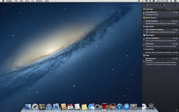
Notification Center

Notification Center. Source: Apple.com

Notification Center is another example of the trend of “Back to the Mac” continuing in Mountain Lion. Notification Center was a complete revamp of how notifications worked in iOS 5. Instead of all notifications plastering a modal dialog over whatever you were doing, banners could slide in along the top and slide roll away after a moment. Swiping down front he top of the screen on an iOS device would reveal the Notification Center, where all notifications yet to be acted upon would be collected.

Mountain Lion brings Notification Center to the Mac. All notifications are presented in a consistent manner by swooping into the upper right. If it is an alert (such as a Reminder or Calendar event), it will have Close and Snooze buttons and will stay on the screen until acted upon. If it is just a banner such as for an incoming email, it will remain for a moment, then zip off the right edge of the screen if you don’t act upon it.

To then reveal the Notification center, simply swipe with two finger front he right edge of your trackpad, or, if you are a mouse user, click the new icon that resides in the upper right corner of the menubar.

Notification Center can be accessed at any time from any app. If you don’t want to see notifications for a time, reveal the Notification Center and scroll down a little to reveal a toggle to disable alerts and banners. They will remain disabled until you toggle the switch back, or they will automatically resume the next day.

Another nice feature is if you connect your Mac to a projector and start a presentation, banners and alert will be disabled until you are finished.

Do Not Disturb
Do Not Disturb

Voice Dictation

The iPhone 4S brought Siri, a digital personal assistant which you activate and use with your voice. The retina iPad included Voice Dictation, which is one facet of Siri’s abilities (the retina iPad will be gaining Siri in iOS 6 this fall).

Mountain Lion includes Voice Dictation for any Mac with a microphone, whether that microphone is built-in or external via USB.

You have to opt-in to Voice Dictation via System Preferences, as it captures your voice, then sends it to an Apple server to be processed, which then sends back the text results. It also uploads the contents of Contacts, so it can begin learning names you may say.

The default keyboard shortcut for Voice Dictation is double pressing the function key (fn fn). When you are done speaking, simply click Done or tap fn once more.

You do need to learn a little bit of syntax when using it. It can’t distinguish punctuation by your inflection (maybe someday, right?) so you need to say “comma” to get a , or “question mark” to get ?.

So, let’s have some fun. Here is a little script of what I will tell Voice Dictation to type:

This is a test of voice dictation on oh ess ten period will it succeed or fail question mark I’m hoping it worked exclamation point

So, here is what I expect it to type for me:

This is a test of voice dictation on OS X. Will it succeed or fail? I’m hoping it worked!

And here are the actual results, with no second tries or corrections on my part:

This is a test of voice dictation on OS X. Will it succeed or fail? I’m hoping it worked!

Perfect. And I’m even sitting in a noisy coffee shop with five people chatting at the table next to me and music blaring over the speakers.

Much like how using the Faces feature in iPhoto or Aperture gets better the more it learns a person’s face, Voice Dictation will supposedly learn your voice over time to better interpret any accent you may have and to better distinguish your voice amongst other noise (I’ve been using it a lot, so I’m not really surprised by my results).

Sharing

Since the early days of iOS, we’ve become familiar with the little icon of a rectangle with an arrow leaping from it. That icon is how we share things from one app to another. Tap it in Photos and you can Message a photo, email it, send it to Twitter, and more.

We’ve even seen this icon make an appearance in iPhoto in years past.

Now the Share button is nearly ubiquitous in Mountain Lion. It’s in the Finder, in QuickLook, Safari, Notes, and more. You can even secondary-click on just about any file and see Share in the contextual menu with relevant services listed for that file type. Right click on a picture and you can share to Twitter or Flickr, a video will allow sharing to Vimeo. Just about anything can be shared to Mail, Messages, or AirDrop.

Sharing is Caring
Sharing is Caring

Aside: See? If the Share button can show relevant services based on file type, and hide the irrelevant, then why can’t iCloud do the same with files and apps, as I mentioned earlier?

Social

iOS 5 brought system level Twitter integration, and iOS 6 will bring Facebook integration. In Mountain Lion, Twitter support is baked right in, with Facebook coming concurrently wight he launch of iOS 6.

Notification Center can display banners for your mentions and direct messages. Notification Center also has a Tweet button for you to send a tweet without launching an app (Facebook button will be right alongside it this fall).

You can tweet a picture from just about anywhere. You can share a link from the Share button within Safari.

All in all, I really like the ability to share things quickly straight from OS X without needing to launch a Twitter client or a browser, especially when I am trying to get things done. It allows the ability to share a quick thought without being tempted to spend ten minutes reading tweets from the past couple hours.

AirPlay

AirPlay’s roots are actually found in iTunes on the Mac and the AirPort Express. It used to be called AirTunes and let you send music from iTunes to speakers connected to an AirPort Express.

With iOS 4, AirTunes was renamed to AirPlay, and was expanded to the iPhone and iPad, and allowed not just audio, but video, to an Apple TV. The iPhone 4S and iPad 2 and later can also mirror their screens to an Apple TV.

Mountain Lion brings AirPlay to the Mac (well, some Macs — mid-2011 or later models. Mine doesn’t qualify). I tested AirPlay with my wife’s MacBook Air, and it works quite well. You can mirror your entire screen along with audio to an Apple TV.

If your Mac is too old for AirPlay support, I suggest you check out AirParrot, which should bring AirPlay to your Mac.

Safari

Mountain Lion ships with Safari 6, which sports some refinements, adds some neat features, takes away a feature, and is super fast.

Gone are the separate address and search fields. They have been replaced by the Smart Search Field, which looks and acts much like Google Chrome’s Omnibar. I about did a backflip when I saw this.

There is also a new Tab View. When you have multiple tabs, a new button appears next to the Add Tab button. Clicking it — or, if you have a trackpad, pinching your fingers from wide to close — pulls the tab bar down and apart, and reveals all your tabs as visual pages. You can then swipe between them.

Safari
Safari

Safari also has a feature called iCloud Tabs. I haven’t had a use for this yet, as it would require me using another Mac. The idea is that you click this little iCloud button and it shows a list of open tabs on your other Mac. Selecting one will open it on the Mac you are using right now.

iCloud tabs will become much more useful when iOS 6 is released this fall, as it will also include open tabs from your iPhone, iPod, or iPad. I expect I’ll use iCloud tabs heavily after that, as I will love being able to access tabs between all three of my devices.

Reading List in Safari gains Offline mode. When you add something to Reading List, Safari will cache the page so you can view it offline. It’s nice, but it’s no Instapaper replacement, if you ask me.

Safari also tackles privacy by adding Do Not Track in its preferences. Sites like Twitter and Facebook track you while you are logged in. They accomplish this via other sites that include their share and like buttons. Do Not Track is an initiative being adopted by browsers to tell sites that perform such tracking to knock it off. Twitter has openly committed to abiding by Do Not Track if the user turns it on. You can find it in the Privacy section of Safari’s preferences. I highly recommend turning it on.

Safari did remove one major feature — RSS. It’s been removed to such an extent that it has become difficult to detect an RSS feed address to send over to apps like Reeder. Thankfully, Daniel Jalkut made a Safari Extension called Subscribe to Feed that replaces Safari’s ability to detect RSS feeds.

Security

Aside from Do Not Track in Safari, OS X has doubled-down on Security in a big way. There is a new sheriff in town and its name is Gatekeeper. With the Mac App Store, Apple has the ability to revoke the certification of an app should it become nefarious.

However, with apps outside the App Store, Apple has no control.

Until now.

Developers can now obtain (and they should) a Developer ID from Apple. This Developer ID is a digital certificate for a developer to “sign” his or her apps with, thereby signifying that they are known and trusted by Apple.

Gatekeeper has three levels of security:

  1. Mac App Store. This setting only allows App Store apps to be installed.
  2. Mac App Store and identified developers. This settings allows App Store apps and Developer ID apps to be installed.
  3. Anywhere. This is the setting we have always known on the Mac, allowing apps from anywhere and from anyone to be installed.

The default setting is the middle of the road (hence why developers should obtain a Developer ID).

This is a huge benefit for users. If they download an app that is Gatekeeper compliant, it installs without a problem. Should the developer of that app go rogue and ship an update to turn it into malware, Apple can revoke that developer’s ID and the app is dead in its tracks.

With Developer ID being the default setting, this should curtail any future malware attacks significantly.

Some think this is just the first step of Apple locking down the Mac to an App Store only model like iOS. I don’t think that is the case. If it were, I don’t think they would have devoted the time to creating Developer ID. They would have just done it. That is Apple’s style, after all.

Apps outside the App Store have a bright future, in my opinion. And a little extra security is a good thing.

Mac App Store

In Lion, system updates came from Software Update and the App Store only showed updates for apps purchased via the store.

In Mountain lion, the App Store handles both app updates and system updates. The screenshot below shows updates that normally would have been Software Update (I unfortunately didn’t have any App Store app updates at the time).

App Store Updates
App Store Updates

Notification Center will also let you know when updates are available via the App Store.

Minutiae

You can rename a document while it is open from the title bar. Just hover the cursor near the title at the top of a document and click the little triangle that appears to the right. Select Rename… and you can edit the name right there. This is one of my favorite little features Mountain Lion.

Save As… was excised in favor of Duplicate in Lion. Now Save As… is back. From the File menu, hold down the option key and Duplicate will change into Save As…, also revealing its keyboard shortcut of option-shift-command-s. I never got the hang of Duplicate, so I am very glad to have Save As… back.

Lion introduced a natural language way of adding a new calendar event by clicking the + button in the upper left of Calendars. I always found it tedious to type all that out instead of just filling out the little popover form for a new event. With Mountain Lion’s Voice Dictation, I click that +, tap fn fn and speak the natural language of my event details. Works like a charm.

The Finder shows a little progress bar on a file’s icon when copying it to/from a server or connected drive. You can also rearrange the sections of the Finder’s sidebar now.

QuickLook used to work only by clicking a QuickLook button in the Finder or tapping the spacebar after selecting a file. Now you can simply do a three-finger tap on the trackpad to QuickLook a file.

A three-finger tap on a word will bring up a Dictionary popover for that word (in Lion it was a three-finger double tap — simplification).

Launchpad now has search. While in Launchpad, just start typing the name of an app to narrow things down.

Mail has a new feature called VIP. Click the star next to a sender’s name to make them a VIP. Mail automatically collects all messages from that sender into a VIP inbox. If you have multiple addresses for that sender in Contacts, Mail grabs messages sent from those addresses as well.

Messages can send files via iMessage up to 100MB. That’s nice.

Notes supports photos and attachments, rich text, links, and bulleted and numbered lists. Notes can also organize notes into folders. I imagine all this will come to iOS 6.

Photo Booth can set your Twitter profile picture.

Oldie-but-a-goodie: This was actually in Lion, but it deserves mentioning again. You can sign your name on a piece of paper, then, using Preview, hold it up to the FaceTime camera on your Mac, and capture it for use on forms.

Scroll bars in Mountain Lion expand when you hover the cursor over them, so it’s easier to scroll a web page or document.

You can now backup to multiple drives using Time Machine, for extra backup goodness.

Buying Advice

OS X Mountain Lion is just $20 from the Mac App Store. Unlike last year with Lion, you will not be able to buy it on a USB stick.

Here’s some really good news: if for some reason you skipped OS X Lion and you are still on Snow Leopard, you can pass Go and collect $200 go straight to Mountain Lion for the same $20.

Mountain Lion is a no brainer. Usually the initial release of a major version of OS X is pretty buggy. Mountain Lion is the most stable version of OS X I’ve ever installed. It’s better than Lion’s latest release of 10.7.4.

Mountain Lion is a great update and you should get it. Period.

Side Note: You should probably also consider ditching the mouse (if you haven’t already) and investing in a Magic Trackpad. OS X is becoming increasingly gesture-based. Even the gesture-enabled Magic Mouse is limited. The Mac these days is made for trackpads. You should get on board.

You can watch videos of OS X Mountain Lion’s main features here or look over the 200+ features here.

¶ Elevation Dock | Review

I don't think anybody really likes using just the cable that comes in the box when they set their iPhone down at night to charge. I'm certainly no fan of just laying my phone down flat on my nightstand.

And since the iPhone's first day, Apple has known this, too. They included a charging dock in the box with the first iPhone. A year later, with the iPhone 3G, they realized people would probably drop a cool $30 on one, and they decided to instead sell it as an accessory.

When I had an iPhone 3G, I used Apple's dock on my nightstand. It sucked. It wasn't heavy enough in comparison to the iPhone, so the slightest bump would tip it over. And when you are fumbling for your phone in the early hours of the morning, you're probably going to bump it before you grasp it.

Not only that, but taking the iPhone out of the dock required both hands. Lifting the iPhone single-handedly would bring the dock along with it. That gets old fast.

So, with my iPhone 4, I have been in search of the perfect dock. I've tried many things, and for the past year, I had settled on the Bluelounge Refresh. That was okay, but still required both hands to disconnect the iPhone, and it was a little too large for my small nightstand.

And then, about six months ago, the Elevation Dock was announced on Kickstarter. Its creator, Casey Hopkins, had the same frustrations as me. So he set out to make a dock to vanquish those problems.

It took a long time, but the wait was definitely worth it. Yesterday, two Elevation Docks (one for me and one for my wife) arrived.

Elevation 5
Elevation 5

This dock is awesome. It works exactly as advertised. Here's a few more pictures.

Elevation 1
Elevation 1
Elevation 2
Elevation 2
Elevation 3
Elevation 3
Elevation 4
Elevation 4

There really isn't a whole lot more to say about the Elevation Dock. It is, after all, just a dock. It does one thing and it does it extremely well.

The machining and precision of craftsmanship on the Elevation Dock is outstanding. This is the dock you would have expected Apple to make.

Now, there has been one concern recently surrounding the rumors that Apple may change the dock connector on the next iPhone. Hopkins has assured should that happen, Elevation will make new circuit boards that users can purchase and install themselves (the board is held in by three little screws).

I can't recommend the Elevation Dock enough. It's beautiful. It does what a great dock should do. Elevation Lab is still fulfilling Kickstarter orders, but you can preorder one from their site.

With that, I'm going to leave you with their Kickstarter pitch video, which I think illustrates Hopkins' drive and passion well.

¶ The New iPad | Review

When the original iPad was released, I, of course, wanted to get it. But I had an internal struggle, one which I hadn’t quite felt when it came to buying a new device out of Cupertino — there wasn’t a clear place for it in my digital life. I had my MacBook Pro. I had my iPhone. The iPad was new, and it wasn’t clear if it be a fad or not.

I bought the first iPad, and found it useful for some tasks, like browsing, email, and Twitter. As developers made new apps for it, I found a few more uses. But one of the things that kept me from using more than I expected was the iPad being hindered by its shape. It was hard to hold comfortably, and it wobbled when it was set on a table. It had just an odd-enough shape to make it difficult to read for long and to type.

So I was pleased when the iPad 2 fixed that problem. A relative wanted to buy my original iPad, so I upgraded to the 2. By this time, the iPad app ecosystem was established, and I found myself able to do many things on the iPad that I would normally turn to my Mac for. And in addition to the better shape of the back, combined with the Smart Cover, I found myself taking my iPad all sorts of places. Since late-2011, I have found myself using the iPad nearly as much as, if not more than, my Mac.


I remember how astounded I was a couple years ago when I upgraded from the iPhone 3G to the iPhone 4. Not only was it markedly faster, the brand new retina display left me in awe. It was simply…unbelievable. Everything on the screen was so clear, so crisp, that it looked as if the display were a glossy photograph. And thanks to the iPhone 4’s LCD being laminated to the glass, everything displayed looks as if it were painted on the glass.

I still catch myself being amazed by it.

The iPhone 4 was released after the original iPad. From the moment I saw the retina display of the iPhone, I knew we would eventually see it in an iPad. As we all know by now, that day has come.

The New iPad’s marquee feature is the retina display. It’s beautiful. Where the iPhone’s retina display looked like a printed photograph, the iPad’s looks like a glossy magazine. The retina display shows off sharp text and photos. Colors are richer and more vibrant than ever.

However, the pixels don’t look painted on the glass, since the iPad’s LCD and glass are not laminated. The two do seem to be closer together than on previous iPads.

The retina display is truly the big seller for most people. When you see it, you’ll know why.

The other big draw is something I can’t testify to, as I purchased the Wi-Fi only model. The models that can connect to a cellular network now use LTE, which, from all accounts I’ve read, is ridiculously fast.

The rear camera saw a huge improvement, and equals the same clarity of 2010’s iPhone 4.

Some internal things were bumped up, as well. The GPU is now quad-core to handle a couple million more pixels and RAM was increased to 1GB from 512MB.

But how does the new iPad feel in use? Honestly, a lot like the iPad 2. Animations are definitely smoother, but overall performance feels a lot like an iPad 2.

That’s not the only thing that feels like an iPad 2. It physically feels the same, even though it technically isn’t. The new iPad got a half-millimeter thicker and an ounce or two heavier. I think both of these are due to the much larger battery inside, which is needed to keep the retina display going for the same 10-hours of use the iPad is known for.

Truthfully, I can’t perceive the increased thickness. I noticed the weight right away, but it is far less than the original iPad, and after nearly two weeks, I’ve become used to the extra ounce or two.

It’s also been going around the web that the new iPad gets hot on the lower left corner. There is a definite warm spot after a while, but I wouldn’t call it hot by any means. It is warm, and just warm. The difference is barely perceptible from the ambient temperature.

Where the original iPad and the iPad 2 felt like something from the future, the new iPad may as well be pure fantasy, because the screen is just that good. Apple has continued to chisel away at this idea that computers are complex. The truth is that all computers are quite complex. Complexity has this unfortunate side-effect of causing people to be apprehensive. For too long people have had to attempt to decipher a bunch of technical specifications to sort out whether they are getting the right computer.

The iPad puts an end to that. Worry less about how fast the processor is or how much memory is included. Pick it up. Use it. It’s fast. It works. And you won’t believe your eyes.

¶ Byword for iOS | Review

If there is one genre of app that I have more than my fair share of, it’s text editors. Since launching techēse, I have been seeking the perfect writing environment that gives me the least resistance to getting words written. I started with OS X’s TextEdit, and eventually found myself doing my long form writing in TextMate after I began writing in Markdown.

TextMate worked for a time. It is very much a coding environment. And even though Markdown is a syntax that relates to code, it is very much a writer’s syntax versus a coder’s syntax. TextMate is great for coding. But it has never satiated the writer in me.

I started using Byword just about a year ago on my Mac, when it added Markdown syntax highlighting and declared its focus to be the best Markdown editor for writers — which it most definitely is. In fact, nearly every article here has been written in Byword.

Byword is great on the Mac. But often I want to write on my iPad, and even sometimes, though rarely, on my iPhone. I’ve used Dropbox to sync and either Elements or iA Writer, which are both fine writing apps. But I have long wished for Byword on my iOS devices.

Today, the wait is over. Byword for iOS is here.

I’ve been beta testing Byword for iOS since early December last year. It’s a universal app with iCloud and Dropbox support.

Byword for iOS also has a handy keyboard accessory which shows word and character counts (tap it to switch between the two or show both simultaneously). The accessory can also. Be swiped to show quick cursor arrows and common syntax used when writing in Markdown. There are two different parts of the accessory for Markdown, pictured below.

Byword Keyboard Accessory

Byword also allows you to preview Markdown, export as HTML, send as an email, and print. It also includes TextExpander support.

Byword for iOS doesn’t yet have the dark theme like the Mac version, but it is coming in a future update.

I’d be remiss if I didn’t mention the update to the Mac version, which now has iCloud integration. iCloud on the Mac is still pretty clunky when it comes to setting up files to be synced. That’s definitely a limitation of OS X Lion, which should be alleviated this summer by OS X Mountain Lion’s revamp of the Open/Save dialog.

First, on the Mac, you have to save the file locally. Then, while the file is open in Byword, you click the File menu and then click Move to iCloud. Once the file is in iCloud, everything becomes pretty seamless. Setting up a file within iCloud on iOS is straightforward. Just click the + button from the file list and give it a name.

In fact, you can have the same iCloud file open on your Mac, iPhone, and iPad, then type on one device and watch it appear on the other two a moment later. It really feels like magic.

Byword for iOS is a fantastic, well-designed app that gets out of your way and let’s you write. It also has the best Markdown-optimized keyboard accessory I have seen on iOS yet, making it hands-down the best tool for a writer using Markdown.

If you are a serious writer, you need Byword.

Byword for iOS is being introduced at $2.99 $4.99 on the iOS App Store, and Byword for Mac is $9.99 on the Mac App Store.

P.S. This entire review was mainly written on the iPad, with a little bit on the iPhone and Mac, kept in sync the entire time with iCloud.

¶ Clear | Review

I really like lists. Seriously, it’s an OCD obsession, one I believe was passed down from my mother, who is the Queen of 3M Sticky Notes. I sort of picked up that tendency to plaster my desk with sticky notes, even though the clutter created by the act is incredibly annoying to a person who likes to keep things tidy (another OCD obsession).

Ever since I got an iPhone, I have been trying to find a great to-do app to take care of lists of things to do. Needless to say, I was thrilled when Apple released Reminders with iOS 5 because of it’s ability to write once, yet have my lists available across my three devices. And for the most part, it works pretty well.

Though Reminders falls short in two areas:

  1. On the Mac, they are currently shoved into iCal, which actually makes it quite difficult to deal with things if you keep multiple lists (this is fixed in Mountain Lion this summer, thank goodness).
  2. It’s really hard to sort items in Reminders by priority. It takes many taps, and, even then, you sometimes aren’t able to put the top priority item at the top of the lists.

Because of this, I find myself really using Reminders for items that either need an alarm or location alert. I’ve been using sticky notes for my daily to-do lists again. And my desk has been cluttered because of it, which annoys and distracts me.

Enter Clear by Realmac Software, Milen, and Imending, Inc., released last week. Clear is a new to-do list app for the iPhone that is re-imagined around gestures, instead of check-boxes and buttons.

To start a new list, you just pull down slightly or pinch apart between two existing lists, and type a name. Need to move the list up or down amongst other lists? Just tap and drag to where you need it.

Tap into list, and you are presented with a nice inspirational quote. Pull down slightly to add a new item, and type. Items are limited to holding 30 characters, encouraging brevity. Just like with lists, items can be added by pulling down again, or pinching apart between a couple items. Reordering works the same, too.

Reordering is where the good stuff happens. Put the important stuff at the top, and the less important stuff at the bottom. A visual gradient is applied between the list items to give a sense of priority, much like a heat map (which is, appropriately, the name of the default theme).

Swipe an item to the right to mark it as done, and it grays out and move below the last item of the list with a strike through it. If you decide you don’t need an item anymore, swipe to the left to delete it. As you mark items as complete, you get a progressive tone that is reminiscent of an old NES game about a plumber. When all items are complete, pull up to clear you list with a triumphant jingle to go along with it.

I have found that my favorite things about Clear are how fast I can add items and how easy it is to determine priority at a glance. It has pretty much taken over as my go-to place to jot down items as they hit me. It’s also earned a prominent spot on my iPhone — it sits right next to Twitterrific, so I am sure to see it often and tap into it.

I have one thing I would love for Clear to add in an update, and that is syncing with my iCloud Reminders. I love Clear’s interface, but it would be great if creating a new list in Clear made the change in Reminders across my devices. Then, if I do need an alarm of geolocation alert, I can switch to Reminders and add that, but I can use Clear as my main way to view and act on items.

I highly recommend giving Clear a shot for simplifying your daily tasks. It’s on the App Store for 99¢.

¶ Kindle Touch | Review

There’s a saying that goes something like “in order to be a good writer you need to be a reader”. I love to write, and before college I was an avid reader. Throughout college, I read a lot more, but only educationally, not recreationally. And then, a couple years ago, I started dipping my toe back into reading for fun when my folks gave me a Kindle 2.

As I began to become a reader again, I noticed something about my reading preferences — I really prefer a device like a Kindle over a paper book. Here’s why:

  1. Books can be awkward to hold, especially hardcovers.
  2. Books can be super portable, or they can feel like a brick. And that changes with each book.
  3. Pages rip. I have a knack for doing that for some reason.
  4. Sometimes books, especially library books, smell a bit like mold. Which I’m allergic to.
  5. Books take up a lot of space. My wife and I have two large and two small bookcases to hold our books.

Needless to say, I really liked my Kindle 2. I also admired its vision. From my write-up of the Kindle 2 a couple years ago:

In the “Welcome to Kindle” letter on the device when I turned it on initially, CEO of Amazon Jeff Bezos said that one of Kindle’s goals was to get out of the way and let you experience a book.

I still believe the Kindle 2 did the best it could to strive for that goal, but it fell short.

  1. The frame was a distracting white.
  2. I often inadvertently hit the next page button prematurely.
  3. Following that, I always had to remember the previous page button existed only on the left side, and that on the right side — where I am usually holding the Kindle — has a Home button in the corresponding area. Hence I often went Home when I was just wanting to go back a page.
  4. The keyboard was wasted space for something that gets used so little when reading.
  5. Although the metal back felt sturdy, the plastic on the front felt cheap and flimsy.

I really think my largest gripe was the keyboard. It took up a third of the length of the device. Really, the only time the keyboard is used is to search for new books, which I only did for about two minutes each month (I’m not the swiftest reader).

There was a lot to improve on. Which Amazon aimed to do with the Kindle Keyboard (née Kindle 3). The device became lighter, smaller, and the plastic color was changed to a dark gray (thought Amazon did make white models, they did not really promote them).

I played with a friend’s Kindle 3 a few times, and admired its Pearl E Ink display, which was leaps and bounds better than the Kindle 2’s display. But it still had that keyboard, and the page turning buttons felt even flimsier than the Kindle 2’s.

Enter the Kindle Touch. The Kindle Touch embraces everything I love about the Kindle and does away with everything I disliked about the Kindle 2.

Hardware

The Kindle Touch is tiny. The E Ink screen is the same size as that of the Kindle 2 & 3, but the bezel around it is only large enough to give you a comfortable place to rest a thumb. No more, no less. Speaking of the bezel, it — and the rest of the Kindle Touch — is a gunmetal gray. It seems about perfect for nearly any reading environment.

Though the Kindle Touch’s body is entirely plastic, it is well constructed. There isn’t a single part that really feels like cheap plastic. Feeling around there are no signs of give, flimsiness, or squeaking. The build is solid, and the lack of a metal back makes the device feel light as a feather.

The Pearl E Ink screen is beautiful. The contrast is a night and day difference from the Kindle 2. Also, I was worried that with the Kindle Touch being, well, touch-based it would suffer from severe fingerprint grime. I’m pleased to say that whatever Amazon coated the screen with wards off fingerprints completely. I have yet to notice one.

There are only two buttons on the device — a home button in the center of the bottom bezel and a sleep/wake button located near the center of the bottom edge of the device. I’ve read other reviews that were less than thrilled with the sleep/wake button, saying it is accidentally triggered often. It is a precarious spot to put such a button, but I haven’t had issue with it. I haven’t once accentually triggered it, even while resting that edge on my chest when reading in bed. I do think Amazon could make one of three improvements to it, one via software update, two as refinements to future models:

  1. Instead of the button activating by a slight press, as it does now, adjust the activation to require holding the button for a few seconds.
  2. Make it a sliding switch, like the Kindle 2 had, or…
  3. Move it to the top of the device.

Touchscreen

Even though the Kindle Touch is a “touchscreen”, it isn’t the type of touchscreen we have come to know and love à la the iPhone and iPad. This is still very much an E Ink screen, meaning it refreshes slowly. In fact, the screen itself is not touch sensitive. The bezel is about a millimeter deeper than the non-touch Kindle, and that millimeter holds a thin infrared transmitter/receiver that puts an invisible grid just above the screen.

The touch event happens when your finger interrupts the grid. The software then translates the interrupted grid sectors to a location on the screen and accepts it as input. Pretty snazzy.

(I should also point out it isn’t just fingers that can trigger touch events. Anything that can interrupt that grid will do the trick — such as a lock of long hair or a towel brushing it. That could be frustrating at the gym if you aren’t careful).

You do need to exercise a little patience when navigating. Tap, wait, then you will see the screen refresh with the action. E Ink is still pretty slow compared to LCD touchscreens. That said, getting around on the Kindle Touch is far easier and less frustrating that using that five-way navigator on non-touch Kindles.

The keyboard is now part of the touchscreen. You can reliably tap out words as fast as you want. The E Ink screen will lag in showing you what you have typed for a few seconds, but the IR grid software doesn’t miss a beat. I haven’t had a typing error even when tapping out a search at my normal touchscreen typing speed. I certainly didn’t expect the keyboard to perform as well as it does. In fact, I really think it is faster than pecking stuff out on the Kindle 2.

Pagination is accomplished through Amazon’s EasyReach system. The screen is divided into three sections. The top quarter of the screen is reserved for accessing the menu. The remainder of the screen is divided into two unequal sections. The larger section on the right — about four-fifths of the screen — is for advancing to the next page. The slim left section goes to the previous page. Honestly, much simpler than the flimsy side buttons. The next page section, which will be tapped the most, is easily accessible with either thumb when reading. I tend to hold the Kindle with my right hand, and I can slightly roll my thumb over the edge of the bezel and trigger the next page without fear of dropping the device. EasyReach is really an appropriate name.

Battery

Amazon claims a two-month long battery life for the Kindle Touch. I obviously haven’t been able to test that yet, but I believe it. After a week of heavy use, only a sliver of the battery meter is missing. And that’s with Wi-Fi on since I unboxed it.

The Box

Even the box was done with Amazon style. You get a plain, rectangular, slim box, with one edge beveled off at a 45° angle. Along that beveled edge is a pull strip. Yank it, and that releases a lid which has a quick tutorial card on the inside, and you see your Kindle in a small tray. Under the Kindle is a solitary micro-USB cable.

The initial instructions are on the Kindle screen, set in E Ink. If you bought it directly from Amazon, it is already pre-set with your Amazon account, with any books you had previously purchased waiting in the archive.

Special Offers

I bought the $99 Wi-Fi Kindle Touch with Special Offers. These are basically ads that are shown only on the lock screen and a small section at the bottom of the home screen. I have found them largely unobtrusive and have even seen a couple good deals that I was tempted by, but I haven’t pulled the trigger on one yet.

You can buy the Kindle outright without Special Offers for an extra $40. The nice thing is if you buy it with Special Offers you are not locked into them forever. You can pay the difference on the device itself to remove them.

My recommendation is to save the $40 initially, and see if the ads bother you or not. If not, you win. If they do, you pay the difference and never see them again.

Epilogue

The Kindle Touch is by far the best Kindle yet. The touchscreen is accurate and works great. The E Ink is stunning. It is super light. The build quality is the best Amazon has put out yet on any of their devices.

If you are looking for an eBook reader that you don’t need to worry about and actually does just get out of your way to let you read, look no further than the Kindle Touch.


If you want to get a Kindle Touch for yourself, using this link will give me some spare change to fund my growing book addiction.

¶ iCloud | Review

It would be impossible to talk about iOS 5 without mentioning iCloud. iCloud is the successor to Apple’s previous subscription MobileMe service. iCloud offers many of the core features of MobileMe, but does so with more elegance in my opinion. Also, where MobileMe ran you a C note per year, iCloud is free.

Apple billed MobileMe as Exchange for the rest of us, referring to Microsoft Exchange for similarly handling email, calendars, and contact syncing. MobileMe also tacked on things like iDisk, Photo Gallery, and iWeb integration. In my experience using MobileMe for three years, the email, calendars, and contacts worked great. iDisk and Photo Gallery were abhorrent. I never used iWeb.

Here is how Apple describes iCloud:

iCloud stores your music, photos, documents, and more and wirelessly pushes them to all your devices. Automatic, effortless, and seamless — it just works.

iCloud still handles email, calendars, and contacts very well — I’d go so far as to say even better. Everything about iCloud just feels faster than MobileMe. I think a lot of that can be attributed to iCloud being a completely rewritten service. It’s lean.

iCloud also does a few other things that are pretty great. iTunes in the Cloud lets you browse your entire purchase history from any device and redownload music, TV shows, apps, & books for free. Photo Stream lets you take a picture with your iPhone, and in mere moments it is also on your iPad and Mac (via iPhoto or Aperture)! Find my iPhone (or iPod, or iPad, or Mac) is a great security feature (or great for finding out which cushion of the couch your phone slid under).

And, for one aspect, Documents in the Cloud works incredibly well. That one aspect is between your iOS devices. Make a change on a document on your iPhone, and it is updated on your iPad. Where Documents in the Cloud falls short is integration with the Mac. It just really doesn’t work. You have to upload and download changed documents manually via iCloud.com. And that stinks. It dispels the magic.

I have to believe Apple is working on a completely new version of iWork for OS X that will work well with Documents in the Cloud.

Overall, iCloud is fantastic. You get 5GB of storage for free. There are paid subscriptions for more storage if needed. Storage is comprised of email, Documents in the Cloud, and backups. Photo Stream and your iTunes purchases do not count against your storage.

Backups

Speaking of backups, iCloud allows your device(s) to backup wirelessly over Wi-Fi while they are charging. This will help ensure that your iPhone or iPad have fairly current backups. Even better, if you need to replace a device or decide to upgrade to a newer model, you can restore from that iCloud backup over Wi-Fi, which I have heard works incredibly well.

So please, sign up for iCloud. Enjoy ad-free email from Apple. Enjoy having access to your entire purchase history any time. Enjoy the wonderful web-apps at iCloud.com when you are away from your own computer. Enjoy knowing that you can track a lost device. And enjoy knowing your data is backed up more than you have been backing it up.

Quite simply: enjoy.