¶ Twitterrific 6 for iOS Tailors Twitter Your Way

When my friends at The Iconfactory said that Twitterrific 5 on iOS was released 6 years ago and has had 86 free updates, I almost didn’t believe them. There’s simply no way Twitterrific 5 is 6 years old. Looking back at my own review confirmed its vintage.

Let’s put this in perspective. 6 years ago this site had a different name and domain, iOS 7’s new design language hadn't yet been revealed, and iPhones still had tiny screens.

Twitterrific has seen a lot of changes in that time. The design was completely overhauled for iOS 7 and tweaked frequently to stay fresh, features have ebbed and flowed as Twitter has given and taken away, and like a Phoenix from the ashes Twitterrific made its triumphant return to the Mac.

Today is the next perch in Ollie’s journey with the release of Twitterrific 6.0 for iOS. This new version of Twitterrific is CHOCK-full of experience enhancements that make Twitter usable and — dare I say — enjoyable.

Media Matters

A great deal of the improvements are related to media handling. Videos and GIFs now silently autoplay in the timeline and direct message threads. If they do contain sound, a speaker icon is shown so you aren’t surprised if you tap it. Also, autoplay can be disabled in the settings if you prefer that.

Image thumbnails now display at the photo’s native aspect ratio. If you like to add GIFs to your tweets, there is a new GIF button in the composer that integrates with GIPHY. I’m fond of the built-in filters for Reactions, Memes, and Swear Trek. Is that a buffet? Not for long.

Speaking of the composer, it’s media capabilities have been revamped. Now you can tap the thumbnail for attached media to see it larger and add accessibility descriptions — even to videos and GIFs. And you can swipe between multiple attachments to quickly add descriptions.

Twitterrific also embraces Twitter’s new ability to add media to tweets that contain quote tweets, as well as viewing said tweets properly.

Twitter Your Way

Twitterrific has always offered customizations to its experience, leaning heavily into one of its tag lines: Twitter your way. Version 6 continues that theme with three new home screen icon choices (Crow, Dove, and Neon — I have been loving Neon during the beta), five new themes (Dove, Akikiki, Puffin, Falcon, and Parakeet, twelve new “Olliemoji” iMessage stickers, a new font, and a few new display customizations.

Pricing

After 86 free updates over 6 years to Twitterrific 5, there are naturally some long overdue changes to the app’s pricing to continue its development — sort of.

No matter what, all features are available for free, but are subsidized with banner ads from The Iconfactory’s own ad network. Users at the free tier will also see reminders for the next level of supporting development — subscriptions.

A monthly or yearly subscription (99¢ and $9.99, respectively) will remove the banner ads and subscription reminders during the length of the subscription. There are some scenarios where recent purchasers of version 5 or users of its Tip Jar feature get a grace period. The Iconfactory has a support article outlining the scenarios.

For those who are not fond of the current app trend of subscriptions there is, thankfully, a one-time “Forever” option priced at $29.99 USD. The quote marks around “Forever” are in the app’s official documentation, and I don’t think it means forever. I would assume it means the lifespan of version 6. Which, if that is the case, shouldn’t be a concern given the longevity of version 5.

Flying Into the Future

It's no secret to users of third-party Twitter clients that Twitter has been hostile to these apps over the past years. Yet a few bravely remain to make Twitter a more delightful place on the internet to connect at. The Iconfactory has poured a lot of love into Twitterrific for the past 10+ years, and it’s encouraging to see them continue to push the needle forward in the face of adversity.

I have no doubt that as long as Twitter continues to allow its existence, and it has a dedicated user base willing to put their money where their tweets are, Twitterrific will continue to soar for years to come. That may seem like a tall order, but the people at The Iconfactory have faced overwhelming odds in the past and persevered, and I know they can continue to do so — as long as we stand alongside them.

¶ AirPods | Review

The iPhone 7 famously removed the 3.5mm headphone jack that has long been on most audio devices for as long as I can remember. In its stead, Apple offered three solutions:

  1. A Lighting-to-3.5mm adapter, included in the box.
  2. An updated version of EarPods, now featuring a Lightning connector, also included in the box.
  3. Go wireless with bluetooth headphones.

To emphasize the third option Apple unveiled their new wireless AirPods. They look nearly identical to EarPods, as if someone had taken a scissors and snipped the cables off. For storage and charging the AirPods slide into a case not much larger than a container of floss, which houses a battery for on-the-go charging and a Lightning connector to recharge the case itself.

Apple promised to deliver the AirPods in October, shortly after the iPhone 7 launched, but something came up that necessitated a delay. Consequently, they launched right before Christmas. And thanks to some quick action by \Santa\ my wife, I had a very nice Christmas gift under the tree.

The Setup

AirPods are ridiculously easy to setup. With my iPhone unlocked I just flipped open the charging case with the AirPods inside it. I brought the case about an inch from my phone and a little card slid up from the bottom of the screen with a Connect button. Tapping that instantly paired them to my iPhone.

And since I use all Apple devices for my computing, iCloud synced that pairing to my iPad, Apple Watch, MacBook Air, and (presumably) the MacBook Pro I use at work.

Switching between devices is as easy as selecting the AirPods from the audio output list on the device I want to use them with. Sure, it’s not as easy as unplugging the standard headphone jack and plugging it into another device, but it’s also not difficult and the AirPods switch between devices pretty quickly.

The Fit

I’ve been using Apple’s iconic white earbuds since I bought my first iPod back in college. Those initial earbuds didn’t fit great the sound was subpar. Nonetheless I wore them because they were iconic. They were a status symbol, and college-me was a bit vain.

In 2012 Apple revised their earbuds when they introduced the EarPods alongside the iPhone 5. EarPods promised a better fit and better sound. For me, they delivered on both fronts. I’m willing to entertain the thought that one night Jony Ive snuck into my room while I was sleeping in order to take an injection mold of my ears. That’s how well EarPods fit me.

My wife, on the other hand, cannot use EarPods. They fall right out of her ears. And if she can manage to keep them in for any length of time, her ears begin to hurt. You’re mileage will vary.

In short, AirPods fit exactly like EarPods. If you like the fit of EarPods, you will love the fit of AirPods. If EarPods won’t stay in your ears, then AirPods likely won’t either.

The Experience

AirPods sound great. The audio quality is a little richer than regular EarPods, as they have a bit more bass to them. It’s not a dramatic improvement, but it is noticeable. And that bass isn’t too heavy; it is just enough to give a nicer sound.

One place I’ve longed to have wireless headphones is at the gym. Inevitably I always catch the EarPods’s cable and painfully yank them from my ears. AirPods solve this completely. They are truly wireless, and they stay put in my ears no matter how much my head jostles.

One part of the gym I hadn’t considered before is when I am changing back to my regular clothes. Normally I would need to pause whatever I am listening to so I could change, as the cable is in the way. With AirPods, I can change my shirt without any issues, so I can keep listening.

AirPods also do the right thing in my car. While listening to music as I left the gym, I got into my car, started it, and plugged my iPhone into my Griffin iTrip Aux. The audio switched from my AirPods to my car stereo without skipping a beat. A moment later I double tapped the right AirPod, the music paused, and Siri activated via the AirPod. I asked Siri to call my wife, and it connected the call through the AirPods. When I finished the call, the music resumed through the car’s speakers. Perfect.

Another nice touch is removing just one AirPod from my ear pauses playback, which is handy when I am ordering coffee and want to pause my music and show the barista I am listening to him or her. Popping the AirPod back in resumes playback.

The Aesthetics

AirPods are nice looking, however, they do look a bit dorky in your ears. Family members have joked that it looks a bit like I have Q-tips hanging out of my ears. It is kind of amazing how removing the cable from the earbuds drastically ups the nerd factor.

I have to wonder how the AirPods would look in a Jet Black finish. I bet that would look pretty sweet.

The Battery

Each AirPod has a tiny battery in it that is supposed to last up to 5 hours of use. The case they slide into is their recharging station, itself having a battery in it that provides up to another 24 hours of charge. The case recharges via a Lightning port on the bottom.

So far battery life seems to meet expectations, but I haven’t given everything a thorough rundown yet.

What is really nice is that the AirPods recharge quickly. 15 minutes in the case will give them 3 hours worth of juice.

The Downsides

There is one major downside to the AirPods compared to EarPods. The EarPods have an inline remote with volume and playback controls. These controls are really handy and quick to use.

With AirPods there’s only a single control gesture: double tap. This can be set to Play/Pause or to activate Siri. That’s it. And it is one or the other. There is not a way to quickly adjust volume or go forward or back a track. To do that you need to activate Siri, speak a command, then wait for Siri to do what you asked.

What I have decided to do instead is tap the side button on my Apple Watch, tap Now Playing, and use that to adjust volume or track selection. It works, but it is a bit of a pain. That said, it is faster than having Siri accomplish the same task.

I hope Apple can add more tap gestures to the AirPods via an update. I’d really like to see taps mimic the inline remote of AirPods. Single tap for Play/Pause, double tap for track forward, triple tap for track backward, and tap & hold for Siri.

Maybe single tap is not available so you don’t get a false positive on activation. If that is the case, perhaps double tapping the left AirPod could handle Play/Pause and double tapping the right AirPod could handle Siri.

Wrapping Up

AirPods are probably one of the neatest gadgets I’ve used in recent memory. There’s a ton of technology packed into these tiny earbuds and that allows them to do things the way you’d expect in almost every situation. It’s clear that Apple spent a lot of time sweating the details to make AirPods delightful to use.

If the standard EarPods fit your ears, I think the AirPods are a must own for any iPhone user. The experience is magnified if you use other Apple products like an iPad or Mac.

In the wake of the uproar over the iPhone 7 removing the 3.5mm headphone jack, the AirPods succeed in completing Apple’s story of a wireless future.

¶ Ulysses 2.5

When I get the urge to write something I either reach for the closest instrument I can or, if available, the one that provides the most comfort. My iPhone is almost always with me and I'll write there if I must, though I much prefer my iPad when lounging in a recliner or my Mac if at a table or desk. Maybe I'm a bit overly particular, but I prefer my writing environment of choice to be as similar as possible across my three devices. This is one reason I love Day One for journaling and why I loved Byword for most anything else.

Yes, I said loved. Past tense.

There are a number of reasons why my beloved Byword fell out of favor with me. The frustrations were mainly with iOS. It started to feel buggy, and sync often bogged down the app, or ended with conflicted copies of files. In short, it became unreliable.

Now, I don't mean to disparage Byword. It will always hold a special place for me. But sentiment isn't something that should keep a tool around of it is no longer working well. It is ultimately only a tool.

Enter Ulysses. I bought Ulysses for Mac some time ago and experimented with it a bit, but I never committed as the story on iOS was only for iPad, and I often start my ideas on iPhone. It felt like an incomplete tool for my writing process.

Of course, hints and rumors have circulated for a while that The Soulmen, the makers of Ulysses, were working on an iPhone version. When they announced a beta, I quickly signed up, and, thankfully, was quickly accepted.

To put it briefly, Ulysses has captured my heart and the words pouring from it.

The Experience

The best apps are the ones that offer an experience. They have a story to tell when you use them, and that story is expressed consistently on each device. Ulysses is such an app. It aims to encourage writing. It has all the tools one could want whether you are jotting a note or penning the next great novel.

Ulysses is powerful when it comes to organizing your writing. First up is the Library, where you create groups, sub-groups, add icons to groups for context, and more. The Library is as sparse or detailed as you want it to be. I use several overarching groups to separate writing for this site, work, and a few other things. Under each of those I typically have some sub-groups for additional context, such as Drafts and Published in my group for Full City Press.

Once you delve into a group you have the Sheet List. Think of Sheets as separate documents. Like a sheet of paper, it is a blank canvas. It doesn't need to have a title or a file name. It just needs words.

Once you create or select a sheet you're in the Editor. This is where the magic happens, and the true joy of writing with Ulysses is found. The Editor is clean, putting your words first. But it also places every tool you'd want within reach, kind of like Batman's utility belt. You can add keywords, set a writing goal, add a note, or even an image via the attachments sidebar. I make use of the writing goals to ensure I don't go overboard on words, and I love using notes to drop links I want to reference without mucking up my main text. I could see a novelist keeping notes about a scene or characters there, as well.

The best part is Ulysses is familiar whether you use it on a Mac, an iPad, an iPhone, or any combination of the three. Every tool you use on one device is found on another, in a sensible place for the size of screen being used.

Write. Anything. Anywhere.

I love the Ulysses’ slogan of Write. Anything. Anywhere. For the 2.5 release The Soulmen focused on the anywhere aspect of it. Bringing Ulysses to the iPhone is easily the capstone feature of this release. As I mentioned earlier, most of my writing starts on my iPhone while I am out and about. An idea hits me and I quickly jot it down, usually with a working title and attaching some notes to capture my general stream of thought. If the occasion permits, I may even tap out the first paragraph or two right there on my iPhone.

Ulysses, by default, leverages Markdown for styling text, which I have long held is the markup language every writer should learn and use. The various symbols you use for Markdown are easily accessible on a hardware keyboard, but can be a bit of a chore when using the on-screen keyboard on iOS. Ulysses again keeps the tools you need close by with the Shortcut Buttons that reside with the iOS keyboard.

Shortcuts are separated into three categories:

  1. Blocks: Headings, Lists, Quotes, Comments, and the like.
  2. Inline styling: Strong emphasis, regular emphasis, links, and more.
  3. Special characters: All the special characters you could shake a stick at.

Ulysses keeps all of these a single tap away while writing, instead of having to toggle the keyboard to symbols and maybe tap and hold on a key to reveal further options, as one would normally need to do things. These are located right in the QuickType Bar on the standard iPad keyboard, and are elegantly placed just above the keyboard on iPhone.

It is astounding how much attention to detail there is to keeping you focused on writing and not worrying about where things are at. Ulysses simply steps out of your way when writing while keeping any tools you may need within reach. To make another superhero reference, Ulysses is the Jarvis to your Tony Stark.

Keeping It All Together

Ulysses can be the one-stop shop for all your writing if you want it to be. It keeps everything organized. And when you use it on more than one device it also keeps everything in sync. Ulysses does this all through iCloud, and requires zero setup. It really just works.

Now, iCloud sometimes gets dirty looks when it comes to sync. Those aren't unwarranted as iCloud has definitely had quirks in the past. That said, I can't say I have had any trouble with iCloud sync in Ulysses. It has indicators in the Sheet List to show whether a particular sheet is uploading or downloading, and everything has always come across on all my devices. I don't even think about it. Ulysses has proven trustworthy that when I close it on one device, my work is there when I open it on another device.

Get to Writing

You don't need a fancy text editor to write. You can use paper, you can use TextEdit, Pages, or any number of tools. Ulysses is not needed for you to write or to write well. I don't think The Soulmen would disagree with that.

That said, when you set out to accomplish something, the caliber of the tool you use matters. There's a tremendous difference between using a generic tool and a precision instrument. Ulysses is the latter. It is designed to make a difference in your writing by taking care of all the things that typically steal away your attention while trying to focus on your writing. While it cannot create focus for you — that part is up to you — it does not create distraction.

Ulysses is the tool I whole-heartedly recommend to serious writers. Whether you write poetry, short stories, reviews, quips, thought pieces, or novels, Ulysses can handle it.

Write. Anything. Anywhere.


Ulysses is available on the iOS App Store as a Universal app for iPad and iPhone for $19.99. The Soulmen told me that price will be going up soon, so now is a great time to buy it. The Mac version of Ulysses is available on the Mac App Store for $44.99.

These apps are worth every penny, and I applaud The Soulmen for pricing them to be sustainable so Ulysses can continue to be the best writing tool for ages to come.

¶ The Companion

A watch can tell you a lot about a person. Do they care more about utility or fashion? Are their tastes modest or lavish? Even how adorned the watch face is can tell you a lot about a person. A more complete & complicated face can tell you whether the person cares greatly about punctuality to the second, whereas a blank face, such as a Movado or Guess, can tell you that the person is only interested in the general estimate of the time.

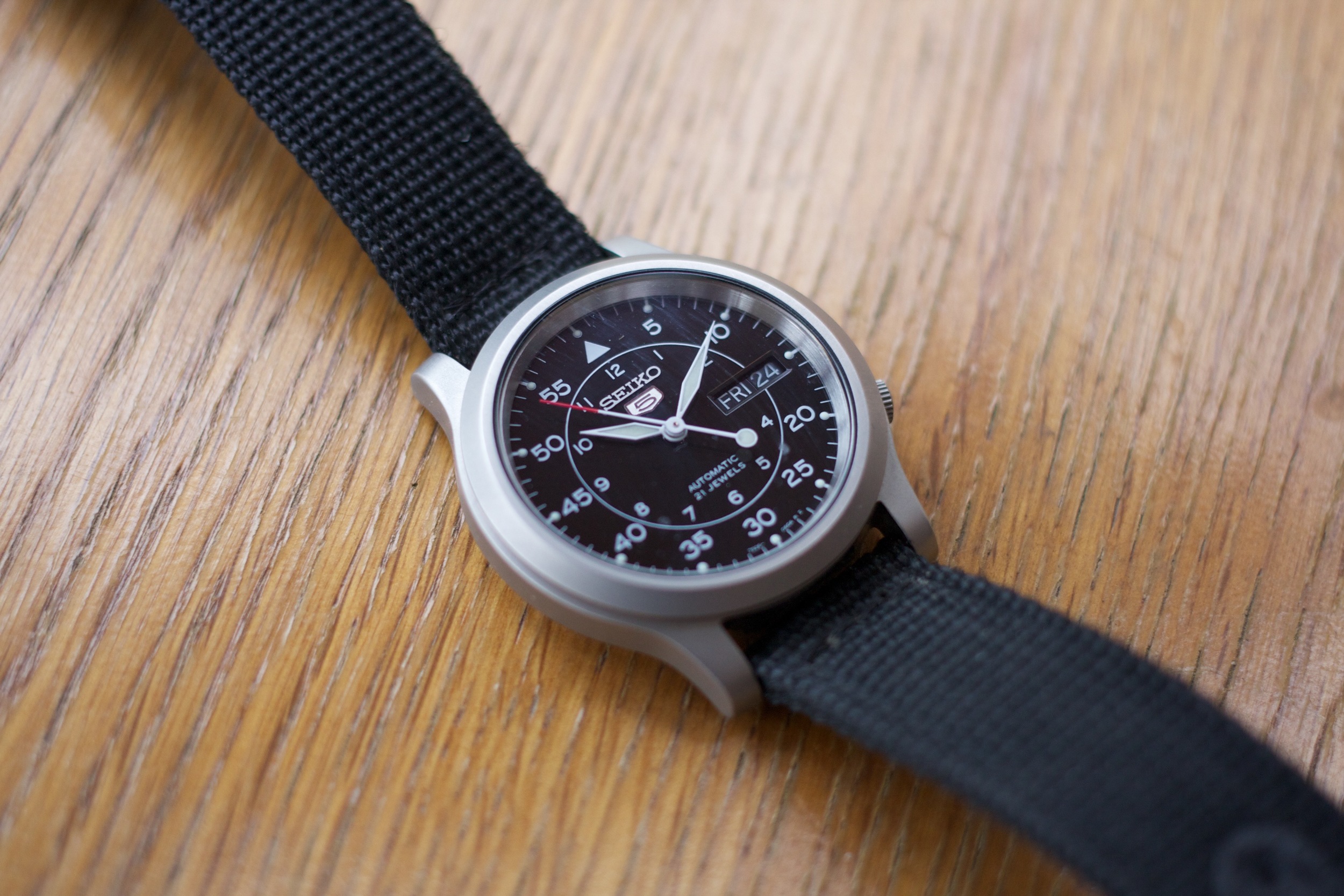
I doubt many people take notice of such things. In my observations, most people don't even register another person's watch. I've taken notice of this more than usual the past six weeks when I took off my Seiko 5 and put on my 42 mm Space Gray Apple Watch Sport.

I honestly expected strangers to notice and ask me questions about it. My friends, of course, knew I was getting it and naturally asked about it. But it took a solid three weeks before a stranger noticed, and it was when I pulled up Passbook for the local theater's rewards program. The clerk immediately noticed then, but, really, how could he not? It was obvious. Likewise, the only other times anyone has noticed have been for times I have used the Watch for Apple Pay or Passbook.

Outside of those obvious contexts, the Apple Watch is just another watch to almost everyone out there.

And it really is a fantastic timepiece. But it is also more than that.

It's a companion.

Timekeeping

Let's start with the basics. The Apple Watch is an excellent watch, and it is priced comparatively to other great watches. Being digital, it is intensely accurate — ± 50 milliseconds of the global time standard.

It's also a handsome and fashionable timepiece. I'm really glad I went with the Space Gray model, as I love the darker toned metal, and the black band it came with. It honestly works with any style of wardrobe I choose. And when you are not using the Watch, the cover glass is pitch black. It draws no attention to itself. It is humble and unassuming.

One feature of the Apple Watch that traditional watches cannot replicate is that it truly can fit for any occasion. It comes with a myriad of choices of watch faces, and a number of them offer a great level of granular customization. You can adorn the face with as little or as much complication as you want, and even change the colors of some elements to match what you are wearing. My favorite is the Utility face, and I generally have the accent color for the date & second hand set to orange, my personal favorite color.

The Utility face is greatly customizable. It can be set to show numbers for all twelve hour positions, or just the four cardinals, or none at all. Another favorite is the Color face, set to either a bright blue or orange, which reminds me a bit of Tron.

No matter the occasion, the Watch is a companion to your style.

Complications

A great deal of the watch faces have little bits of data you can add called Complications. They are like little widgets. You can set things such as activity level (more on that later), the weather, timer, calendar, sunrise/sunset, moon phase, and the time of various cities via the World Clock.

The standards I keep on my beloved Utility face are Activity, Timer, and Weather. Tapping one of them will switch you over into the corresponding app. I love this in the morning as I am getting ready. I'll glance at my Watch to see the current weather, and with a tap on that Complication, I can check the hourly forecast for the day. Sometimes I take a peek at the 10-day forecast to build a mental picture of how the week looks. It seems Monday will be an opportune time to mow the lawn.

Fitness

It turns out mowing the lawn is quite the workout. I have the data to prove it thanks to the Watch. Of course, I'm the one using an old school, Chris-powered reel mower, so it better be a workout.

Fitness is one aspect where the Watch has been shining as a companion. The three activity rings — pink for active movement, green for exercise at a brisk walk or above, and blue for 1 minute of standing movement per hour — are genius and provide a great deal of motivation for me to move more.

The pink Move ring, as Apple calls it, measures your active caloric burn throughout the day. By default, it starts you off with a rather attainable daily goal. When you meet that every day for the week, the start of the next week will prompt you to increase your goal and suggest a new goal. You can adjust that up or down. I've become a bit obsessive about completing my Move ring each day. I had a 34 day streak going until I missed it by 15 calories when my wife & I were watching something. Don't worry, I'll get it back.

The green Exercise ring is the bane of my existence right now. For the past two months I have gone on a daily walk during my lunch break from work. At first I could log only about a half mile in 20 minutes. Now I can do about 1 to 1.25 miles in that time. Yet at my new normal walk pace it isn't enough to budge that dang green ring. I don't know what speed Apple considers a brisk walk, but I have to be near jogging to get the ring moving. I hope this gets adjusted in a software update, because it feels a bit off.

That said, it logs perfectly when I go for a run or a bike ride, or when I mow the lawn of all things. I have a feeling a great deal of the Exercise ring is due to heart rate, and I must not be getting my heart rate up enough when walking to count. But mowing the lawn does the trick quite well. Oh, did I mention that the back of the Watch is a heart rate monitor? Well, it is.

Finally, the blue Stand ring is changing my health for the better, and I love it. It's not only helping my physical health, but also my mental health. I'm the type of person who will get tunnel visioned on my work and I will sit at my desk for four hours straight before standing. And when that happens it hurts to stand up. And my eyes hurt from being so focused on a screen.

Now, if I have been sitting from the top of the hour to fifty minutes past, the Watch will give me a tap on the wrist. It's hard to ignore. I glance at the screen and it says it is time to stand up and move around for at least one minute. I obey, rise from my chair, and walk about the house. I say hi to my wife, give her a kiss, and ask her how she's been the past hour. We connect for a moment, and I get myself something to drink. Another tap, the minute is up.

It's now a new routine. I get a mental break from my work. A brief moment to unplug and step away. My eyes thank me for the change of scenery. My legs appreciate the movement.

Now, if I have not been sedentary for those 50 minutes into an hour, the Watch logs that and credits the hour to my Stand ring, and forgoes the nudge on the wrist. I also appreciate that, too. I rarely feel a tap to stand up & move on a weekend.

The Watch has become my fitness companion.

Assistant

The single greatest thing about the Watch has been that I am looking at my iPhone less.

It used to be that my phone would vibrate and make a sound, and I would instinctively pull my phone out from my pocket, and swipe on the notification to deal with it. But I wouldn't stop there. The next thing I knew I was checking another app, then maybe another. And ten minutes have passed. I never really noticed this as a problem, but in retrospect it wore on me.

Some of the first things I did when setting up my Apple Watch was to silence it, and limit which things I'd allow the phone to send over as notifications. Now, my phone doesn't explicitly notify me for most things, and my watch gives me gentle taps on the wrist instead.

The beautiful part is that I've gained more restraint in whether or not to act on a notification. My wrist is tapped, I glance to see a short preview of the notification, and often I just turn my wrist away to queue the notification to be acted upon later. Most things don't require my immediate attention, and now I can tell that in seconds with little effort.

It's almost like having a well-known assistant who can give you non-verbal cues as to whether your attention is really needed or not.

I'd be remiss to make a comparison about the Watch being like an assistant with mentioning Apple digital assistant Siri. I'll admit I was pretty bearish on Siri for the Watch as Siri has never been all that stellar on iOS. But somehow, Siri is really good on the Watch. This is important, because Siri is the main way you interact with the Watch. Dictation is almost always spot on with the Watch, more so than it ever has been (or still is) with the iPhone. I've even found Siri to be responsive to a near whisper if I hold the Watch a little closer.

She also doesn't talk to you, at least, not out loud like she does on iPhone. Instead, Siri on Apple Watch communicates solely via text. And I kind of like that. It almost feels more personal since it is unlikely for someone else to be looking on, whereas the verbal aspect of Siri on iPhone can be heard by anyone around you.

Between the subtle approach to notifications and a faster, more accurate, and — dare I say — more intimate Siri, the Watch makes an impressive companion as an assistant.

The Little Things

Apple Watch wouldn't be an Apple product if it didn't make us appreciate the little things. And there are many of them to be appreciated.

In no particular order:

  • The ability for the Watch to easily change bands is amazing. With the simple press of a button on the underside the strap slides off the case, and a new one can slide right in. It's amazing other watches have never done this.
  • The Sport band is extremely comfortable. I didn't expect it to be. I expected it to feel plasticy or rubbery, but it feels like neither. It is soft & feels fantastic. I can see why Apple insists on using the mouthful of a word fluoroelastomer instead of simply rubber, as it is a totally different grade of material warranting a higher expectation.
  • I love using the Digital Crown. The crown on traditional watches is something you use maybe twice a year to set the time for daylight savings. On Apple Watch, the crown is used constantly. It's how you scroll a text view or longer notification or zoom in and out of maps (and it is so smooth when scrolling. It glides like it is greased with butter). Pressing it is akin to the iPhone's Home button. Double pressing it switches you between the last two apps used. Pressing & holding manually activates Siri.
  • I was impressed by how compact the Watch is, even the larger 42 mm. The pictures on Apple's site don't do it justice here. The pictures make it look rather thick & cumbersome, and it is anything but. In fact, it is the same thickness as my Seiko 5, and has about the same height x width footprint. It really does feel like a watch, not a miniature wearable computer.
  • This is the first Apple device to be water resistant, and it is really water resistant. It appears to surpass Apple's very cautious recommendations. I've seen videos of folks swimming with it, or leaving it at the bottom of a pool for an hour without problem. I've personally ran with it in the rain, done the dishes numerous times, and even wore it in the shower once, all without issue. It's a very rugged little watch.
  • Sending my heartbeat to a friend is fun because it weirds them out. Receiving a heartbeat from a friend, well, weirds me out. I do think it'd be a great feature if my wife ever decides she wants an Apple Watch, especially on the rare times one of us is traveling without the other. I can see having an appreciation for sending & receiving heartbeats with her, much like I appreciate FaceTime in that regard.
  • Don't worry about battery life. I have rarely had it dip below 30% charge, even with higher usage on a family trip to Chicago, where I was getting directions. It truly is all-day battery. And, since I am looking at my iPhone less frequently, my battery life has been better day-to-day on that, as well.

The fact that the Apple Watch is a watch first and foremost — and an excellent watch at that — makes it an excellent companion with regard to style and daily utility. Add to that an amazing fitness tracker that measures many aspects of my health, and improving on aspects I didn't expect it to, makes it a companion on the journey to a better me. Finally it is my companion as a well-timed assistant, keeping me focused on the things that carry greater importance, and leaving the chaff to be dealt with at a later time.

I was skeptical about how the Apple Watch would fit into my life. I questioned whether I really needed yet another device. But Apple Watch is not just any other device. It is my new watch for any occasion, in pretty much any environment, helping me be healthier, and helping form a new habit to be intentional in my interactions with my devices and with other people.

¶ The Seiko 5 Automatic Watch

I first wore a watch in elementary school. I was nearly obsessive about time as a young child. When was recess? Lunch? End of the school day? When did Teenage Mutant Ninja Turtles come on? I was always looking forward to what was next in my day and a watch kept me informed. I'm sure I annoyed my teachers by reminding them of what should be coming next in the day.

Over the years I wore many different types of watches. I had the Mickey Mouse watch as a kid. My Dad passed down his Casio G-SHOCK watch when he got a newer model. I love that watch, because of all the timers and gizmos it had. I envied Dad's newer model because it looked almost futuristic.

As I grew into my teens and became fascinated by the newer James Bond movies of the time (ah, GoldenEye), my taste in watches mimicked the class of Bond. I desired stainless steel. I eventually got a Pulsar that was stainless steel with a blue bezel that made me feel like 007.

After a number of years, the ratcheting bezel on the Pulsar broke and I got a very nice looking Seiko stainless steel watch that I still have to this day, though it needs a new battery. But a few years into wearing it, I decided to stop wearing watches entirely.

I remember exactly why, too. I was in college, and had upgraded from the eMac to the iBook G4 for my sophomore year. It was the thickness of the iBook combined with placing my wrist on its wrist rest that discouraged me from my watch. The angle made the buckle of the watch dig into my wrist, and it wasn't long before I started having shooting pains in my left hand. I started taking off my watch when I'd be typing for a bit and, over time, it just remained on my desk. I started checking the time on the small external display of my Motorola RAZR.

I stopped wearing a watch.

Fast forward about ten years and watches are quite popular to talk about again, the topic is not the watches of your father's or grandfather's time. That's a story for a different day. Needless to say, the interest of those I follow on Twitter and read articles of has had a halo effect renewing my interest in timekeeping. So I put a watch on my Amazon wish list about a year or so ago, and figured I'd see what happens.

I could have simply replaced the battery in my stainless steel Seiko, but it is a watch that is not likely something one would wear day-to-day with a t-shirt and jeans. I wanted to wade back into timekeeping with something simple and unobtrusive. I picked the Seiko 5 Automatic watch.

The Seiko 5 is a simple watch in that it tells the current time and shows the day and date. That's all. It has an aluminum body, a clear back, and a simple black canvas strap. Its second hand moves in such tiny yet quick increments it appears as if it were a sweeping second hand. It's a nice touch that I enjoy quite a bit.

It's also an automatic watch. It will never need a battery. The momentum of wearing it keeps it going. This is where the clear back of the watch is fascinating. You can see the weight move around and keep the springs wound tight. It's also a neat way to observe the inner workings of a wristwatch. Everything is so small and delicate, it amazes me any of it even works.

My favorite characteristic of the Seiko 5 is when I bring my arm up to rest my head upon my hand, leaning on my desk or the arm of the couch. That's when I can hear the mechanics of the watch as it is close to my ear. Tick tick tick tick tick tick tick. It's rapid and almost hypnotic. The steady rhythm is relaxing and brings peace.

The Seiko 5 is both simple yet elegant in appearance. It can be worn casually in your most comfortable clothes, but also pairs well when dressing up, as it doesn't stand out in any way. Not too plain, not too eye-catching. Just right.

¶ Bible App 5 | Review

The Bible can seem like a pretty daunting thing to get into. It's a rather large book1, and it comes in so many translations. Which should you choose? Dost thou goeth with ye olde King James? Or something a bit more modern like the NIV? The options are endless.

I happen to like to read a few different versions to get a better idea of what is being said. I find the different viewpoints to be helpful in forming a more complete picture. The problem here is that I don't really care for having a few copies of the same book sprawled out. And I certainly don't enjoy carrying around a large book.2

That is why I have been a longtime fan of YouVersion's Bible App. It collects a metric ton of different translations into one app on your iPhone, iPod touch, iPad, or Android device. And my iPhone is a lot lighter than a book.

Today YouVersion introduced Bible App 5. It has a great new interface across the board, and even though the same interface is shared across iOS and Android, it looks right at home on iOS 7.

The best part is that the Bible App is taking the focus of the app from being solely on you and branching it out to being part of your own community of friends. The folks you add as friends can now comment and like on your notes, highlights, and bookmarks (you can choose to make any of those public or private). Here is what YouVersion says about the new focus of the app:

Up until now, the Bible App was designed mostly around you as an individual—you reading or listening to your Bible, adding your personal notes and your insights. While many people have told us that this kind of personal experience has helped them grow closer to God through His Word, we think there’s still more we can do—a lot more. The all-new Bible App 5 transforms the way you experience Scripture…from “me” to “we.”

Historically, people were only able to experience the Bible in community. Before the printing press, very few people had personal copies of the Bible. But movable type changed everything. For the first time in history, anyone who could read could experience God’s Word with their very own printed Bible. In more recent times, audio Bibles in several languages invite even more people to enjoy God’s Word by listening—even if they can’t read.

Bible App 5 was designed from the ground up to bring the best of all these things together again. It draws the Scriptures back into community, without sacrificing personalized access. You can keep enjoying your own Bible, just as you always have. But now, for the first time, you can also easily experience it within the context of close, trusted friendships.

No matter what your view on the Bible is, it is amazing that a text as old as it is has transcended so many mediums throughout history. From scrolls that were largely shared verbally and copied by scribes to the printing press and to the digital age.

Over the years I have found that the best part of my church is the community. Yes, the worship service and my pastor's sermons are important, but the real growth happens in small groups, with people coming together and sharing their views.

While likes & comments in an app is not a replacement for that in-person community, I think it is a great way to keep your small group connected between Sundays.

Bible App 5 is entirely free and available for iOS and Android.


  1. Well, it’s a collection of books, technically. I guess that’s what we call an Anthology?

  2. To say I am a fan of eBooks would be an understatement.

Knock. To Unlock.

Knock knock.

Who's there? Your iPhone, that's who. Why? To unlock your Mac.

We all hate having to deal with security because security and convenience just don't always seem to play well together. Thankfully there are many things out there to help them get along. Things like 1Password (which has a smashing new version out for Mac, and is also a major contributor to my lack of writing here last month). Then there is the new kid on the block, Touch ID.

I've used the demo of Touch ID on an iPhone 5s at the Apple Store. It's pretty rad. I can't wait to have it next Fall (I skip the 's' generations), and I was hoping it would come to the new iPads announced a couple weeks ago. And someday I hope it comes to a portable Mac so I can stop typing in a password to login.

But until then we'll have to use creativity, and that is where Knock comes in. Knock is a pair of apps, one for your Mac, one for your iPhone. Together, they create a super duper secure link over Bluetooth 4 Low Energy.

When you wake up your Mac, it checks to see if the iPhone is close by. If it is, a green circle pusles around your avatar on the standard OS X login screen. Then, your just give your iPhone a quick knock-knock, like you're knocking on someone's door. Magically, your Mac unlocks.

The Mac app runs as a menubar utility, easily tucked away by my good friend Bartender. The iOS app just needs to hang out on your iPhone, and doesn't even need to be running. During setup you give it special permission to monitor Bluetooth and CoreLocation so it can detect the Mac and its proximity.

The best part is your iPhone doesn't even need to be unlocked. You can leave it in your pocket and give it a gentle double-tap to unlock the Mac.

I'm really impressed by Knock, and it will be indispensible not only at coffee shops, but around the house, too, as my Mac tends to fall lock down while I step away to AeroPress some coffee.

Knock is a $3.99 iOS app and the Mac app is free on their website.

¶ iOS 7

To say that I had felt a little underwhelmed at iOS 6's unveiling a little over a year ago would be an understatement. There had been rumors of a visual refresh, of changing the standard interface chrome from a steel blue to a grayish silver, and I was looking forward for some fresh paint on the pixels. But that didn't happen. The biggest interface change was tinting the status bar to somewhat match the chrome of the app running. And it looked pretty awful.

For the first time, iOS had felt stale to me.

This year, the rumors weren't of subtle changes. They were of big changes. Pave the land and start anew kind of changes.

With iOS 7, Apple did just that.

When you install iOS 7 on your device you'll quickly realize that there was not a single pixel of iOS itself that was left untouched. Everything and the kitchen sink went out the door, and every design started on a blank canvas. iOS 7 is unabashedly different.
 More on the design in a moment. There is a lot that did not change. iOS 7 still operates much in the same way as before. If you knew your way around iOS 6, you'll find your way in iOS 7 as very little interaction changed. And what did change is, in my opinion, for the better.

Examples? It used to be that you had to get to your first home screen and then swipe from left to right to do a Spotlight search. Now, from any home screen, just scroll down on the icon area a little and the search field appears. In Safari (and many others apps) you can swipe from the left or right edge of your device to go back or forward a page in the browser, or a level of hierarchy in an app. iOS 7 just feels a bit more elegant in function.

Where iOS 7 really shines in the simplification of its design. Apple has spent a great deal of effort on pushing two things in iOS 7's design: typography and color. Most things that were handled by and icon before are now a simple and straightforward text label. The icons that remain have been redesigned, thinned out, and simplified, yet overall familiar. Color is used everywhere. Icons and labels in Safari are blue, Calendar is red, Notes is yellow, Music is pink, and it goes on.

Design is not the only change in iOS 7, but it certainly is the most apparent. Other features and refinements have been made as well. The lock screen lends itself to being far less cluttered and showing more of the wallpaper image. Also, from the lock screen, you can now pull down the Notification Center, which has been given a new view called Today. The new Today view is really handy. It tells you plainly what is coming up next on your schedule and the weather. It shows a small portion of your calendar for the next few hours, and even tells you want is on your plate for the next day. In the case of an iPhone, it will tell you how long it would take you to drive to your next appointment, if you entered the address in Calendar. And when you are out and about, it will tell you how long it would take to drive home.

While Notification Center is at the top of the screen, the new Control Center is at the bottom. Slide up from the bottom of the screen to show quick toggles for Airplane Mode, Wi-Fi, Bluetooth, Do Not Disturb and Orientation Lock. You can adjust the brightness, audio that is playing, AirDrop and AirPlay, and then buttons to turn the LED flash on as a flashlight, and quid access to the Timer, Calculator, and Camera.

Control Center has become one of my favorite things about iOS 7. And like Notification Center, Control Center can be accessed from the home screen or from within any app.

One of my other favorite things of iOS 7 is the new parallax effect on the lock and home screens. Tilt your device around, and you will notice the icons and wallpaper subtly shift in opposition to each other, giving an effect that is not quite 3D, but decidedly not 2D. It's one of those little attentions to detail that makes iOS 7 feel so great.

Siri debuted with iOS 5 on the iPhone 4S as a beta feature, and remained that way ever since. With iOS 7 Siri loses the beta label, gets a much better voice (and a male voice), and seems overall more responsive and functional. Siri can even now turn certain components like Wi-Fi and Bluetooth on and off. I'm really enjoying the new Siri, and though I still feel it is a little behind Google Now, I think Siri is far less frustrating than in the past.

The last thing I really want to touch on is iTunes Radio. If you've ever used Pandora, you'll quickly understand iTunes Radio. I've been using the heck out of this, and it's really well done. It's impeccably good at finding music that fits with your tastes, and just keeps getting better the more you use it. This is one of those features that is easy to get lost in the shuffle of the new design, but it is truly one of the best features of iOS 7 if you love music.

iOS 7 takes a lot of risks with visual design, and in some areas it is spot on terrific, and other areas it has gone a little too far. I love the overall change, but I also realize that it is far from perfect. iOS 7 is an enormous undertaking, but what it is doing best is laying a brand new foundation to build upon for the future of iOS. As much as I adore iOS 7, I can't wait to see what happens in iOS 8, because it's a whole new ballgame. And even more than looking forward to iOS 8, I can't wait to see what developers do with their apps now that there is a blank canvas to work from.

Apple has made guides for iOS 7 available on iBooks, one for iPad, one for iPod touch, and (presumably) one for iPhone (I'll add the link when it is available).

¶ Downcast for Mac | Review

I'm pretty sure I've been an avid podcast listener since Apple first integrated it into iTunes and the iPod. Many would likely agree Apple kicked podcasts into mainstream use.

After the debut of the iPhone and then the App Store, third party podcast apps started to appear for movie listening, but I stuck with Apple's iTunes and the iPhone's iPod app, since I was syncing all the time anyway, because untethered sync still wasn't around for the iPhone. And I kept on this way until Apple released its Podcasts app partway through iOS 5's life cycle.

And boy did that app suck.

Podcasts was gorgeous at its debut, sure. I loved the reel-to-reel animation, superfluous as it was. But actually using the app was downright awful. So that left me with a decision to make between the two biggest names I had heard about. Instacast and Downcast. Both were iOS only at the time, but I didn't mind because I was doing most of my listening on my iPhone, anyway.

I chose Downcast. It didn't take long using Downcast and seeing how easily it synced over iCloud with my iPad to realize it was the app that Podcasts should have been.

From my review of Downcast for iOS:

Apple’s Podcasts app is slow, buggy, and lacks the typical polish and refinement we’ve all come to expect. This app does not feel like something Apple made. It doesn’t even use iCloud to sync the subscription list between your iPhone and iPad, instead making you go through the subscription process twice.

So here’s what you should do. Buy Downcast. It is every bit the caliber you would expect Apple to make, but Apple didn’t make it.

The only role Downcast didn't fulfill was being able to listen from my Mac. At first this didn't really bother me until I started being in front of my desk more and more. Sure, I've fired up my podcasts on my iPad and kept it playing on my desk, and that's fine and all. But I had been wanting podcast listening on my Mac again.

Today, my want is fulfilled. Downcast for Mac is now available on the Mac App Store. As soon as I installed and launched it, I simply clicked a little cloud icon, and checked four boxes. Immediately, my settings, episode list, podcast subscriptions, & playlists all came in via iCloud.

Aside: Downcast is one of the few apps using iCloud that really seems to just work without hassle. Many others I have don't work entirely well and I use Dropbox instead.

Downcast's interface is plain and simple in a refreshing way. It's very focused. You select your podcast and play. I do think it needs some refreshing over time. For instance, there are three different refresh buttons in the main window. One that refreshes all feeds, one to refresh a specific feed list, and another that seems to refresh everything in iCloud.

Aside from an abundance of things to refresh, Downcast for Mac is a faithful interpretation of what Downcast is in a Mac app. Downcast for Mac is available on the Mac App Store at an introductory price of $9.99.

Byword 2 | Review

I've been beta testing Byword 2 for OS X & iOS for a while, and I am really glad it's finally here. It has many little improvements I've been thirsting after for some time, and a great big feature I wish my host/CMS — Squarespace 6 — had an API to use with.

If you're not in-the-know already, Byword is a fantastic app focused on writing. It simply gets out of your way gives you a page to write on, with minimal fluff to deal with. The best part is that it is designed for web publishing as it is one of the best — no, wait, I'll just say the best — Markdown-centric apps I've used.

The grand marquee feature of Byword 2 is blog publishing. You can now publish your text directly to Wordpress, Tumblr, Blogger, Scriptogram, or Evernote. I've been dabbling a bit more into Evernote use, so maybe I will find a home for this feature via the big green elephant. I haven't used the publishing feature, to be completely honest, so I can say very little about it.

Byword 2 also sports improved conflict resolution, showing you each conflicting version in their entirety, so you can make an informed decision on which is the keeper. The update also includes better handing of new, edited, renamed, and deleted documents in Airplane Mode.

The remaining features are the removal of friction points that I have run into with previous versions. When viewing the Markdown preview, Byword 2 now keeps the scroll position intact. This is one of those things you subconsciously knew was annoying that is now fixed.

On iOS specifically, you can now move and duplicate documents. This is handy if you decide you'd rather have a document on Dropbox instead of iCloud, or vice-versa. Fonts on iOS are also much better. Rather than some obscure fonts you've never heard of, Byword 2 now uses Avenir Next (yay!), Helvetica Neue, Courier, and Georgia. I, for one, am in love with the Avenir font family, so I am really glad the developers added it (they were extremely gracious when I was being super-annoying about it during the beta).

If you regularly write for the web there are two things that will help make your life so much easier: learn Markdown, and use Byword.

Byword 2 is a free update for existing users and $10 (OS X)/$3(iOS) for new users. The publishing feature is an in-app purchase for $5 on each platform.